
Everlane. Minimalist atelier on raw linen.
- Commerce
- Light theme
- 9 colors
- 5 typefaces
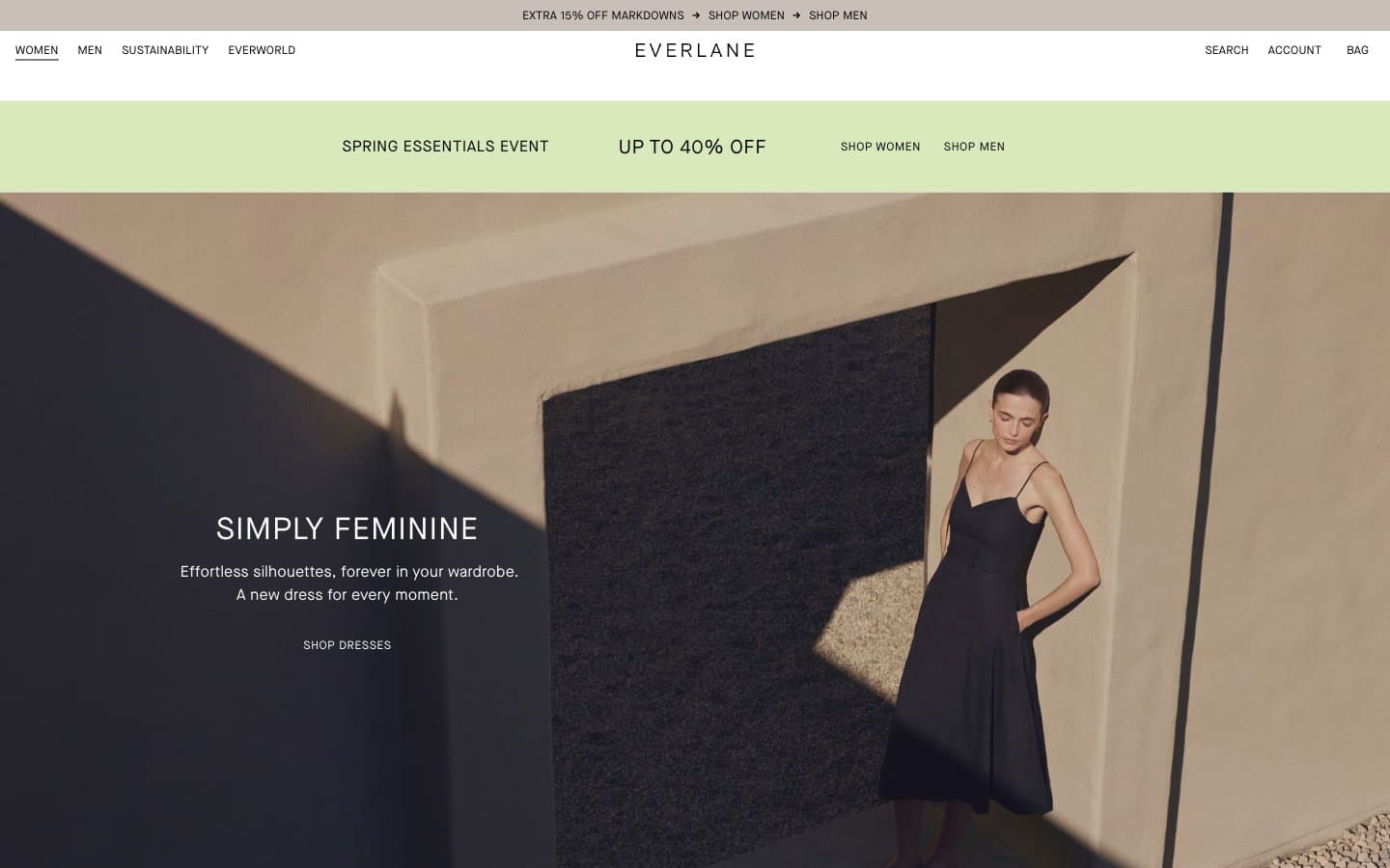
Everlane operates as a minimalist editorial fashion catalogue: near-total achromatic palette, one soft sage accent reserved for promotional urgency, and Maison Neue set almost entirely in uppercase with wide tracking. Photography carries nearly all visual weight — full-bleed editorial shots and tightly cropped product images sit on white canvases with zero decoration, zero shadows, and zero chrome. Type is the only ornament: tracked uppercase headings float over imagery, body copy stays minimal and quiet. Components are stripped to their essentials — thin text links, sharp-edged product tiles, no buttons, no cards, no panels. The result reads less like a storefront and more like a printed lookbook translated to screen.
Everlane design system

Accent1
Promotional bar fill, seasonal event accent — the single chromatic note in the entire system, used sparingly for time-bound urgency
Neutrals8
Primary text, icons, hairline borders, nav typography, footer text — the dominant ink across every surface
Dark feature sections, inverted text on light surfaces, high-contrast blocks
Near-black body text variant, deep borders — virtually indistinguishable from Onyx but carries a barely-warm cast
Secondary body text, muted descriptions, helper copy beneath headlines
Tertiary text, captions, price labels, disabled links
Subtle borders, dividers between product tiles, low-emphasis separators
Warm taupe surface for editorial bands, soft section backgrounds — the only chromatic neutral
Page canvas, product card backgrounds, hero text overlays, input fills
Try a pairing
Pick any two colors from the palette to check whether text stays readable on top.
Aa
Onyx on Pistachio Wash
16.32 : 1 contrast
- Body textPasses AA 4.5
- Large textPasses AA 3
- StrictPasses AAA 7
More DESIGN.md files. Same web, different personalities.

High Protein
Commerce
Hopper
Commerce
2.AG
Commerce
A-WARE
Commerce
AATHER
Commerce
Abel
Commerce
Acme Cups New Zealand
Commerce
Acne Studios
Commerce
Adam Lippes
Commerce
Adanola
Commerce
Advene
Commerce
Aevi Wellness
Commerce


