
Escape Coffee Company. Large display type cut into warm off-white, all atmosphere carried by raw photography.
- Commerce
- Light theme
- 7 colors
- 5 typefaces
Escape is a monochromatic, editorial system built around weather-worn photography and three custom typefaces that do the heavy lifting. The canvas is a warm off-white (#f5f4f2) rather than pure white, giving every page the feel of a sun-bleached magazine spread rather than a SaaS dashboard. Molitor at 250px carries the emotional weight — oversized, tightly leaded (0.85), and slightly negative-tracked so the type feels cut from stone — while TWK Lausanne at near-light weights (200–300) handles everything functional with the restraint of a printed caption. Color is deliberately absent: the entire palette is warm grays from #ffffff to #151515, and accents arrive only as the texture of the imagery itself (snow, stone, coffee grounds). Components are minimal and geometric: thin borders, no elevation, tiny radii (3–10px), and generous whitespace. The system never decorates — it curates.
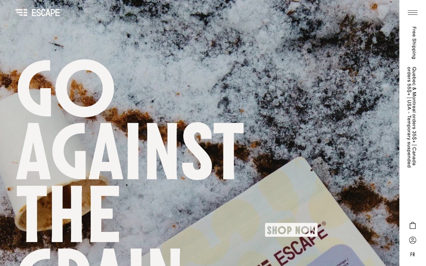
Escape Coffee Company design system

Neutrals7
Link borders, input borders, maximum-contrast accents where Ink is too soft
High-contrast neutral action fill for primary buttons on light surfaces.
Muted helper text, input border default state, low-emphasis dividers
Mid-tone panel surface for subdued dark UI layers and secondary containers. Do not promote it to the primary CTA color
Secondary surface, input fills, subtle dividers, disabled states — one step darker than Bone, used to separate zones without introducing color
Primary canvas, page background, section surfaces — warm off-white replaces pure white to give every page a printed, slightly weathered feel
Card surfaces, elevated panels, reverse text on dark images — true white reserved for surface lift against the warm canvas
Try a pairing
Pick any two colors from the palette to check whether text stays readable on top.
Aa
Paper on Pure Black
21.00 : 1 contrast
- Body textPasses AA 4.5
- Large textPasses AA 3
- StrictPasses AAA 7
More DESIGN.md files. Same web, different personalities.

High Protein
Commerce
Hopper
Commerce
2.AG
Commerce
A-WARE
Commerce
AATHER
Commerce
Abel
Commerce
Acme Cups New Zealand
Commerce
Acne Studios
Commerce
Adam Lippes
Commerce
Adanola
Commerce
Advene
Commerce
Aevi Wellness
Commerce


