
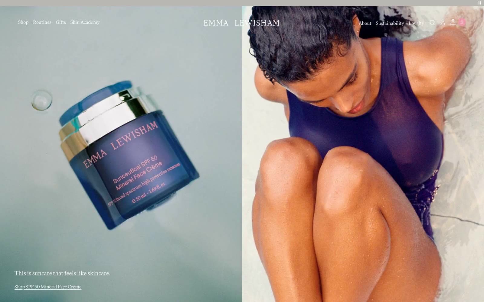
Emmalewisham. Porcelain apothecary at golden hour.
- Commerce
- Light theme
- 9 colors
- 2 typefaces
Emma Lewisham is a porcelain apothecary rendered in editorial photography: warm stone-linen canvases, full-bleed pastel product vignettes, and a single deep iris-violet accent that whispers through thin outlines and links rather than shouting from filled buttons. The system feels calm, considered, and almost analog — serif wordmarks float over sans-serif UI text, products are presented as still-life objects on color-drenched stages, and surfaces stay nearly weightless with hairline borders instead of shadows. Color is used as atmosphere (peach, blush, mauve washes) and as restraint (violet for emphasis only); density is sparse, whitespace is generous, and the only interactive surface style is a thin outlined border in the brand violet.
Emmalewisham design system

Brand1
Outlined action borders, link color, heading accents, navigation emphasis — the singular brand hue, deployed as a fine outline or thin underline rather than a filled mass
Accent3
Muted secondary accent for list borders, decorative link borders, and subtle dividers — the diluted echo of Iris Violet used when the full intensity would overpower
Input focus state text/border — a slightly lifted tonal variant of Iris Violet to signal active text fields
Atmospheric surface wash and decorative accent — warm pink used for full-bleed product stage backgrounds and occasional badge fills
Neutrals5
Primary text, button outlines, icon strokes — used at hairline weights to stay quiet
Secondary text and low-emphasis fills — softer than pure black for body copy and metadata
Muted background panels, announcement bar, low-emphasis surfaces
Page canvas — the warm off-white that grounds every section, used as the base layer beneath product stages and text blocks
Card surfaces, product image cutouts, nav and button borders, inverted text on dark or violet fields
Try a pairing
Pick any two colors from the palette to check whether text stays readable on top.
Aa
Pure White on Iris Violet
9.11 : 1 contrast
- Body textPasses AA 4.5
- Large textPasses AA 3
- StrictPasses AAA 7
More DESIGN.md files. Same web, different personalities.

High Protein
Commerce
Hopper
Commerce
2.AG
Commerce
A-WARE
Commerce
AATHER
Commerce
Abel
Commerce
Acme Cups New Zealand
Commerce
Acne Studios
Commerce
Adam Lippes
Commerce
Adanola
Commerce
Advene
Commerce
Aevi Wellness
Commerce


