
Dyson. Products are specimens on a mat board, framed by a black lintel and a single green purchase signal in an otherwise monochrome room.
- Commerce
- Light theme
- 12 colors
- 1 typeface
Dyson treats its products as museum objects on a warm cream canvas (#fff8e6) rather than items on a clinical white grid. The interface is overwhelmingly monochrome — charcoal text (#333333), white product cards, hairline dividers (#ebebeb) — with chromatic color appearing only as functional punctuation: a green (#79b928) for the occasional filled promotional button, a vivid blue (#0066cc) for announcement bars and price text, and a single warm brown (#ac5d00) reserved for new-product labels. A solid black header bar anchors every page like a gallery lintel, and content sections breathe through generous vertical rhythm rather than tight stacking. Typography is geometric and precise (DysonFutura, a custom Futura derivative), preferring weight 300 for headlines so engineering speaks quietly. Corners stay sharp — 2px on controls, 8px on imagery — and shadows are entirely absent; surfaces layer through flat planes and 1px rules, producing the vitrine-like effect of objects placed on paper rather than stacked in 3D space.
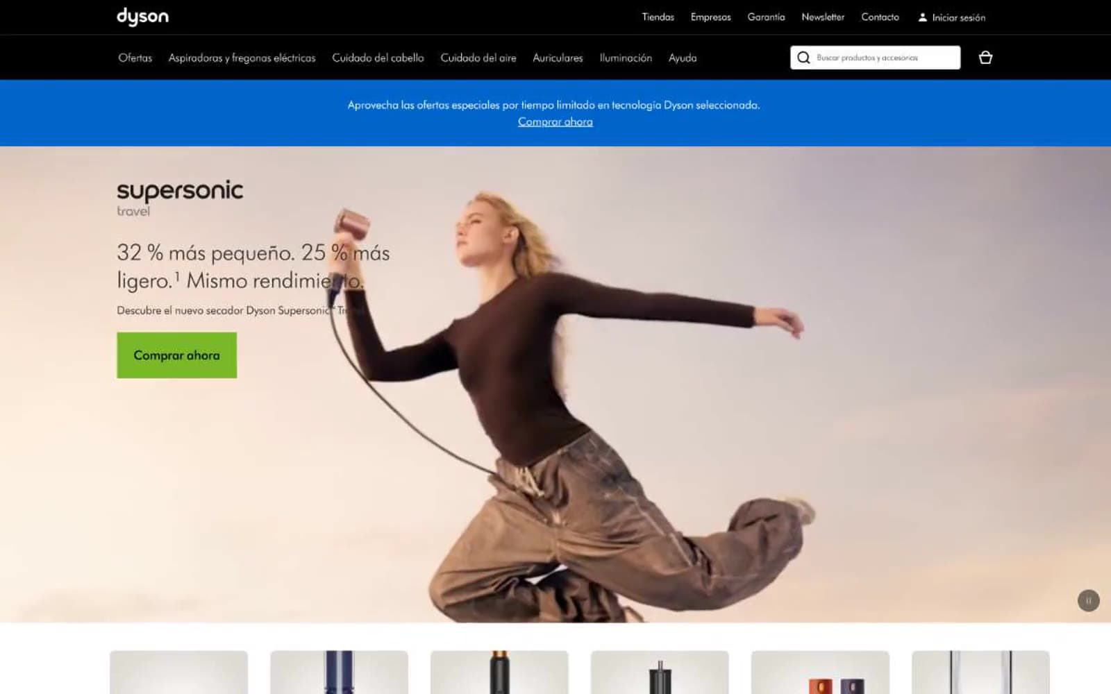
Dyson design system

Brand2
Announcement bar background, price text, inline links, the brand's only chromatic interface surface — carries informational weight across the site
Blue supporting accent for decorative details and low-frequency emphasis. Do not promote it to the primary CTA color
Accent2
Green supporting accent for decorative details and low-frequency emphasis. Do not promote it to the primary CTA color
Orange supporting accent for decorative details and low-frequency emphasis. Use as a supporting accent, not as a status color
Neutrals8
Top header bar background, dark surface anchor — the solid black band that frames every page
Primary text, headings, product names, body copy — the dominant text color across the entire interface
Secondary body text, descriptions, paragraph copy — a softer dark gray for long-form reading
Tertiary text, helper labels, placeholder text, muted icons
Slightly stronger borders for emphasis, secondary hairline dividers
Hairline dividers, input borders, card separators, section rules — the 1px line that defines structure without weight
Page background, hero and section canvas — the warm off-white that replaces pure white and gives the interface its gallery-mat quality
Product card surfaces, input fields, secondary navigation bar — the brighter white that sits on top of the cream canvas
Try a pairing
Pick any two colors from the palette to check whether text stays readable on top.
Aa
Paper White on Signal Blue
5.57 : 1 contrast
- Body textPasses AA 4.5
- Large textPasses AA 3
- StrictFails AAA 7
More DESIGN.md files. Same web, different personalities.

High Protein
Commerce
Hopper
Commerce
2.AG
Commerce
A-WARE
Commerce
AATHER
Commerce
Abel
Commerce
Acme Cups New Zealand
Commerce
Acne Studios
Commerce
Adam Lippes
Commerce
Adanola
Commerce
Advene
Commerce
Aevi Wellness
Commerce


