
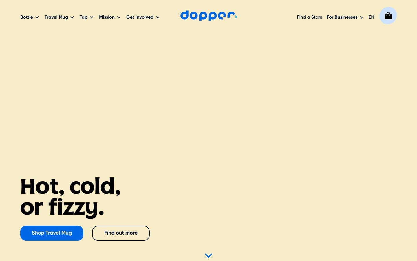
Dopper. Sunlit cream lagoon with a vivid blue current.
- Commerce
- Light theme
- 10 colors
- 3 typefaces
Dopper's visual language reads as a sunlit eco-counter: a warm cream canvas (#f6ecc8 hero, #fcfaf2 page body) carries generous whitespace and a single saturated blue (#0067e5) that snaps every interactive element into focus. The brand voice is confident but friendly — oversized display headlines in a custom 'Dopper' face, rounded 20px corners on every card and button, and solution blocks painted in candy-bright full fills (teal, yellow, sky, navy) that turn the product grid into a poster. Typography is dual-personality: a quirky custom display face for hero punch and a clean grotesque (Gilroy) for everything structural. The system avoids heavy shadows and decoration, instead using color blocks, generous 20px gaps, and large product imagery to create rhythm.
Dopper design system

Brand2
Blue supporting accent for decorative details and low-frequency emphasis. Do not promote it to the primary CTA color
Gradient terminus paired with Electric Blue — used in the subtle horizontal brand gradient for decorative washes
Accent3
Solution card fill, decorative high-energy accent — one of the candy-bright poster colors for the product grid
Solution card fill, decorative oceanic accent — reinforces the water brand narrative in the product grid
Solution card fill, soft brand-blue companion — a lighter blue tone for visual variety in card blocks
Neutrals5
Outlined button stroke, icon strokes, text in solid dark contexts — used sparingly for maximum contrast outlines
Primary text, headings, dark surface cards, logo wordmark — the dominant ink of the system. Deep enough to anchor the cream canvas without going pure black
Muted secondary text, supporting body copy — keeps longer passages from competing with the Midnight Navy headings
Hero band background, alternating section backdrop — sets the warm, sunlit atmosphere of the brand
Page canvas, card surfaces, button text on filled blue — the base layer everything sits on
Try a pairing
Pick any two colors from the palette to check whether text stays readable on top.
Aa
Soft Off-White on Electric Blue
4.94 : 1 contrast
- Body textPasses AA 4.5
- Large textPasses AA 3
- StrictFails AAA 7
More DESIGN.md files. Same web, different personalities.

High Protein
Commerce
Hopper
Commerce
2.AG
Commerce
A-WARE
Commerce
AATHER
Commerce
Abel
Commerce
Acme Cups New Zealand
Commerce
Acne Studios
Commerce
Adam Lippes
Commerce
Adanola
Commerce
Advene
Commerce
Aevi Wellness
Commerce


