
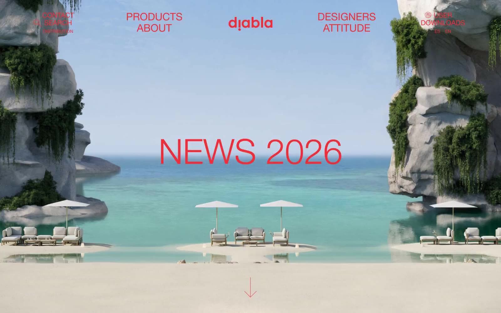
Diabla. Sun-bleached pink walls, one bold red canvas awning, and editorial serif headlines stretched across the sky.
- Commerce
- Light theme
- 4 colors
- 3 typefaces
Diabla speaks in a sun-bleached Mediterranean vernacular: a whisper-pink canvas, editorial Helvetica, and one searing vermillion that punctuates like lipstick. Typography does the heavy lifting — the display face is set absurdly large (80–110px) and pulled almost impossibly tight (line-height 0.88–0.91), turning product names into cropped fashion headlines. Interfaces are quiet and gallery-like: generous whitespace, hairline-red outlined buttons, and almost no shadow. Color is rationed: red appears as outlines, link text, and the wordmark, never as a flat fill — the brand gestures rather than shouts. The result reads like a Vogue spread for outdoor furniture rather than an e-commerce catalog.
Diabla design system

Brand1
Wordmark, link text, heading text, outlined-button borders — the single chromatic note in an otherwise neutral palette, used as outline and ink rather than flood fill to keep it editorial
Neutrals3
Button text and occasional thin button borders where a neutral-bordered variant is needed
Body copy, paragraph text, default readable text — softer than pure black, lets the red feel like the only sharp edge on the page
Page background, input field fills — a barely-there warm pink that softens the white experience and gives the brand its sunlit, not sterile, identity
Try a pairing
Pick any two colors from the palette to check whether text stays readable on top.
Aa
Onyx on Vermillion
5.05 : 1 contrast
- Body textPasses AA 4.5
- Large textPasses AA 3
- StrictFails AAA 7
More DESIGN.md files. Same web, different personalities.

High Protein
Commerce
Hopper
Commerce
2.AG
Commerce
A-WARE
Commerce
AATHER
Commerce
Abel
Commerce
Acme Cups New Zealand
Commerce
Acne Studios
Commerce
Adam Lippes
Commerce
Adanola
Commerce
Advene
Commerce
Aevi Wellness
Commerce


