
D.S. & DURGA. A single warm cream canvas where black ink and oversized type do all the talking.
- Commerce
- Light theme
- 3 colors
- 1 typeface
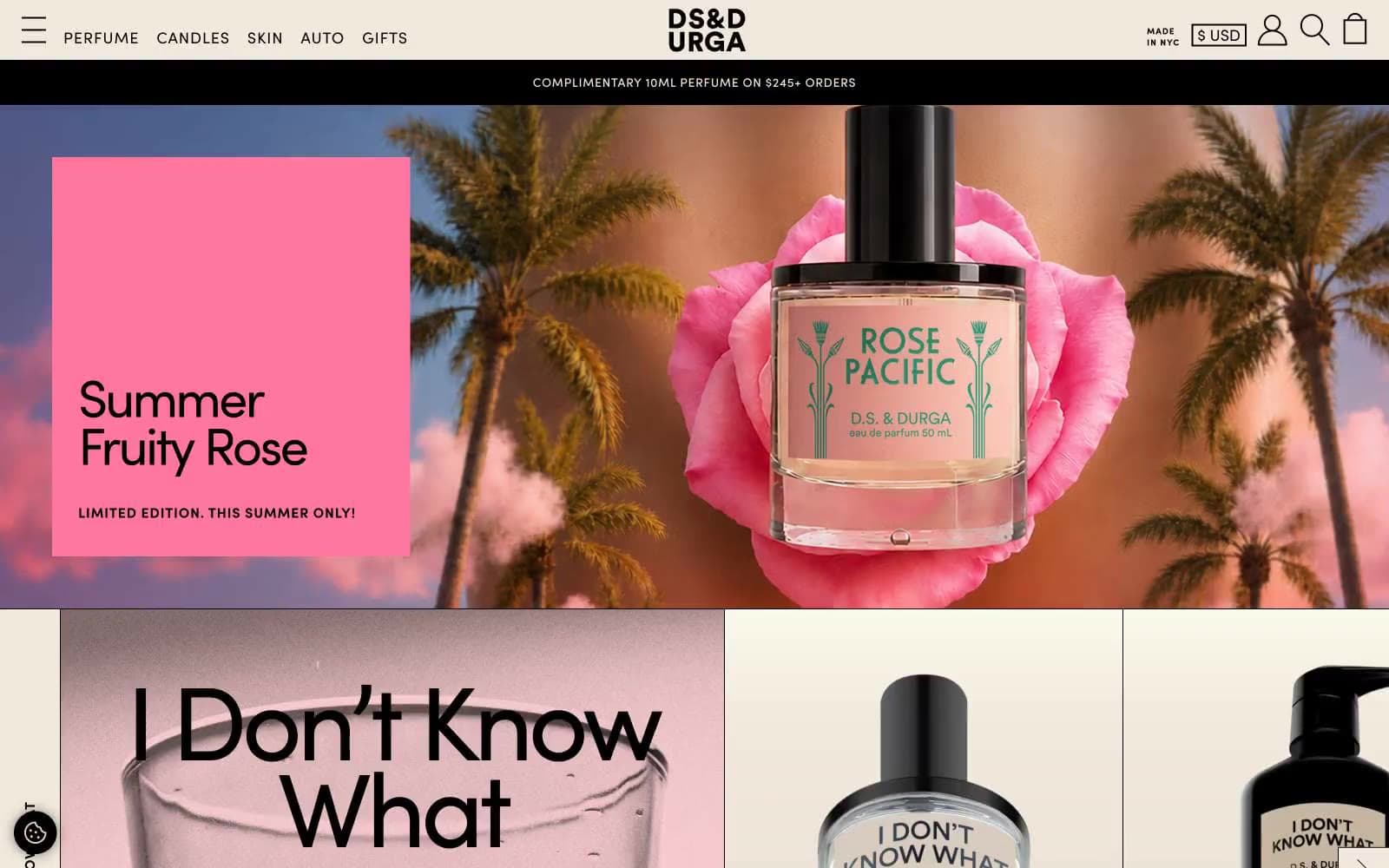
D.S. & Durga reads as an indie perfumery broadsheet printed on bone-white paper. The entire system is monochrome-warm: a single warm cream canvas, black ink for all type and rules, and a dusty rose secondary surface that only appears as quiet tonal shifts between bands. Typography does the heavy lifting — Sofia Pro is pushed to its extremes, with a chunky weight-800 display face at 120px serving as editorial hero headlines and a whisper-thin weight-400 for utility labels, creating dramatic size contrast that feels like a fashion magazine spread. Photography is the dominant visual element: full-bleed product shots on dark moody backdrops, torn-paper collages, and oversized object crops sit directly on the cream canvas with no card chrome or borders. Components are stripped to absolute minimum — no buttons with backgrounds, no rounded containers, no shadows; the only interactive affordance is a thin black arrow and uppercase tracked text. The site feels more like an art object or printed catalog than a typical e-commerce experience.
D.S. & DURGA design system

Neutrals3
High-contrast neutral action fill for primary buttons on light surfaces.
Secondary surface band, subtle tonal shift between cream sections — barely-distinguishable warm blush that creates the only depth in an otherwise flat system
Page canvas, announcement bar, card surfaces, product label backgrounds, button fills — warm cream that makes the entire site feel like aged paper
Try a pairing
Pick any two colors from the palette to check whether text stays readable on top.
Aa
Bone White on Ink Black
17.49 : 1 contrast
- Body textPasses AA 4.5
- Large textPasses AA 3
- StrictPasses AAA 7
More DESIGN.md files. Same web, different personalities.

High Protein
Commerce
Hopper
Commerce
2.AG
Commerce
A-WARE
Commerce
AATHER
Commerce
Abel
Commerce
Acme Cups New Zealand
Commerce
Acne Studios
Commerce
Adam Lippes
Commerce
Adanola
Commerce
Advene
Commerce
Aevi Wellness
Commerce


