
Cowboy. Belgian bicycle gallery in porcelain white.
- Commerce
- Light theme
- 12 colors
- 4 typefaces
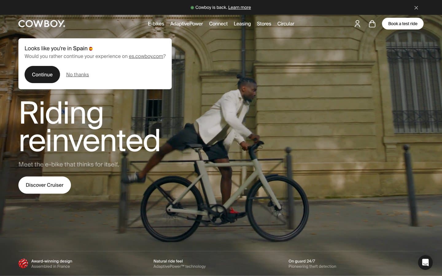
Cowboy's visual system is editorial restraint taken to its logical extreme: a near-monochrome canvas where the only chromatic signal comes from product photography and press logos. SuisseIntl at near-poster sizes (72–100px) with aggressive negative tracking gives every headline a magazine-cover gravity, while 8px radii and 9999px pill buttons keep the chrome physically quiet. Surfaces are white porcelain; structure is communicated through hairline #e5e7eb borders rather than shadows or filled panels. The interface is designed to disappear so the bicycle — and the word — can carry the room.
Cowboy design system

Accent1
Green wash for highlight backgrounds, decorative bands, and soft emphasis behind content. Use as a supporting accent, not as a status color
Neutrals10
Icon fills, high-contrast graphic marks — reserved for SVG iconography only
Primary text, filled primary action buttons, active nav — a soft black that reads warm rather than digital
Body section background, mid-tier surface for inset panels
Input field borders at rest — the one input-state neutral
Secondary body text, button borders, subtle metadata — a middle gray that recedes behind primary copy
Tertiary text, disabled state, muted helper copy — the quietest text tier
Faint dividers, disabled borders, focus halos at rest
Dividers, card borders, input outlines, image frame edges — the structural skeleton of every section
Soft card backgrounds, subtle alternating bands — provides the only tonal step between white surface and white surface
Page canvas, card surfaces, button text on dark fills — the dominant neutral that lets photography carry all chromatic weight
semantic1
Info state, focused input highlight — the only chromatic functional signal in the system
Try a pairing
Pick any two colors from the palette to check whether text stays readable on top.
Aa
Onyx on Moss
6.38 : 1 contrast
- Body textPasses AA 4.5
- Large textPasses AA 3
- StrictFails AAA 7
More DESIGN.md files. Same web, different personalities.

High Protein
Commerce
Hopper
Commerce
2.AG
Commerce
A-WARE
Commerce
AATHER
Commerce
Abel
Commerce
Acme Cups New Zealand
Commerce
Acne Studios
Commerce
Adam Lippes
Commerce
Adanola
Commerce
Advene
Commerce
Aevi Wellness
Commerce


