
Counterprint. White gallery wall, books as art.
- Commerce
- Light theme
- 6 colors
- 2 typefaces
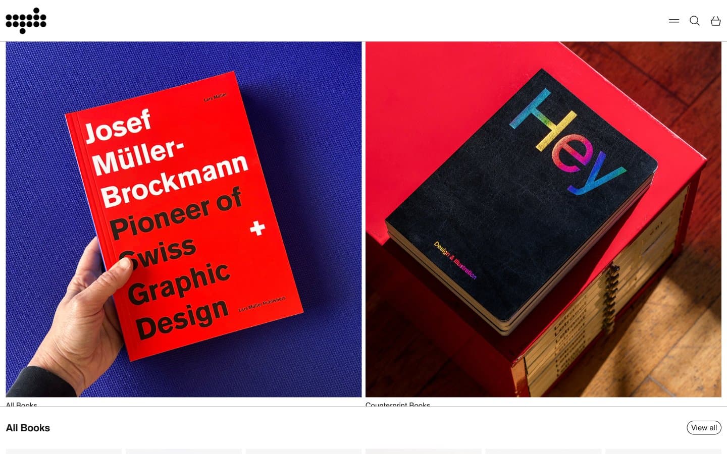
Counterprint is a quiet white canvas designed to let bold printed matter do the talking — a publisher's storefront that behaves like a gallery wall rather than a shop. The interface is deliberately monochrome: a pure white stage, hairline gray dividers, and near-black type, with the entire color vocabulary supplied by the photographed books themselves. Every screen follows a strict rhythm: section title on the left, minimal 'View all' pill on the right, then a uniform six-column product grid where the only variation is the cover art. The product images are square, unbordered, and presented without chrome — no card containers, no shadows, no hover decoration — so the editorial photography carries 100% of the visual weight.
Counterprint design system

Neutrals6
Maximum-contrast text and icon fills where the deepest dark is needed
Primary text, product titles, icon strokes, outlined button borders — the only chromatic dark in the system
Secondary text, meta labels, footer copy — a near-identical companion to Ink Black for subtle hierarchy steps
Muted helper text, tertiary metadata, disabled states
Hairline dividers, card separators, input borders, table rules — the sole structural line color, used at 1px
Page and surface background — the entire interface lives on this single white plane
Try a pairing
Pick any two colors from the palette to check whether text stays readable on top.
Aa
Pure Canvas on Pure Black
21.00 : 1 contrast
- Body textPasses AA 4.5
- Large textPasses AA 3
- StrictPasses AAA 7
More DESIGN.md files. Same web, different personalities.

High Protein
Commerce
Hopper
Commerce
2.AG
Commerce
A-WARE
Commerce
AATHER
Commerce
Abel
Commerce
Acme Cups New Zealand
Commerce
Acne Studios
Commerce
Adam Lippes
Commerce
Adanola
Commerce
Advene
Commerce
Aevi Wellness
Commerce


