
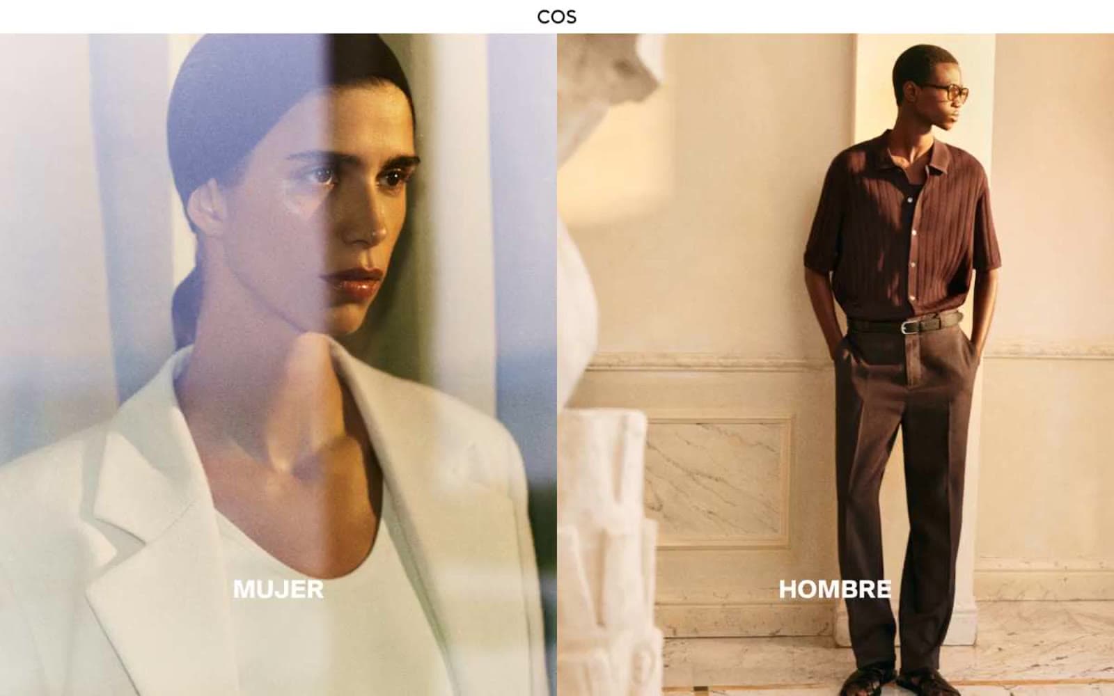
COS. White-walled fashion gallery.
- Commerce
- Light theme
- 5 colors
- 1 typeface
COS speaks in the visual grammar of a contemporary art gallery: vast white walls, oversized monochrome photography, and typography that stays out of the model's way. The interface is nearly colorless — 97% achromatic — using a near-black (#080808) on pure white (#ffffff) as the only structural contrast, with a single red (#c80000) held in reserve as a whisper-quiet accent for moments that must feel urgent without being loud. Spacing is generous and editorial, section padding reaches 135px, and components dissolve into the page: hairline borders at #dadada, no shadows, no gradients, no rounded corners. Typography (SuisseIntl) is the only ornament — a single grotesque family that stays consistent from 12px micro-labels to 35px category statements, tracking slightly positive to feel like printed gallery placards.
COS design system

Accent1
Red supporting accent for decorative details and low-frequency emphasis
Neutrals4
Hero text overlays on dark imagery, body copy, button labels — the true-zero black reserved for highest-contrast typographic moments
Primary text, icons, links, navigation type, button borders, logo, footer text — softer than pure black so photography does not feel clipped against it
Hairline borders, input underlines, subtle dividers, disabled-state outlines — the quietest neutral, only visible by what it separates
Light supporting surface for subtle backgrounds and section separation. Do not promote it to the primary CTA color
Try a pairing
Pick any two colors from the palette to check whether text stays readable on top.
Aa
Canvas White on Signal Red
6.08 : 1 contrast
- Body textPasses AA 4.5
- Large textPasses AA 3
- StrictFails AAA 7
More DESIGN.md files. Same web, different personalities.

High Protein
Commerce
Hopper
Commerce
2.AG
Commerce
A-WARE
Commerce
AATHER
Commerce
Abel
Commerce
Acme Cups New Zealand
Commerce
Acne Studios
Commerce
Adam Lippes
Commerce
Adanola
Commerce
Advene
Commerce
Aevi Wellness
Commerce


