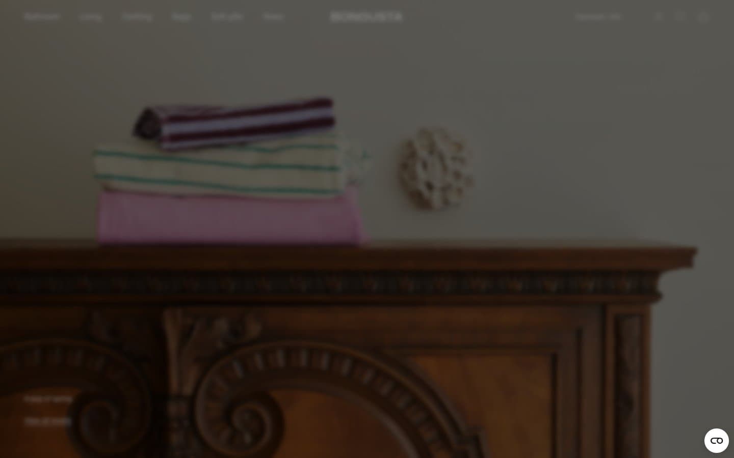
Bongusta. Editorial linen closet behind museum glass.
- Commerce
- Light theme
- 9 colors
- 2 typefaces
Bongusta operates as a quiet, editorial luxury system: warm white canvas, deep aubergine ink replacing pure black, and a single humanist sans-serif carrying all typography at compact sizes. The near-monochrome palette deliberately steps back so textile photography and interior still-lifes carry the visual weight — the UI is the gallery wall, never the artwork. Structure is built from warm linen hairlines rather than elevation, with pill-shaped actions carrying the only brand-tinted shadow in the entire system. The result reads like a curated museum catalog: dense with product, restrained in chrome, and confident enough to let the objects speak.
Bongusta design system
Brand1
Primary text, icons, outlined action borders, badges, links — a warm near-black that gives the monochrome system its only chromatic voice without ever feeling colored
Neutrals8
Icon fills, SVG strokes, link text in decorative contexts — used sparingly where absolute contrast is required
Monochrome icon fills, brand marks, and high-contrast graphic details. Do not promote it to the primary CTA color
Input field borders, image container borders, secondary structural edges where slightly more weight is needed than Warm Linen
Secondary muted text, price labels, helper copy — sits behind Aubergine Ink in the text hierarchy
Card body text, descriptive copy — a warm gray that reads as natural on the white canvas
Structural borders on cards, dividers, image edges, nav, lists — the single most-used color in the system defines every edge between surfaces
Subtle background fills and dividers where Warm Linen would be too warm — a cool counterpoint for nested surfaces
Page background, card surfaces, nav fill, badge fills — the canvas on which everything sits
Try a pairing
Pick any two colors from the palette to check whether text stays readable on top.
Aa
Soft White on Aubergine Ink
16.07 : 1 contrast
- Body textPasses AA 4.5
- Large textPasses AA 3
- StrictPasses AAA 7
More DESIGN.md files. Same web, different personalities.

High Protein
Commerce
Hopper
Commerce
2.AG
Commerce
A-WARE
Commerce
AATHER
Commerce
Abel
Commerce
Acme Cups New Zealand
Commerce
Acne Studios
Commerce
Adam Lippes
Commerce
Adanola
Commerce
Advene
Commerce
Aevi Wellness
Commerce


