
bella Kitchen Appliances. Warm cream surfaces with a single pop of coral.
- Commerce
- Light theme
- 5 colors
- 2 typefaces
bella is a warm, domestic kitchen-counter aesthetic built on a cream-and-coral palette that feels sunlit rather than clinical. The entire interface rests on a warm off-white canvas (#ebeadf) with slightly warmer beige cards (#d5cec0) and white surfaces floating above — layers are defined by hue temperature, not stark contrast. A single saturated coral accent (#f04923) provides all the energy: bestseller tags, promotional cards, price highlights, and active states. Typography uses a geometric sans (Supreme LL TT) with uniformly tight -0.05em tracking at every size, giving headings a compact, modern posture. The design avoids shadows in favor of color-temperature layering and 12px rounded corners; buttons and badges are full pills (999px). The overall feel is approachable, appetite-driven, and product-forward — photography does the heavy atmospheric lifting while the UI stays minimal and warm.
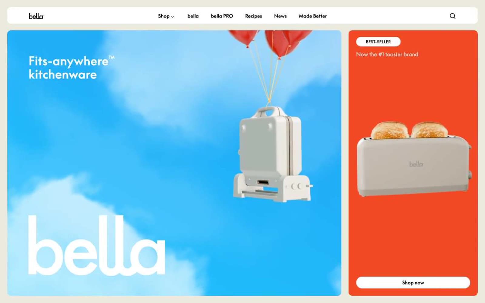
bella Kitchen Appliances design system

Brand1
Bestseller badges, promotional card backgrounds, price callouts, and active accents — the singular warm energy that breaks the cream monochrome
Neutrals4
Primary text, icon strokes, hairline borders, and the brand wordmark — defines the entire typographic system
Secondary card surfaces and warm-toned background panels for product grouping and featured sections
Page background — the foundational warm off-white that gives the whole interface its sunlit, lived-in feel
Elevated card surfaces, navigation bar, product card backgrounds, pill button fills
Try a pairing
Pick any two colors from the palette to check whether text stays readable on top.
Aa
Ink Black on Coral Pulse
5.68 : 1 contrast
- Body textPasses AA 4.5
- Large textPasses AA 3
- StrictFails AAA 7
More DESIGN.md files. Same web, different personalities.

High Protein
Commerce
Hopper
Commerce
2.AG
Commerce
A-WARE
Commerce
AATHER
Commerce
Abel
Commerce
Acme Cups New Zealand
Commerce
Acne Studios
Commerce
Adam Lippes
Commerce
Adanola
Commerce
Advene
Commerce
Aevi Wellness
Commerce


