
BEHAVE Candy. Neon candy-aisle pop.
- Commerce
- Light theme
- 7 colors
- 1 typeface
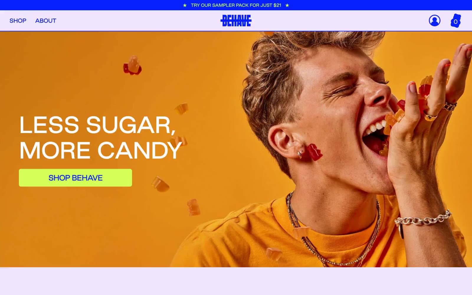
BEHAVE candy speaks in a maximalist candy-aisle visual language: a single dominant cobalt blue carries every word, border, and icon, while electric chartreuse lime punctuates only the moments that need to act or shout. The canvas is pale lavender rather than white, which makes the cobalt feel like neon signage rather than corporate navy. Photography is editorial and full-bleed — close-cropped people mid-bite, rows of gummy bears — and text is almost entirely the brand blue, never black or gray. Components are soft-cornered but not pillowy: cards carry a 20px radius and thin cobalt outlines, buttons sit at a tighter 7px radius, and type runs tight (-0.05em at display sizes) to give the wide headlines a compressed, almost squished punch. The overall feeling is unapologetically loud, friendly, and slightly bratty — built for a single product category, not a platform.
BEHAVE Candy design system

Brand1
Headlines, body text, card borders, nav links, icons, and the filled primary CTA — this is the single voice of the brand and appears in nearly every context including input outlines. Saturated blue at near-maximum chroma reads as neon rather than corporate
Accent2
Green action color for filled buttons, selected navigation states, and focused conversion moments.
Product card fills behind the flavor name — a warm pink that softens the cobalt/lime intensity and reads as candy packaging rather than UI chrome
Neutrals4
Elevated card surface — a step up from Lavender Mist for highlighted panels or hover states where a card needs to rise off the canvas without using a shadow
Input field background — sits between the lavender canvas and the Lilac Bloom elevated surface, giving form fields a subtle fill without introducing a new hue
Primary page canvas — every content section between photographic full-bleeds lives on this pale lavender. Replaces what would normally be white or light gray
Headline text on photographic full-bleeds, text inside filled cobalt CTAs, and the gummy bear product row. White does not appear as a page background
Try a pairing
Pick any two colors from the palette to check whether text stays readable on top.
Aa
Paper White on Cobalt Surge
7.93 : 1 contrast
- Body textPasses AA 4.5
- Large textPasses AA 3
- StrictPasses AAA 7
More DESIGN.md files. Same web, different personalities.

High Protein
Commerce
Hopper
Commerce
2.AG
Commerce
A-WARE
Commerce
AATHER
Commerce
Abel
Commerce
Acme Cups New Zealand
Commerce
Acne Studios
Commerce
Adam Lippes
Commerce
Adanola
Commerce
Advene
Commerce
Aevi Wellness
Commerce


