
Bauhaus Clock. Turquoise mechanical glow.
- Commerce
- Light theme
- 12 colors
- 1 typeface
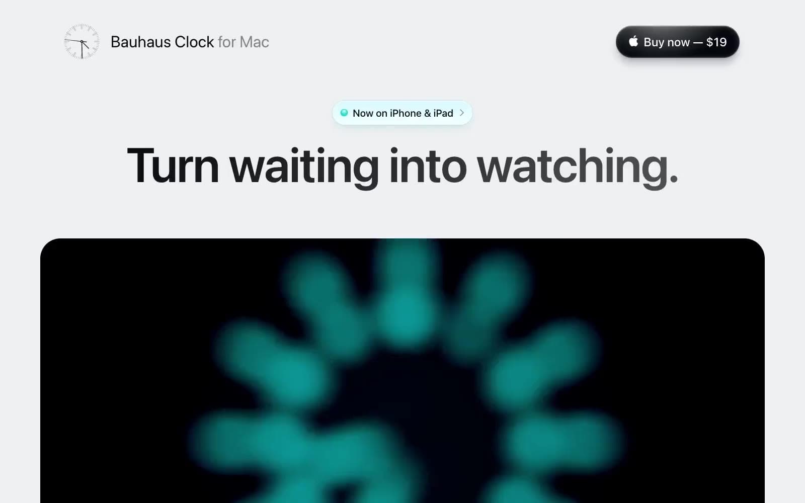
Bauhaus Clock builds its page as a pale-gray gallery interrupted by deep black clock footage, white testimonial tiles, and occasional aqua dial surfaces. The visual signature is oversized, tightly tracked system type set in near-black, with enormous headline scale balanced by compact rounded controls. Soft 30px containers make product media and review modules feel like physical display cards, while a floating frosted purchase bar stays above the content like a hardware control strip.
Bauhaus Clock design system

Accent6
Large feature-card surface and illuminated dial treatment — a soft aqua interruption in the otherwise achromatic gallery
Text-highlight bands, pale feature surfaces, and the soft aqua wash behind selected review phrases
Occasional clock-dial feature surface; reserve for isolated product artwork rather than general interface states
Dark clock and product-media atmosphere, fading from metallic gray into Instrument Ink
Pale luminous treatment for aqua product callouts
Radial glow within dial-focused graphics and illuminated product details
Neutrals6
Hero headlines, long-form headings, body copy, and dark product-media fields
Secondary headings, testimonial quotes, and strong supporting text
Footer links and subdued inline navigation
Muted explanatory copy and low-emphasis labels
Page background, header field, and low-contrast section canvas
Review cards, floating navigation surface, and light content panels
Try a pairing
Pick any two colors from the palette to check whether text stays readable on top.
Aa
Instrument Ink on Dial Teal
14.19 : 1 contrast
- Body textPasses AA 4.5
- Large textPasses AA 3
- StrictPasses AAA 7
More DESIGN.md files. Same web, different personalities.

High Protein
Commerce
Hopper
Commerce
2.AG
Commerce
A-WARE
Commerce
AATHER
Commerce
Abel
Commerce
Acme Cups New Zealand
Commerce
Acne Studios
Commerce
Adam Lippes
Commerce
Adanola
Commerce
Advene
Commerce
Aevi Wellness
Commerce


