
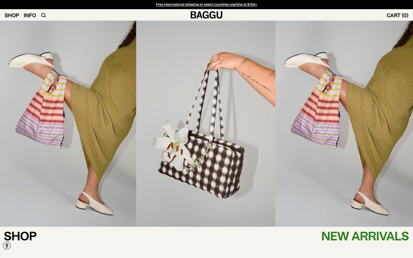
Baggu. A single warm off-white surface where black type and product photography do all the work, and a single green whisper says 'new'.
- Commerce
- Light theme
- 4 colors
- 4 typefaces
Baggu operates as an editorial product catalog: a single warm cream canvas, black type and hairline borders, and product photography that takes 90% of the viewport. The interface is almost entirely achromatic — one warm off-white surface, one true black, and one muted warm gray for secondary metadata. The only chromatic element is a single medium green reserved for the 'New Arrivals' label and success states, functioning as a quiet signal rather than a brand color. Typography is custom and compact: a neo-grotesque at 12–18px with tight tracking and stylistic alternates enabled, sitting close to the baseline so product cards feel like printed price tags. Layout is image-first, text-second: full-bleed editorial triptychs, 5-up product grids, category tiles with caption labels. Density is tight, but the cream surface gives the whole thing room to breathe.
Baggu design system

Accent1
Green outline accent for tags, dividers, and focused UI edges. Use as a supporting accent, not as a status color
Neutrals3
Primary text, hairline borders, icons, nav, button outlines, footer. Drawn at full saturation — no softened grays for type
Secondary text, muted metadata, breadcrumb separators, helper labels. Sits at AA contrast against bone cream for body text
Page background, card surfaces, button fills, input fields. The signature warm off-white that defines the entire visual field — never pure white, always slightly toasted
Try a pairing
Pick any two colors from the palette to check whether text stays readable on top.
Aa
Bone Cream on Moss Signal
4.55 : 1 contrast
- Body textPasses AA 4.5
- Large textPasses AA 3
- StrictFails AAA 7
More DESIGN.md files. Same web, different personalities.

High Protein
Commerce
Hopper
Commerce
2.AG
Commerce
A-WARE
Commerce
AATHER
Commerce
Abel
Commerce
Acme Cups New Zealand
Commerce
Acne Studios
Commerce
Adam Lippes
Commerce
Adanola
Commerce
Advene
Commerce
Aevi Wellness
Commerce


