
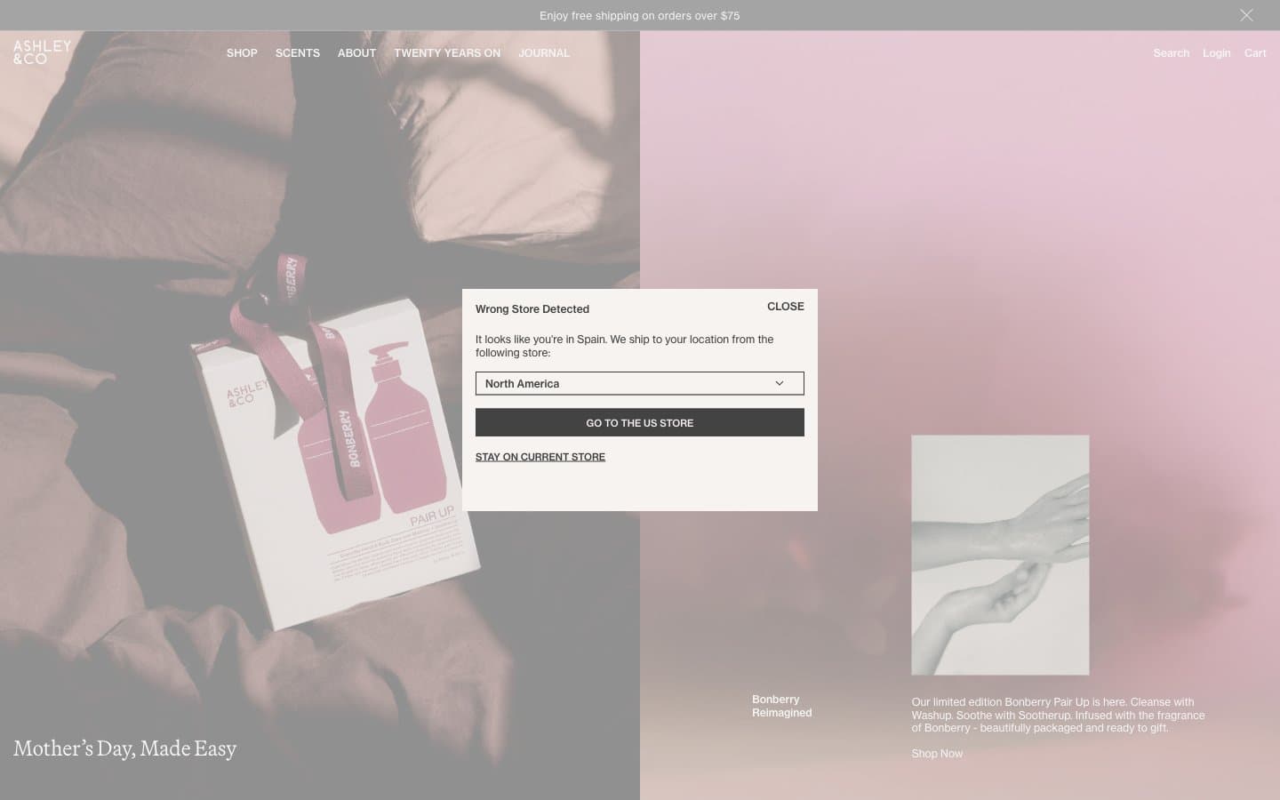
Ashleyandco. A warm cream page where a single serif headline floats like a perfume ad and every other element recedes into silence.
- Commerce
- Light theme
- 7 colors
- 2 typefaces
Ashley & Co operates in the visual register of a hushed beauty editorial: a warm cream canvas, near-black ink typography, and photography that arrives in muted rose and stone washes. The interface stays almost entirely achromatic — color is permitted only inside the imagery, never on buttons, borders, or type. Two typefaces do the heavy lifting: a refined serif (Martina Plant) for display moments that feel like magazine pull-quotes, and Neue Haas Grotesk Text for everything utilitarian. Components are weightless: hairline borders, no shadows, no fills beyond the canvas itself. White space is the dominant design element — generous 80px section gaps and off-grid asymmetry create the feeling of flipping through a coffee-table book rather than scrolling a shop. Navigation is whisper-thin uppercase tracked lettering; CTAs are text links with thin underlines. The overall effect is restrained, apothecary-luxe, and confident enough to let product photography and serif headlines carry the entire brand.
Ashleyandco design system

Neutrals7
Maximum-contrast text and strong borders for emphasis moments. Used in place of Ink Charcoal when an element needs to read as a hard rule — list separators, selected states, bold emphasis
Primary body text, nav links, headings, and the dominant border color. Slightly softer than pure black — the entire interface reads as if printed in warm ink rather than digital black
Button border and dark-mode modal backgrounds. A middle graphite that defines outlined actions without the harshness of pure black
Medium-contrast borders, control outlines, and structural separators.
Hairline dividers and subtle structural borders between sections. A warm pale gray-green that disappears into the cream canvas — visible only as a quiet structural gesture
Page canvas, hero and section backgrounds. This off-white with a barely-there pink undertone is the only surface tone used at scale — it warms the entire brand without ever calling attention to itself
Card surfaces, modal backgrounds, and inverted text on dark buttons. Used sparingly against the cream canvas to create a single step of elevation without shadows
Try a pairing
Pick any two colors from the palette to check whether text stays readable on top.
Aa
Pure White on Carbon Black
21.00 : 1 contrast
- Body textPasses AA 4.5
- Large textPasses AA 3
- StrictPasses AAA 7
More DESIGN.md files. Same web, different personalities.

High Protein
Commerce
Hopper
Commerce
2.AG
Commerce
A-WARE
Commerce
AATHER
Commerce
Abel
Commerce
Acme Cups New Zealand
Commerce
Acne Studios
Commerce
Adam Lippes
Commerce
Adanola
Commerce
Advene
Commerce
Aevi Wellness
Commerce


