
ARTU. Gallery wall on white paper.
- Commerce
- Light theme
- 4 colors
- 1 typeface
ARTU operates as a furniture gallery in browser form: one custom neo-grotesque at a single weight, pure white canvas, product photography that fills the viewport, and almost no visible UI chrome. The discipline is extreme — there is one weight, one type family, two surface colors, and negative space does the work that shadows and gradients do elsewhere. Color is used surgically: a high-chroma lime green (#d7ff66) punctuates only the footer band as a terminal signal, while a raw red (#ff1313) appears as thin border lines and icon strokes — deliberately failing contrast, it functions as graphic rhythm, not information. The result reads less like a commerce site and more like an art-book spread: the products are the layout, the layout is whitespace, and the UI is a thin black line of all-caps navigation at the top edge.
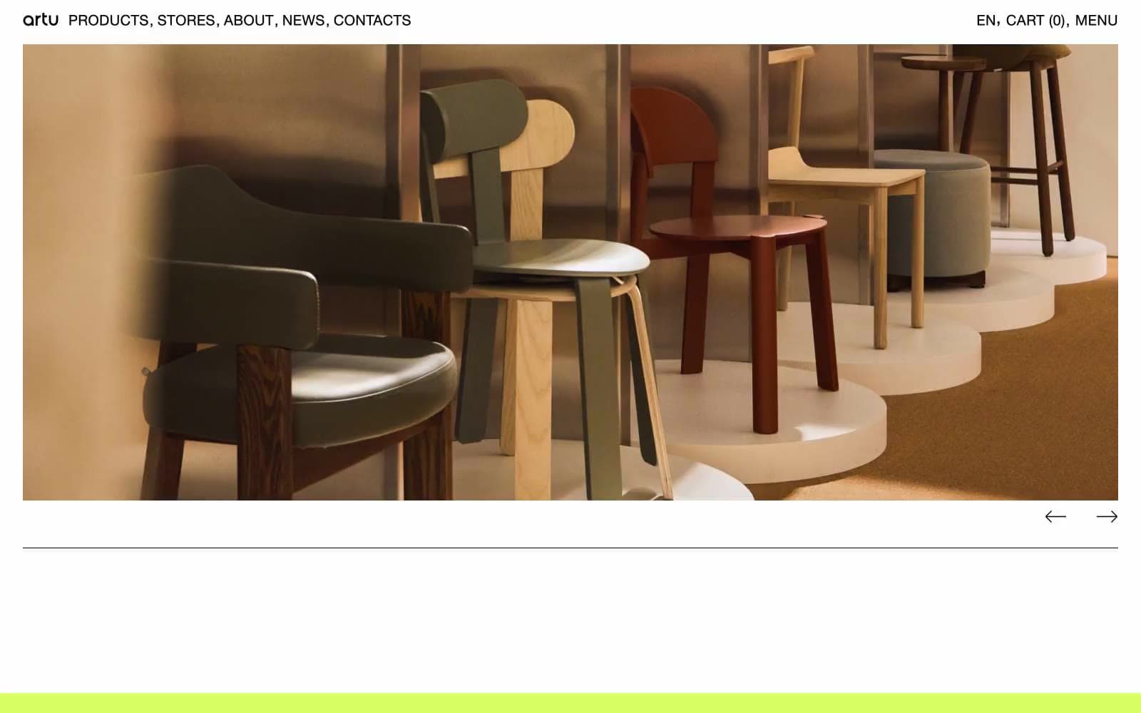
ARTU design system

Accent2
Footer band, surface highlight wash, terminal accent — high-chroma green that signals a page boundary the way a colored edge stops a gallery wall
Decorative border strokes, icon outlines, hairline rules in editorial layouts — used at sub-readable contrast as graphic punctuation, never as body text
Neutrals2
All text, hairline borders, navigation, link underlines, image frames — the sole structural color
Page background, card surface, image plate — the entire site sits on pure white
Try a pairing
Pick any two colors from the palette to check whether text stays readable on top.
Aa
Ink Black on Terminal Lime
18.39 : 1 contrast
- Body textPasses AA 4.5
- Large textPasses AA 3
- StrictPasses AAA 7
More DESIGN.md files. Same web, different personalities.

High Protein
Commerce
Hopper
Commerce
2.AG
Commerce
A-WARE
Commerce
AATHER
Commerce
Abel
Commerce
Acme Cups New Zealand
Commerce
Acne Studios
Commerce
Adam Lippes
Commerce
Adanola
Commerce
Advene
Commerce
Aevi Wellness
Commerce


