
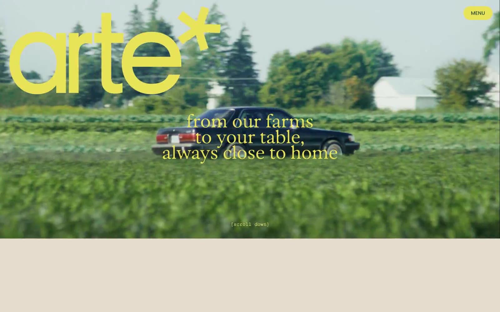
arte*. A cream canvas where sun-dappled forest photos meet oversized rounded display type, electric chartreuse logo, and warm copper text that feels printed rather than rendered.
- Commerce
- Light theme
- 10 colors
- 6 typefaces
arte* is a sunlit harvest editorial: a warm cream canvas (#e5dccd) hosts oversized display headlines in Parafina — a soft, slightly retro rounded sans at extreme sizes (70–173px) with crushed line-heights near 0.8–0.9 — while Poppins handles all secondary copy at a tight 1.4. The palette is farm-garden: burnt harvest copper (#ab5700) for primary text, a shocking chartreuse (#e8e359) for the logo and hero overlays, and a periwinkle (#7997ff) that acts as a cool counterweight for inline highlights. Imagery is the other half of the system — full-bleed golden-hour photography of forests, food, and faces, layered with display type rather than separated from it. Components are few and soft: pill buttons at 31px radius, 20px card radii, hairline borders, almost no shadows. The overall impression is a printed cookbook or farmers' market poster digitized — confident display type, earth-toned with one electric yellow accent, and the brand name itself ends in an asterisk that signals playful editorial mischief.
arte* design system

Brand4
Primary text, body copy, list borders, card borders, decorative strokes — the default ink color across all editorial content
Logotype color, hero text overlays, accent borders, icon highlights — the electric chartreuse that makes the brand pop against forest greens and cream
Button borders, body text on light accents, deep decorative strokes — a grounded dark green for contrast moments
Darkest accent, background fills for contrasted blocks, depth shadows
Accent5
Inline text highlights, links, secondary icon accents, input focus — a cool periwinkle that cools the otherwise warm palette when it enters body copy
List borders, secondary heading accents, warm decorative strokes
List borders, tag accents, organic decorative strokes
Heading borders, muted decorative strokes, cool-tone secondary
Soft fill washes, list surface tints, warm secondary backgrounds
Neutrals1
Page canvas, card surfaces, section backgrounds — the warm off-white that holds every screen
Try a pairing
Pick any two colors from the palette to check whether text stays readable on top.
Aa
#fafafa on Harvest Copper
4.91 : 1 contrast
- Body textPasses AA 4.5
- Large textPasses AA 3
- StrictFails AAA 7
More DESIGN.md files. Same web, different personalities.

High Protein
Commerce
Hopper
Commerce
2.AG
Commerce
A-WARE
Commerce
AATHER
Commerce
Abel
Commerce
Acme Cups New Zealand
Commerce
Acne Studios
Commerce
Adam Lippes
Commerce
Adanola
Commerce
Advene
Commerce
Aevi Wellness
Commerce


