
Arsenijs Fabrica. Editorial beauty spread under gallery lights.
- Commerce
- Light theme
- 8 colors
- 3 typefaces
Arsenijs Fabrica operates as an editorial beauty spread: expansive white surfaces, whisper-weight display type that floats across the canvas, and a single vivid orange that cuts through monochrome like a studio strobe. The brand voice in type is restrained and continental — weights 200-300 at hero scale, near-black text on pure white, generous breathing room between sections. Orange appears as functional punctuation: filled CTAs, modal backgrounds, card borders, and link accents — never as a wash or gradient field. Components feel fashion-magazine lightweight: hairline 1px borders, 10px card corners, 600px pill buttons, and a deliberate absence of shadows across the structural layer.
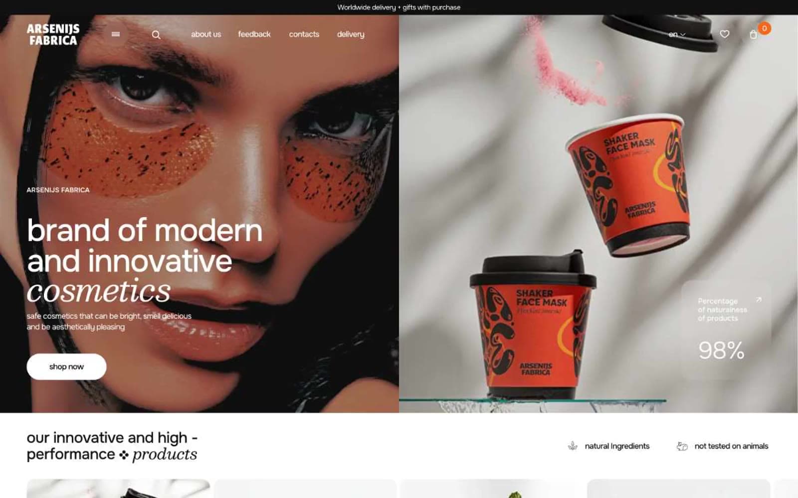
Arsenijs Fabrica design system

Brand2
Filled CTA buttons, primary action backgrounds — deep saturated orange that reads as confident rather than playful, the only color with enough chroma to anchor a click target against the white field
Promotional surface fills (email capture modal, featured product cards, stat callout backgrounds) — slightly brighter and more luminous than Ember, used where orange must own an entire region of the layout
Accent1
Borders on outlined cards, link underlines, icon strokes, accent hairlines — the lightest orange, functioning as a warm-tinted structural color rather than a fill
Neutrals5
Body text, default borders, the dominant structural color — a true near-black, not warm, used for the bulk of hairline rules and paragraph copy
Heading text, navigation text, primary headings — a deep black with the faintest cool-green undertone that gives headlines a quiet cast against pure white
Secondary captions, muted helper text, subdued icon strokes — the only mid-gray in the palette, used sparingly to fade metadata without going fully light
Soft card borders, hairline dividers on white surfaces where Graphite would feel too heavy
Page canvas, card surfaces, text on dark/orange surfaces — the unchanging ground tone across every section
Try a pairing
Pick any two colors from the palette to check whether text stays readable on top.
Aa
Graphite Black on Ember Orange
5.53 : 1 contrast
- Body textPasses AA 4.5
- Large textPasses AA 3
- StrictFails AAA 7
More DESIGN.md files. Same web, different personalities.

High Protein
Commerce
Hopper
Commerce
2.AG
Commerce
A-WARE
Commerce
AATHER
Commerce
Abel
Commerce
Acme Cups New Zealand
Commerce
Acne Studios
Commerce
Adam Lippes
Commerce
Adanola
Commerce
Advene
Commerce
Aevi Wellness
Commerce


