
ARKET. Scandinavian white gallery.
- Commerce
- Light theme
- 9 colors
- 3 typefaces
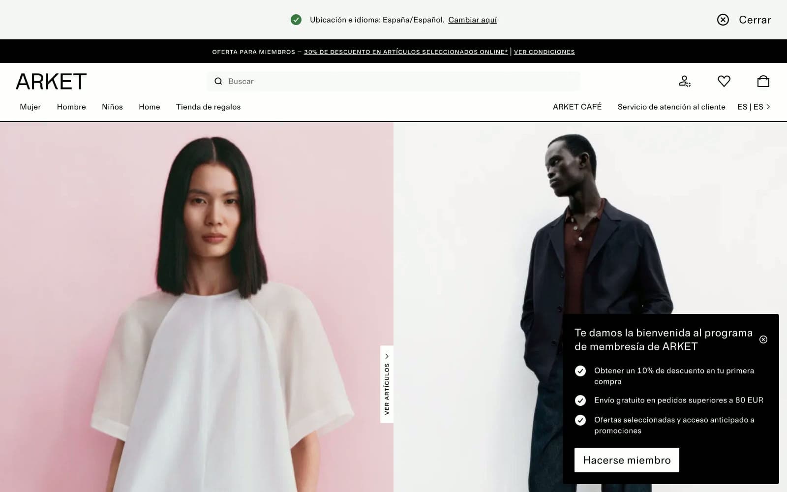
ARKET is a Scandinavian fashion retailer whose digital presence reads as a curated white-gallery space: bone-white canvases, carbon-black type, hairline borders, and no color anywhere except inside the photography itself. Typography pairs a quiet humanist sans with a small-caps monospace that labels editorial cards like museum wall text, reinforcing the art-direction-over-advertising voice. Interactive elements are sharp (2px corners), flat, and rely on inversion rather than color for emphasis — a solid black button sits beside an outlined one at the same height. The system prizes restraint: generous whitespace, no gradients, minimal elevation, and a single nearly invisible blue accent reserved for links. Every screen should feel like a printed lookbook page — spacious, monochrome, and let the imagery do the chromatic work.
ARKET design system

Accent1
Violet supporting accent for decorative details and low-frequency emphasis. Do not promote it to the primary CTA color
Neutrals8
Primary text, navigation, icons, hairline borders, filled emphasis buttons, and the membership overlay surface
Deep text and link stroke alternative — visually indistinguishable from Carbon but slightly softer on screen
Button labels and secondary headings on light surfaces
Input placeholder text and form helper copy
Muted metadata, tag fill, and secondary link underlines
Hairline dividers, input borders, subtle section separators
Outlined button borders, tag and chip backgrounds
Page canvas, card surfaces, and inverse text on dark surfaces
Try a pairing
Pick any two colors from the palette to check whether text stays readable on top.
Aa
Bone White on Indigo Whisper
5.86 : 1 contrast
- Body textPasses AA 4.5
- Large textPasses AA 3
- StrictFails AAA 7
More DESIGN.md files. Same web, different personalities.

High Protein
Commerce
Hopper
Commerce
2.AG
Commerce
A-WARE
Commerce
AATHER
Commerce
Abel
Commerce
Acme Cups New Zealand
Commerce
Acne Studios
Commerce
Adam Lippes
Commerce
Adanola
Commerce
Advene
Commerce
Aevi Wellness
Commerce


