
Arc. Industrial white gallery above midnight water.
- Commerce
- Light theme
- 6 colors
- 1 typeface
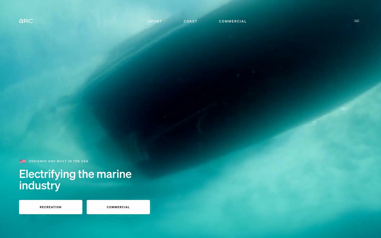
Arc operates as an industrial white gallery suspended above dark ocean. The page alternates between full-bleed aerial marine photography and monastic white space dominated by type, with a single deep teal-navy band used as a rhythmic counterpoint between sections. Components are deliberately skeletal: thin ghost buttons with hairline borders, 5px corner radii on controls, almost no shadow, and generous negative space that lets the imagery and oversized type do the storytelling. The Soehne family carries a weight-300 display voice at 48–140px that reads as confident and engineering-precise, while body text sits at 16–18px weight 400 with tight tracking. Color is used as restraint — the system is 99% achromatic plus two near-black teals (#031e25, #1d1d1e) for image-driven sections, with no chromatic accent at all. Photography is always contained within generously rounded 32px frames against the flat canvas.
Arc design system

Neutrals6
Headings on light canvas where maximum contrast is required, nav background accents — used sparingly only where absolute black is needed
Primary body and heading text, nav links, footer text, filled button text — near-black for maximum legibility without the harshness of pure black
Dark feature section backgrounds (alternating bands), large image containers — the navy-black that recedes like deep ocean water
Secondary dark section background, elevated panels over Deep Current — one step lighter to layer depth within dark bands
Page canvas, card surfaces, hairline dividers between sections, ghost-button borders — the lightest structural gray carries borders, surface, and the dominant background in a near-white mode
Card surfaces, filled button backgrounds, image overlays, reverse text on dark sections — the brightest structural white
Try a pairing
Pick any two colors from the palette to check whether text stays readable on top.
Aa
Paper on Obsidian
21.00 : 1 contrast
- Body textPasses AA 4.5
- Large textPasses AA 3
- StrictPasses AAA 7
More DESIGN.md files. Same web, different personalities.

High Protein
Commerce
Hopper
Commerce
2.AG
Commerce
A-WARE
Commerce
AATHER
Commerce
Abel
Commerce
Acme Cups New Zealand
Commerce
Acne Studios
Commerce
Adam Lippes
Commerce
Adanola
Commerce
Advene
Commerce
Aevi Wellness
Commerce


