
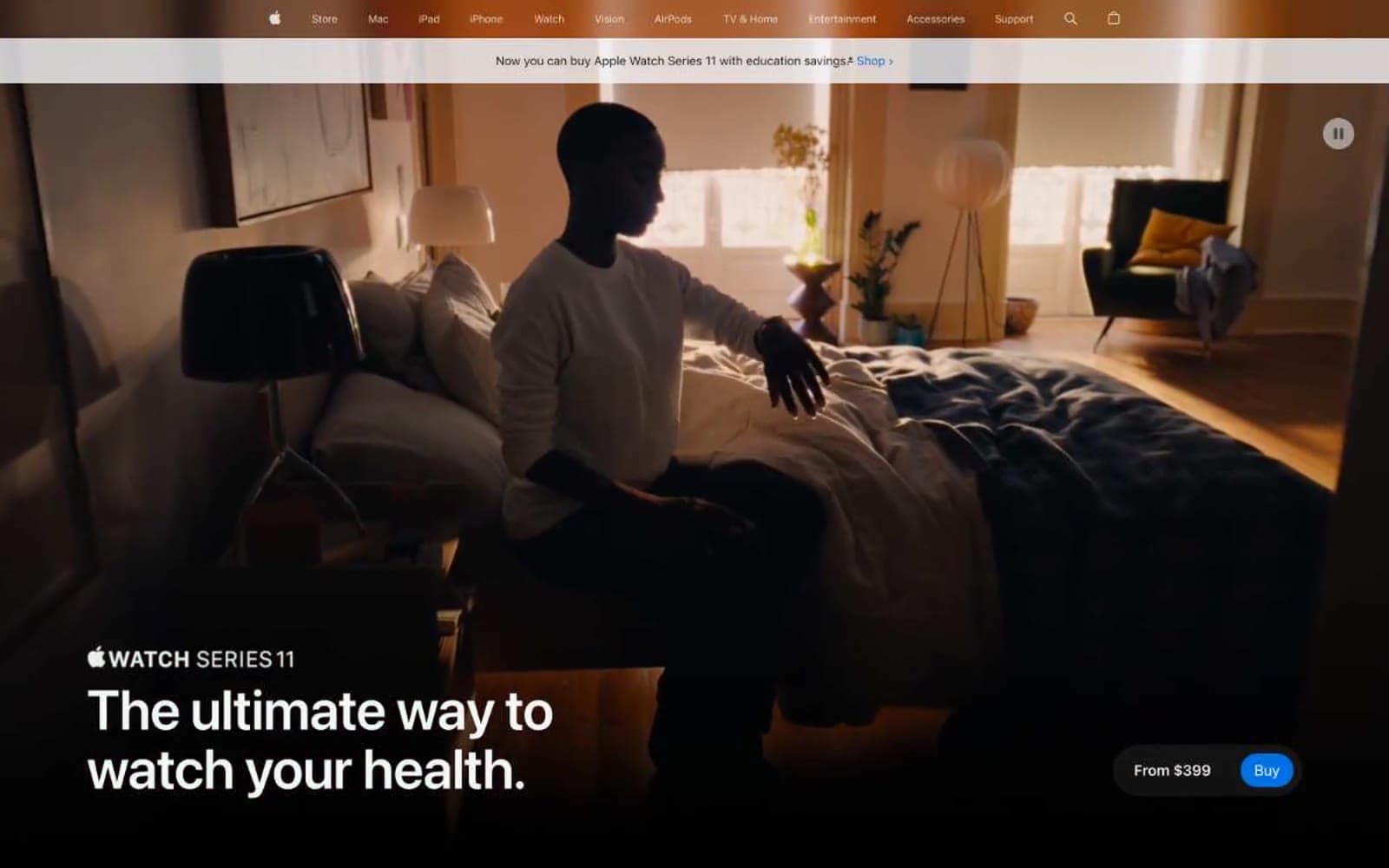
Apple Watch Series 11. Every product its own still life, every headline a wall label.
- Commerce
- Light theme
- 16 colors
- 2 typefaces
Apple's product page language is cinematic and confident: a full-bleed photographic hero bleeds edge-to-edge, then resolves into spacious white and pale-gray bands where the product sits alone, photographed under controlled studio light. Type is the primary voice — SF Pro Display at display scale carries short, declarative Spanish headlines with aggressively tight negative tracking, while SF Pro Text keeps UI and body quiet. Color is almost entirely neutral; the only chromatic move is a single vivid Apple blue that powers the buying action, with text links and legal footnotes wearing a slightly deeper blue. The system rewards breathing room: large product images sit opposite single short paragraphs, feature lists collapse into icon-pill accordions, and elevation is barely perceptible — corners are generously rounded but cards rely on tonal contrast against #f5f5f7, never on drop shadows.
Apple Watch Series 11 design system

Brand2
Primary CTA fill — the single saturated button on the page (Comprar, Learn more). Vivid mid-blue that reads as a switch-on moment against matte neutrals
Inline text links, footnote references, and underlined link borders. Slightly deeper and cooler than the CTA blue so links and buttons read as distinct actions
Accent4
Accent stroke for positive health/sleep metric visualizations and decorative data highlights on product UI
Orange outline accent for tags, dividers, and focused UI edges
Tertiary accent for multicolor data rings, decorative product UI, and illustration strokes
Quaternary accent completing the Apple Watch activity ring palette
Neutrals10
True black for hero image overlays, icon fills, and high-contrast heading strokes
Primary text, heading fills, icon strokes, and card borders. Apple's near-black — softer than #000, reads warm against white
Nav-specific dark text and borders in the top utility bar
Nav border-bottom, link muted state, and mid-contrast UI text
Secondary/muted text, nav borders, list dividers, and subdued UI labels
Disabled or de-emphasized button/link background fill
Hairline borders, inactive dividers, and subdued list separators
Light surface tone for secondary buttons and list-item fills sitting on white
Page canvas and section background — the dominant pale-gray that separates content bands from pure white card surfaces
Card surfaces, button text on dark fills, nav backgrounds, and badge interiors
Try a pairing
Pick any two colors from the palette to check whether text stays readable on top.
Aa
Pure White on Apple Blue
4.70 : 1 contrast
- Body textPasses AA 4.5
- Large textPasses AA 3
- StrictFails AAA 7
More DESIGN.md files. Same web, different personalities.

High Protein
Commerce
Hopper
Commerce
2.AG
Commerce
A-WARE
Commerce
AATHER
Commerce
Abel
Commerce
Acme Cups New Zealand
Commerce
Acne Studios
Commerce
Adam Lippes
Commerce
Adanola
Commerce
Advene
Commerce
Aevi Wellness
Commerce


