
Apple Watch Se 3. White museum gallery at noon.
- Commerce
- Light theme
- 16 colors
- 2 typefaces
Apple's product page language is a luminous white gallery: every pixel of chrome is stripped away so the photographed product and one bold typographic statement own the screen. Headlines in SF Pro Display at 64–96px do nearly all of the work, set in near-black (#1d1d1f) with selectively tinted words — a green verb for one emotion, a blue verb for another — that turn the headline itself into a micro-product story. Surfaces are paper-flat: no shadows, no gradients, no decorative borders, only hairline rules and generous whitespace. Interaction is reduced to two button archetypes — a blue pill (#0071e3) for the purchase moment and a subtle neutral pill (#e2e2e5) for everything else — surrounded by a sea of 28px-rounded cards that float on a #f5f5f7 canvas. The whole system is engineered to feel weightless, confident, and barely-designed: the brand is the product, and the design system is the silence around it.
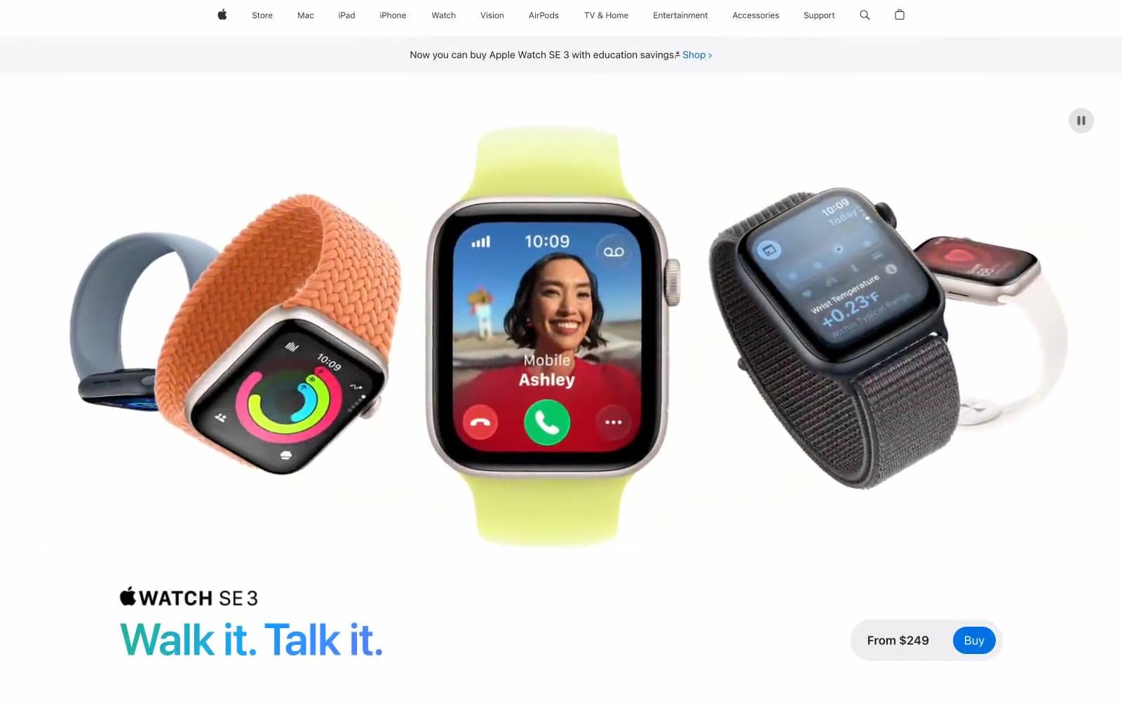
Apple Watch Se 3 design system

Brand1
Blue action color for filled buttons, selected navigation states, and focused conversion moments.
Accent6
Inline link text and link underlines throughout body copy — the only chromatic text color permitted in paragraph flow
Accent word within hero headlines (e.g. the first verb of a product tagline) — used to color-code an emotional concept inside otherwise monochrome type
Darker green variant for text-level green accents and underlined links in sustainability/spec contexts
Violet outline accent for tags, dividers, and focused UI edges.
Orange outline accent for tags, dividers, and focused UI edges.
Teal outline accent for tags, dividers, and focused UI edges.
Neutrals9
Icon fills on light surfaces, nav logo — reserved for the most absolute contrast moments
Primary text, headlines, card borders, nav rules — the singular dark anchor; not pure black, a graphite that softens contrast on white
Nav text, button labels on neutral surfaces — slightly cool graphite for UI controls
Nav borders, link underlines, secondary text in dense lists
Secondary nav borders, list dividers, subdued UI metadata
List row backgrounds, hairline separators in data-dense sections
Neutral pill button fill, secondary surface tier for compact controls and list rows
Page background, section bands, card surfaces — a near-white that separates structural surfaces from pure white product highlights without introducing tint
Elevated card surfaces, icon fills, and inverted text on dark/colored backgrounds
Try a pairing
Pick any two colors from the palette to check whether text stays readable on top.
Aa
Paper White on Signal Blue
4.70 : 1 contrast
- Body textPasses AA 4.5
- Large textPasses AA 3
- StrictFails AAA 7
More DESIGN.md files. Same web, different personalities.

High Protein
Commerce
Hopper
Commerce
2.AG
Commerce
A-WARE
Commerce
AATHER
Commerce
Abel
Commerce
Acme Cups New Zealand
Commerce
Acne Studios
Commerce
Adam Lippes
Commerce
Adanola
Commerce
Advene
Commerce
Aevi Wellness
Commerce


