
Apple iPad Air. White gallery vitrine.
- Commerce
- Light theme
- 14 colors
- 3 typefaces
Apple's iPad Air page is a gallery of negative space — vast white canvas interrupted by single-product hero photography and generous vertical breathing room. The visual system is monochrome at its core (#1d1d1f text on #ffffff surface) with one saturated blue (#0071e3) as the sole accent for the primary action, and never more than one chromatic moment per band. Typography does the heavy lifting: SF Pro Display at 80px weight 600 for hero, tightening to 56px and 48px for section headlines, always with negative letter-spacing — the headlines feel carved rather than typed. Cards float at 28px radius with zero shadow and no border; surfaces separate purely through tint shifts (white → #f3f6f6 → #e8e8ed). Buttons are pill-shaped (980px–9999px) or underlined text links — never boxes. Everything is airy, precise, and restrained.
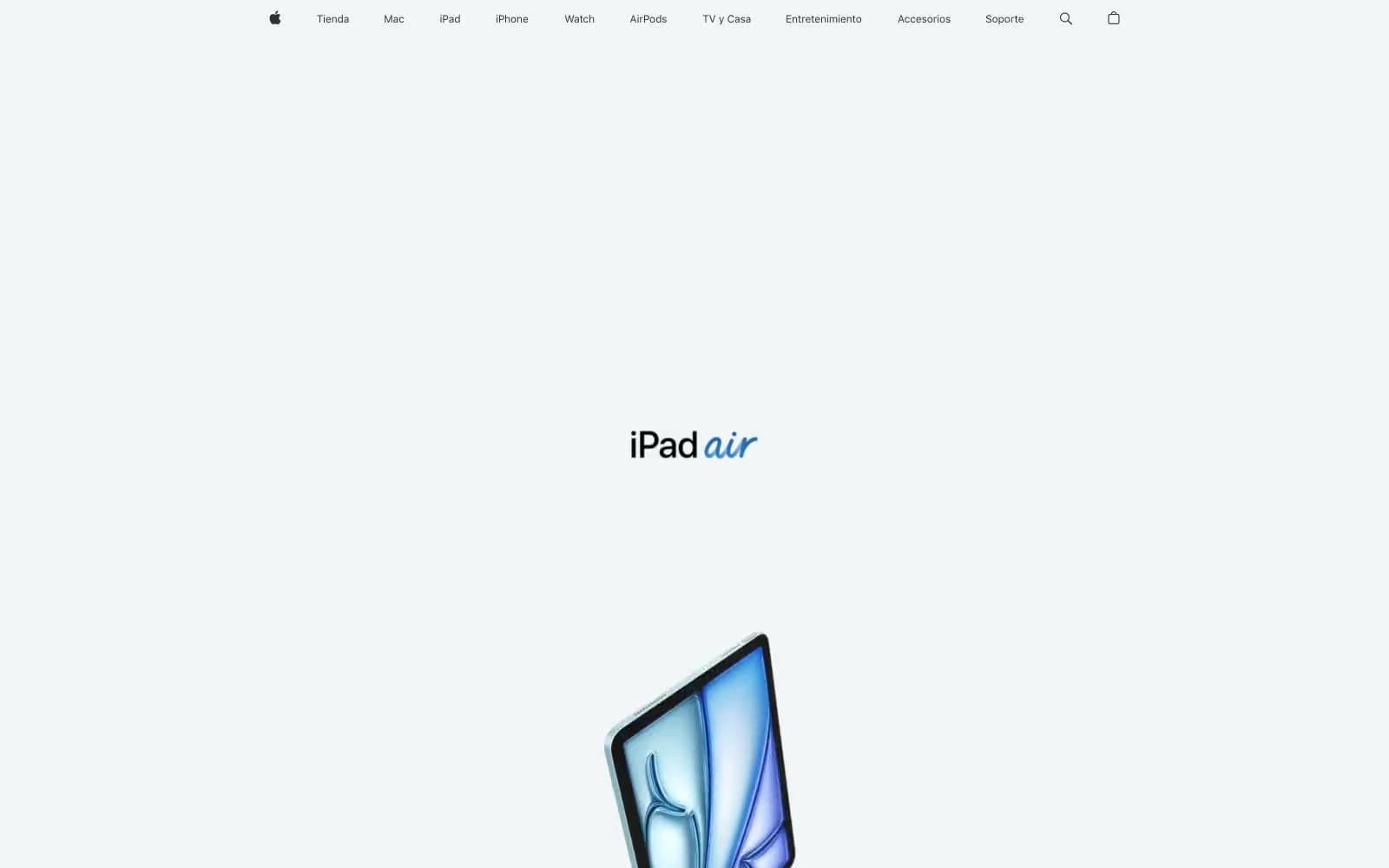
Apple iPad Air design system

Brand2
Primary action fill — the only chromatic button color, also nav hover and focus ring
Inline text link color, secondary link accent
Accent2
Orange state accent for badges, validation surfaces, and short status labels.
Hero gradient stop — deep blue anchoring the product spotlight wash
Neutrals10
Icon fills, input underline, maximum-emphasis headings
Headlines, primary body text, all editorial copy — the dominant ink
Nav icon fills, button text on light surfaces, dark surface tint
Nav text, secondary nav and link text
Secondary body text, captions, helper labels
Hairline separators, disabled button backgrounds
Tertiary surface, subtle dividers, chip backgrounds
Footer surface, secondary card tint, alternating section backgrounds
Opened nav menu surface — barely-distinguished from white canvas
Page canvas, card surfaces, nav background, icon fills
Try a pairing
Pick any two colors from the palette to check whether text stays readable on top.
Aa
Pure White on Apple Blue
4.70 : 1 contrast
- Body textPasses AA 4.5
- Large textPasses AA 3
- StrictFails AAA 7
More DESIGN.md files. Same web, different personalities.

High Protein
Commerce
Hopper
Commerce
2.AG
Commerce
A-WARE
Commerce
AATHER
Commerce
Abel
Commerce
Acme Cups New Zealand
Commerce
Acne Studios
Commerce
Adam Lippes
Commerce
Adanola
Commerce
Advene
Commerce
Aevi Wellness
Commerce


