
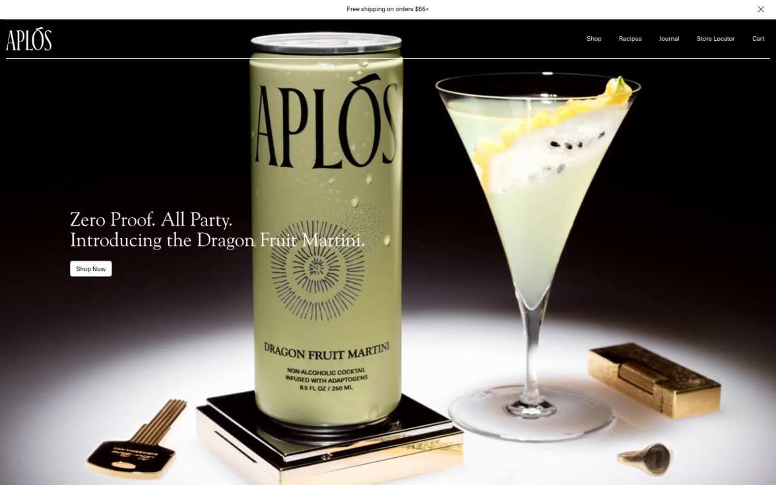
Aplós. Old-world apothecary at dusk.
- Commerce
- Light theme
- 6 colors
- 2 typefaces
Aplós is an old-world apothecary rendered in warm monochrome: bone-white canvas, deep cocoa accents, and a single editorial serif (Goudy Old Style) that does the work a sans-serif system normally would. The page rhythm is slow and confident — dramatic dark hero slabs, generous cream sections, and tightly spaced type that reads more like a printed cocktail menu than a DTC storefront. The product itself is always the visual hero; the interface stays out of the way with minimal borders, one shared 5px radius, and almost no chromatic accent. Color appears only as tonal shift: bone → white → cocoa → ink, never as decorative hue.
Aplós design system

Neutrals6
Primary text, nav links, logo wordmark, hairline borders, hero backdrop
Dark accent cards, inverted text blocks — warm near-black that softens pure ink and keeps dark sections feeling organic rather than digital
Secondary body copy, muted helper text, subdued descriptions
Subtle link hover shadows, barely-there elevation hints
Page background, large section canvases — the warm off-white that gives the system its paper-like editorial feel
Card surfaces, elevated panels, light benefit cards — sits one step above Bone to create lift without shadows
Try a pairing
Pick any two colors from the palette to check whether text stays readable on top.
Aa
Paper White on Ink
21.00 : 1 contrast
- Body textPasses AA 4.5
- Large textPasses AA 3
- StrictPasses AAA 7
More DESIGN.md files. Same web, different personalities.

High Protein
Commerce
Hopper
Commerce
2.AG
Commerce
A-WARE
Commerce
AATHER
Commerce
Abel
Commerce
Acme Cups New Zealand
Commerce
Acne Studios
Commerce
Adam Lippes
Commerce
Adanola
Commerce
Advene
Commerce
Aevi Wellness
Commerce


