
Analogue aF-1. Vogue spread meets Bauhaus blueprint.
- Commerce
- Light theme
- 10 colors
- 2 typefaces
Analogue aF-1 speaks the visual language of a luxury editorial print magazine: stark white canvases, Garamond serif whispers for moments of meaning, and a single jolt of electric blue that only appears when a hand is asked to act. Surfaces are flat, defined by hairline borders and generous corner radii (20-30px) rather than shadows — depth comes from layering soft radial washes and full-bleed photography behind film-strip frames. The palette is almost fanatically achromatic; the blue is rationed like ink, reserved exclusively for the primary action and atmospheric product vignettes. Components feel like printed editorial spreads — confident negative space, confident typography, and no decoration that doesn't earn its place.
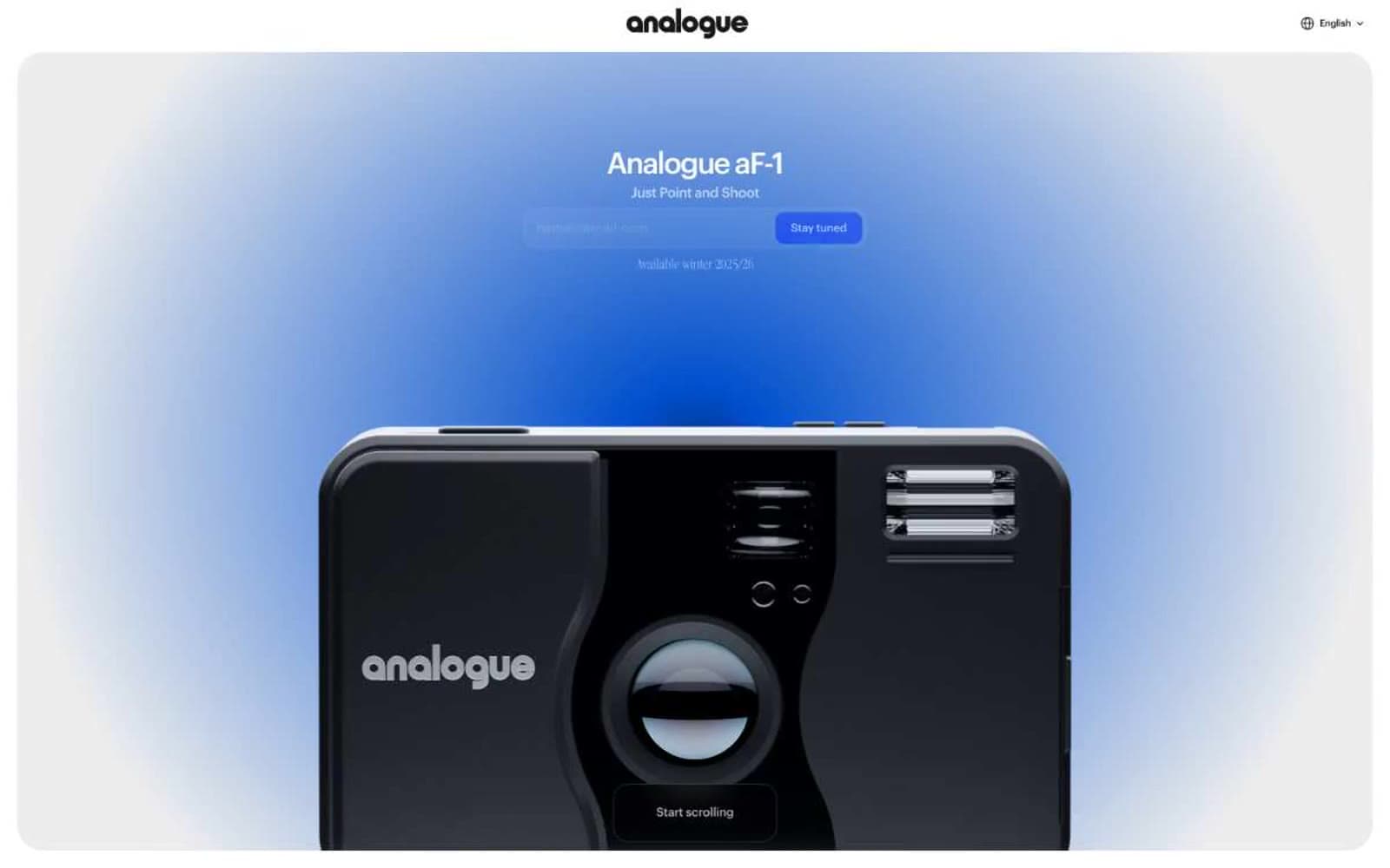
Analogue aF-1 design system

Brand1
Violet action color for filled buttons, selected navigation states, and focused conversion moments.
Accent1
Atmospheric radial gradient anchor (mid-stop) for the hero blue vignette
Neutrals8
Absolute black for borders, icons, and the film-strip frame effect — appears most in structural borders rather than type
Deepest text, dark gradient anchor points, near-black accents where maximum contrast is needed
Primary body text, heading text, hairline borders, icon strokes — the workhorse near-black that carries UI structure
Muted body copy, secondary borders, placeholder text — the dominant mid-gray carrying prose-level hierarchy
Light surface wash, disabled or decorative backgrounds
Mid-neutral border for tertiary dividers
Soft card surface lift, input fields, subtle background differentiation from pure white canvas
Page canvas, card surfaces, button text on cobalt fill, heading text on dark sections
Try a pairing
Pick any two colors from the palette to check whether text stays readable on top.
Aa
Pure White on Cobalt Signal
7.37 : 1 contrast
- Body textPasses AA 4.5
- Large textPasses AA 3
- StrictPasses AAA 7
More DESIGN.md files. Same web, different personalities.

High Protein
Commerce
Hopper
Commerce
2.AG
Commerce
A-WARE
Commerce
AATHER
Commerce
Abel
Commerce
Acme Cups New Zealand
Commerce
Acne Studios
Commerce
Adam Lippes
Commerce
Adanola
Commerce
Advene
Commerce
Aevi Wellness
Commerce


