
amp. Warm orange pill on cool white.
- Commerce
- Light theme
- 14 colors
- 1 typeface
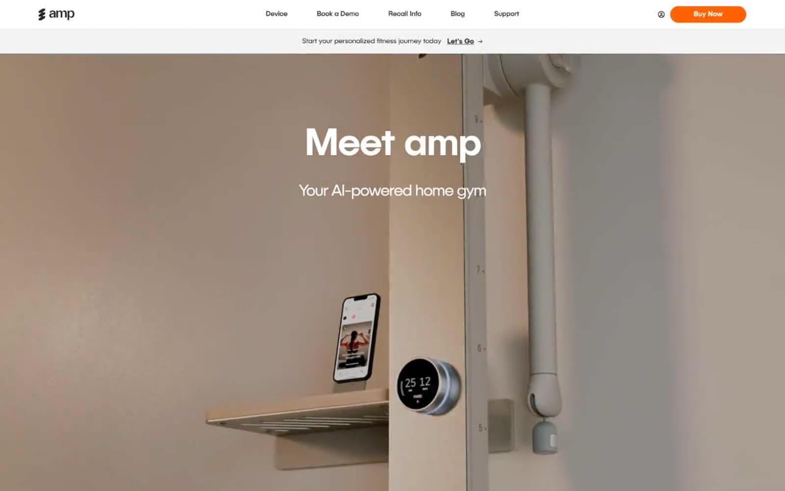
amp is a single-color, single-typeface system: one warm orange against an achromatic canvas, and one custom sans-serif used at every size. The page reads like a product photography spread — generous whitespace, large editorial headlines, and a single device (the amp column) photographed in a soft beige interior. Orange is rationed: it marks the buy button, the current step indicator, and a thin accent rule. Everything else stays in white, off-white, and near-black, so the accent does the talking. Cards and inputs use small 5px corners; the primary CTA is a 50px pill with a brand-colored glow; secondary controls round to 24px. Typography is one family (PublicaSans) at weights 300/400/500, tightening its tracking aggressively as sizes scale up — -0.036em at display, almost zero at body.
amp design system

Brand2
Primary action fill, active step badge, accent rule, and brand strokes — the only chromatic color in the interface. Used at high contrast on white surfaces (7.0:1 against #ffffff) and as a warm border tint on cards and inputs
Orange supporting accent for decorative details and low-frequency emphasis. Do not promote it to the primary CTA color
Accent1
Soft highlight surface for featured cards and step accents. A near-gray peach that stays quiet while adding warmth to a card stack
Neutrals11
Primary text, logo mark, button text. 19.8:1 against white — the highest-contrast neutral in the stack
Dark elevated surface for cards, headers, and contained panels.
Secondary text and nav links, slightly softer than Ink. Icon strokes also draw from this level
Heading underline accent in dark sections, heavier than Carbon
Neutral form states, badge text, and quiet UI feedback where color should stay understated.
Disabled link text and placeholder-level text — the quietest text tone before disappearing
Soft border for cards and body blocks where #e5e5e5 reads as too crisp against off-white
The dominant border color across the site — dividers, card borders, button outlines, and structural rules. By far the most-used neutral (1628+ borderColor occurrences)
Neutral button fill (88 occurrences) — the ghost/secondary button background. A light step above canvas
Off-white alt surface — secondary button fills and surface tints where pure white is too clinical
Page background, card surfaces, button text on dark and orange fills. The base of the surface stack
Try a pairing
Pick any two colors from the palette to check whether text stays readable on top.
Aa
Ink on Amp Orange
6.57 : 1 contrast
- Body textPasses AA 4.5
- Large textPasses AA 3
- StrictFails AAA 7
More DESIGN.md files. Same web, different personalities.

High Protein
Commerce
Hopper
Commerce
2.AG
Commerce
A-WARE
Commerce
AATHER
Commerce
Abel
Commerce
Acme Cups New Zealand
Commerce
Acne Studios
Commerce
Adam Lippes
Commerce
Adanola
Commerce
Advene
Commerce
Aevi Wellness
Commerce


