
Alpine Hearing Protection. Sunlit Scandinavian editorial.
- Commerce
- Light theme
- 10 colors
- 2 typefaces
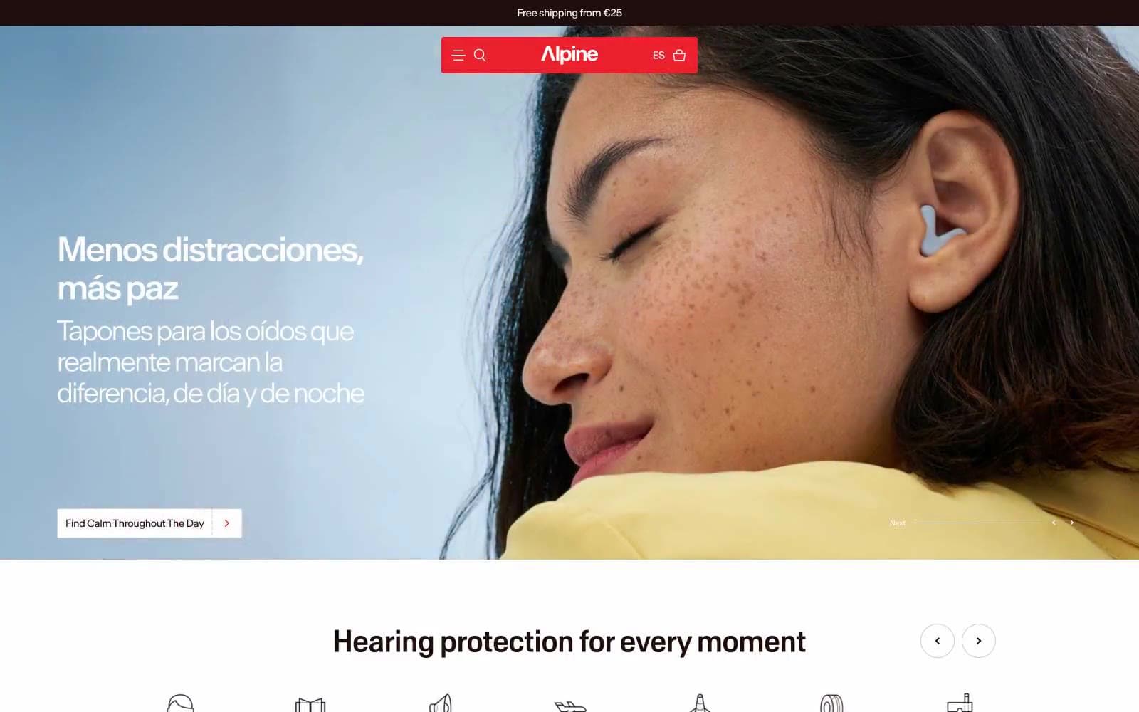
Alpine uses a warm Scandinavian-editorial language: an off-white canvas bathed in cinnamon undertones, a near-black cocoa ink for text, and a single electric red accent that appears only in the brand bar and product badges. The system feels like a print magazine spread — generous full-bleed photography sits next to tight, sharp-cornered product cards with minimal rounding (2.23px) and no decorative elevation. Typography is custom and slightly compressed (Antarctica), pulling headlines close for editorial tension. Warm cream surfaces (#f8f0ec, #f3e7e2, #fde3d6) layer underneath product imagery like a gallery wall. The visual mood is calm, premium, and tactile — photography does the emotional work while UI components stay near-flat and information-dense. Red is rationed: a logo bar, a badge, a guarantee bar — never buttons. The only filled action color is the warm cocoa (#200e0e), which replaces what most sites would use as black.
Alpine Hearing Protection design system

Brand2
Primary text, filled action buttons, card text, icon strokes, card borders — warm near-black replaces pure black throughout, giving every label a roasted, tactile quality
Red decorative accent for icons, marks, and small graphic details.
Accent2
Product color swatch — specific earplug variant color, not a system-wide token
Product color swatch — specific earplug variant color, not a system-wide token
Neutrals6
Secondary card backgrounds for dark product variants — used sparingly as a near-black with slight warmth
Hairline borders, dividers, input field outlines on neutral surfaces
Decorative illustration panels, soft highlight washes on icons and product imagery backgrounds
Badge backgrounds, subtle card elevation, border tints on light cards — a step warmer than Blush Cream for tag/label contexts
Card surfaces, soft elevated sections, product detail backgrounds — the warm secondary layer beneath the white canvas
Page background, nav text, button labels on dark surfaces — the neutral base all warm tones sit on
Try a pairing
Pick any two colors from the palette to check whether text stays readable on top.
Aa
Canvas White on Cocoa Ink
18.57 : 1 contrast
- Body textPasses AA 4.5
- Large textPasses AA 3
- StrictPasses AAA 7
More DESIGN.md files. Same web, different personalities.

High Protein
Commerce
Hopper
Commerce
2.AG
Commerce
A-WARE
Commerce
AATHER
Commerce
Abel
Commerce
Acme Cups New Zealand
Commerce
Acne Studios
Commerce
Adam Lippes
Commerce
Adanola
Commerce
Advene
Commerce
Aevi Wellness
Commerce


