
Airbnb. Quiet white gallery wall with one coral-red bookmark.
- Commerce
- Light theme
- 9 colors
- 1 typeface
Airbnb operates on a white-canvas, photograph-first vocabulary: nearly every screen is a quiet monochrome frame that lets full-bleem property imagery carry the experience, with a single saturated coral-red accent (Rausch) as the only chromatic punctuation for action. Typography is set in a custom geometric sans (Airbnb Cereal VF) at mostly small, confident sizes — 14px body, 16px UI, 22–28px section titles — with tight negative tracking and generous line-height that keeps dense listing cards readable. The interface is flat, borderless, and rounded: 12–14px radii on cards and controls, pill-shaped circular buttons, and soft layered shadows only for elevated overlays like the search bar. Everything else — cards, list items, links — relies on whitespace and hairlines rather than chrome.
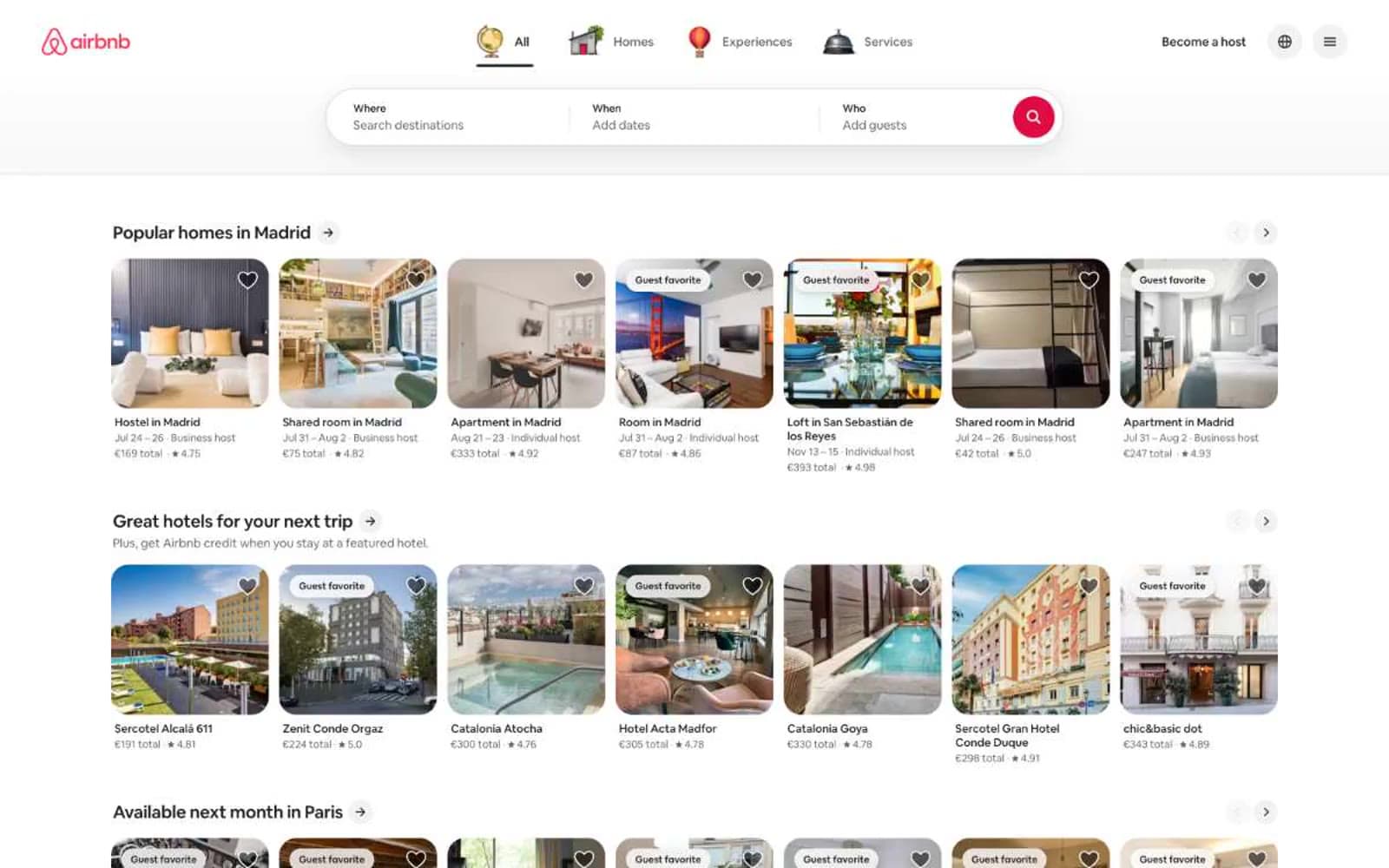
Airbnb design system

Brand2
Red decorative accent for icons, marks, and small graphic details. Do not promote it to the primary CTA color
Pressed and dark-state variant of Rausch for hover/active surfaces of the brand accent
Neutrals7
Primary text, body copy, headings, icon strokes, and inverse backgrounds — a near-black neutral that anchors the entire achromatic system
Secondary text, muted labels, helper copy, disabled icon fills, and subdued metadata beneath card titles
Disabled text, placeholder text in inputs, and muted icon strokes where state de-emphasis is required
Card surface backgrounds for muted containers, skeleton placeholders, and disabled card states
Hairline borders, input underlines, dividers between list rows, and subtle separator lines
Page canvas background, footer surface, and hover state for interactive surfaces — the soft off-white that sets the page apart from pure white cards
Elevated card surfaces, input fields, modals, and the primary surface against the off-white canvas
Try a pairing
Pick any two colors from the palette to check whether text stays readable on top.
Aa
Hof on Rausch
4.52 : 1 contrast
- Body textPasses AA 4.5
- Large textPasses AA 3
- StrictFails AAA 7
More DESIGN.md files. Same web, different personalities.

High Protein
Commerce
Hopper
Commerce
2.AG
Commerce
A-WARE
Commerce
AATHER
Commerce
Abel
Commerce
Acme Cups New Zealand
Commerce
Acne Studios
Commerce
Adam Lippes
Commerce
Adanola
Commerce
Advene
Commerce
Aevi Wellness
Commerce


