
zkPass. A single lime-green signal cutting through near-black typography that mixes a whisper-weight serif with terminal-grade sans.
- Crypto
- Dark theme
- 15 colors
- 4 typefaces
zkPass is an encrypted-terminal meets editorial-broadsheet: a near-black canvas serves as the substrate for a single vivid chartreuse accent (#c5ff4a) that behaves like a signal light in a dark room. The display voice is PT Serif at weight 300 — a deliberate contrarian choice that lends editorial gravity to a cryptographic protocol, contrasting the cold tech feel with a typeset-newspaper authority. Body and UI chrome switch to Inter Tight, with uppercase tracked-out labels (0.18–0.26em) that read as classified-document metadata. Surfaces stack tightly: pure black canvas → near-black cards → slightly raised panels, all separated by hairline borders rather than shadows. The lime green only ever appears in three roles: filled CTA, glowing border, and italic accent word inside headlines. Everything else stays monochrome.

zkPass design system

Brand1
Primary CTA fill, glowing borders, italic accent words in headlines — the single chromatic punctuation in an otherwise monochrome system; at 17.8:1 contrast against black it reads as emergency lighting
Accent2
Dark green stroke for SVG world-map art and shadow glows under signal-lime elements
Deepest green used only as decorative stroke in dotted-globe illustrations
Neutrals12
Page canvas, deep background layer — the absolute floor of the surface stack
Primary page background where pure black would be too harsh — the actual canvas color in the dominant layout
Subtle elevation layer between canvas and card
Card surfaces, nav bar, raised panels — the dominant mid-neutral
Box-shadow depth, elevated surface tint — provides warmth on hover and focus
Hairline borders on dense tables, row dividers
Low-emphasis borders, disabled control outlines
Muted body text, helper copy, link underlines — the workhorse mid-gray
Secondary captions, metadata text
Tertiary text, subtle heading tints
High-emphasis body text where pure white would vibrate against black
Display text, primary headings, icon strokes — the only text color permitted above #e5e5e5
Try a pairing
Pick any two colors from the palette to check whether text stays readable on top.
Aa
Void Black on Signal Lime
17.78 : 1 contrast
- Body textPasses AA 4.5
- Large textPasses AA 3
- StrictPasses AAA 7
More DESIGN.md files. Same web, different personalities.
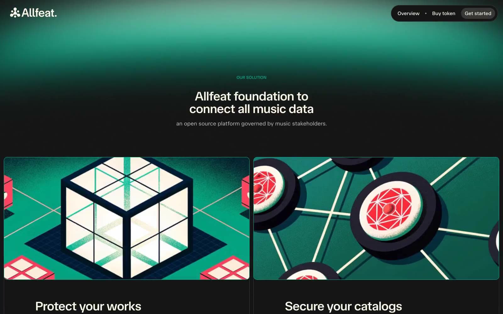
Allfeat
Crypto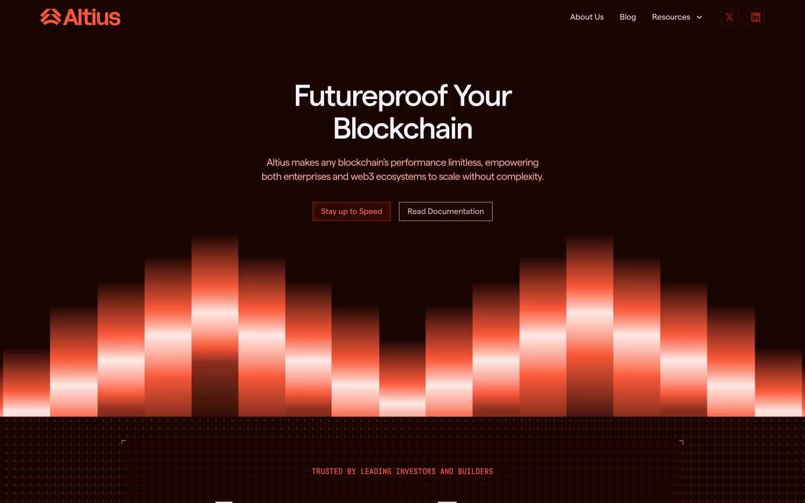
Altius
Crypto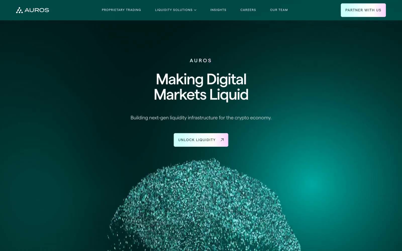
Auros
Crypto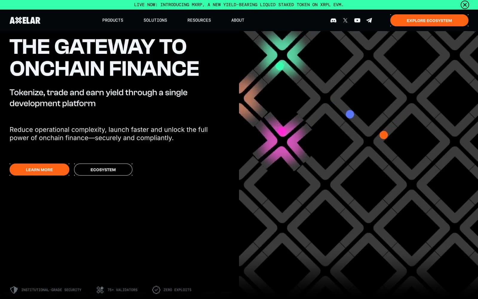
Axelar
Crypto
BitcoinOS
Crypto
Cosmos Network
Crypto
Hyper Foundation
Crypto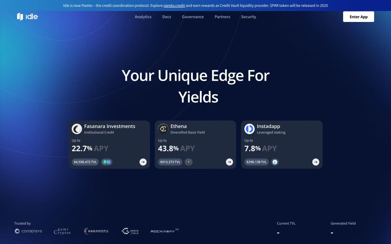
Idle Finance
Crypto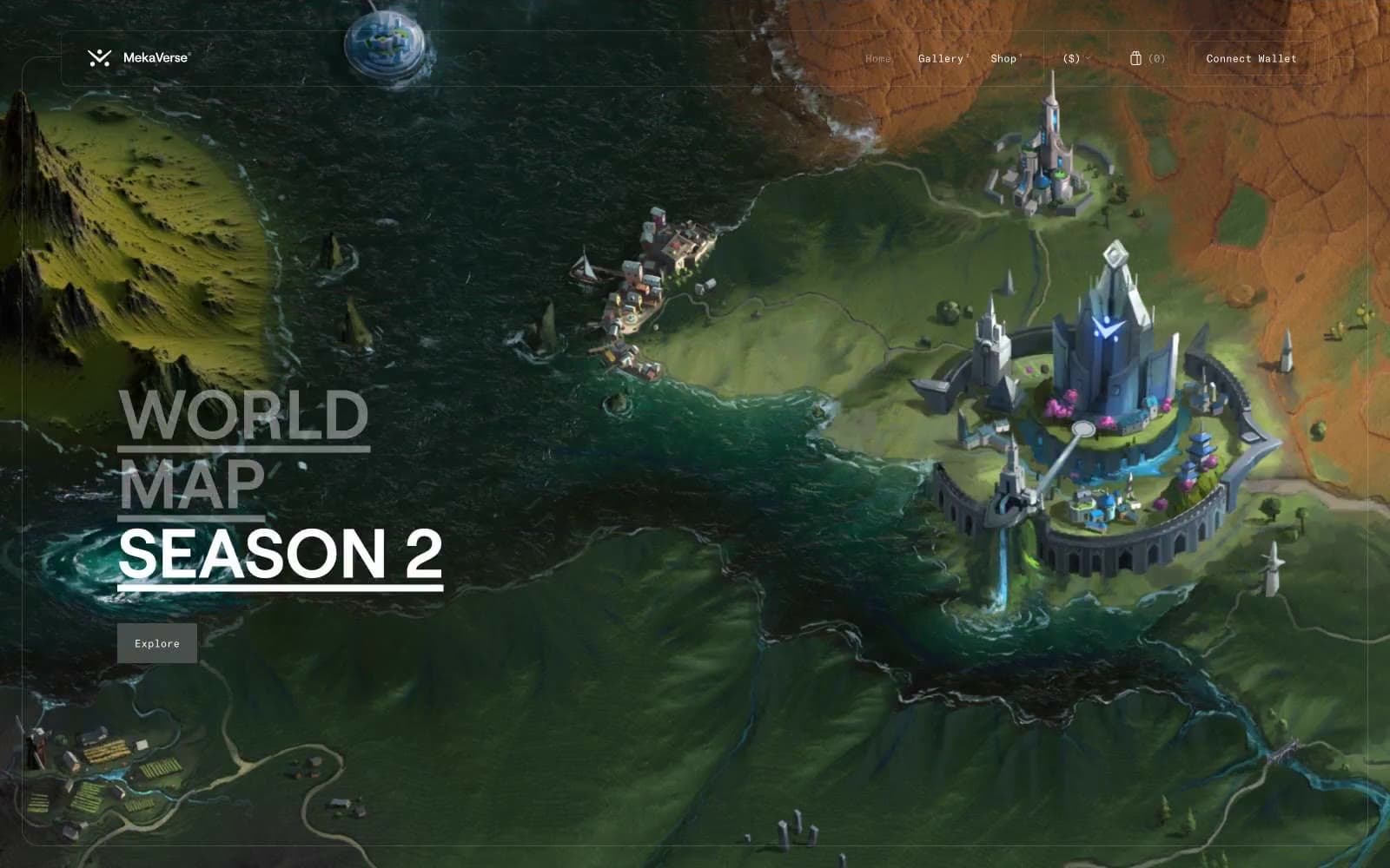
MekaVerse
Crypto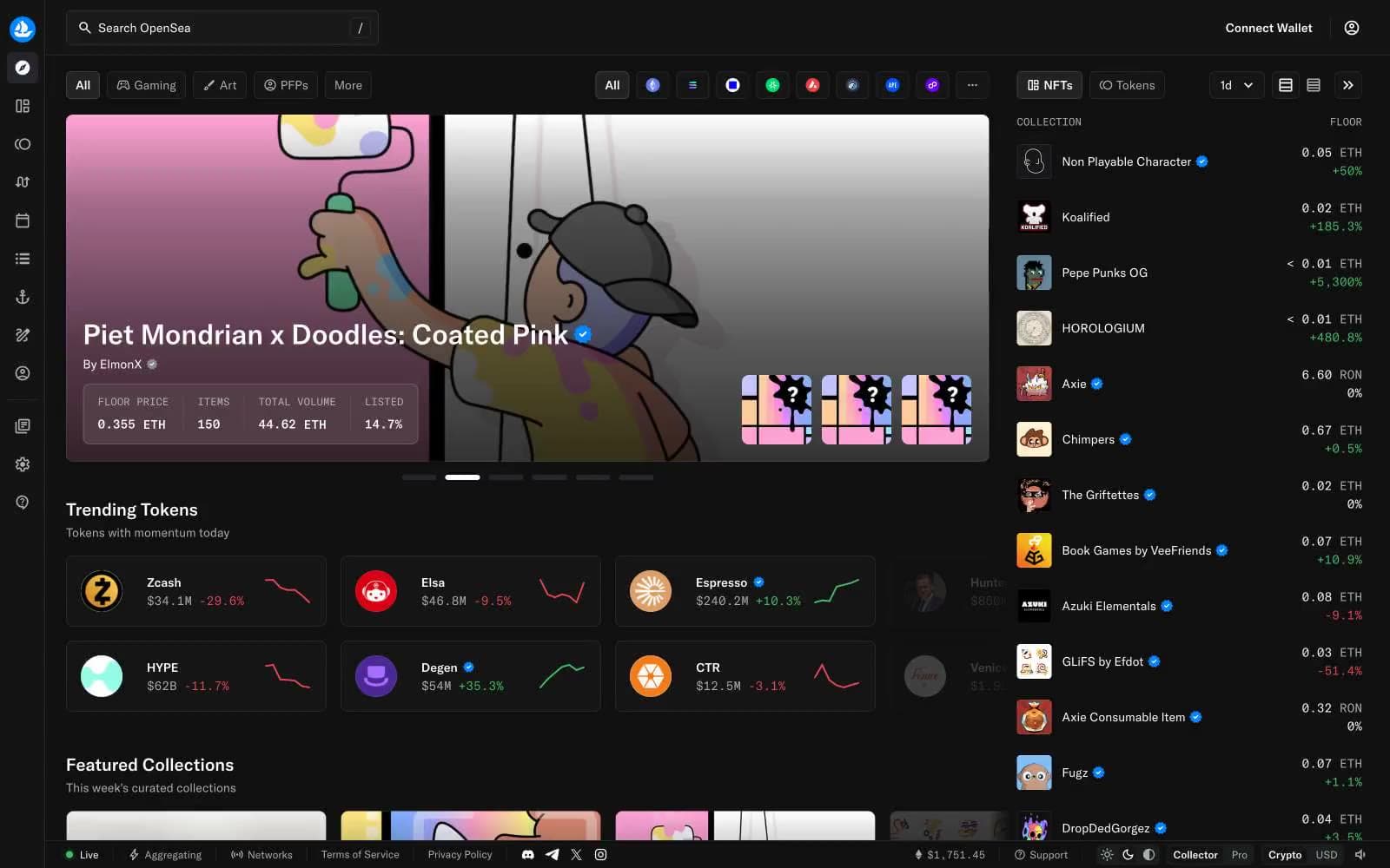
OpenSea
Crypto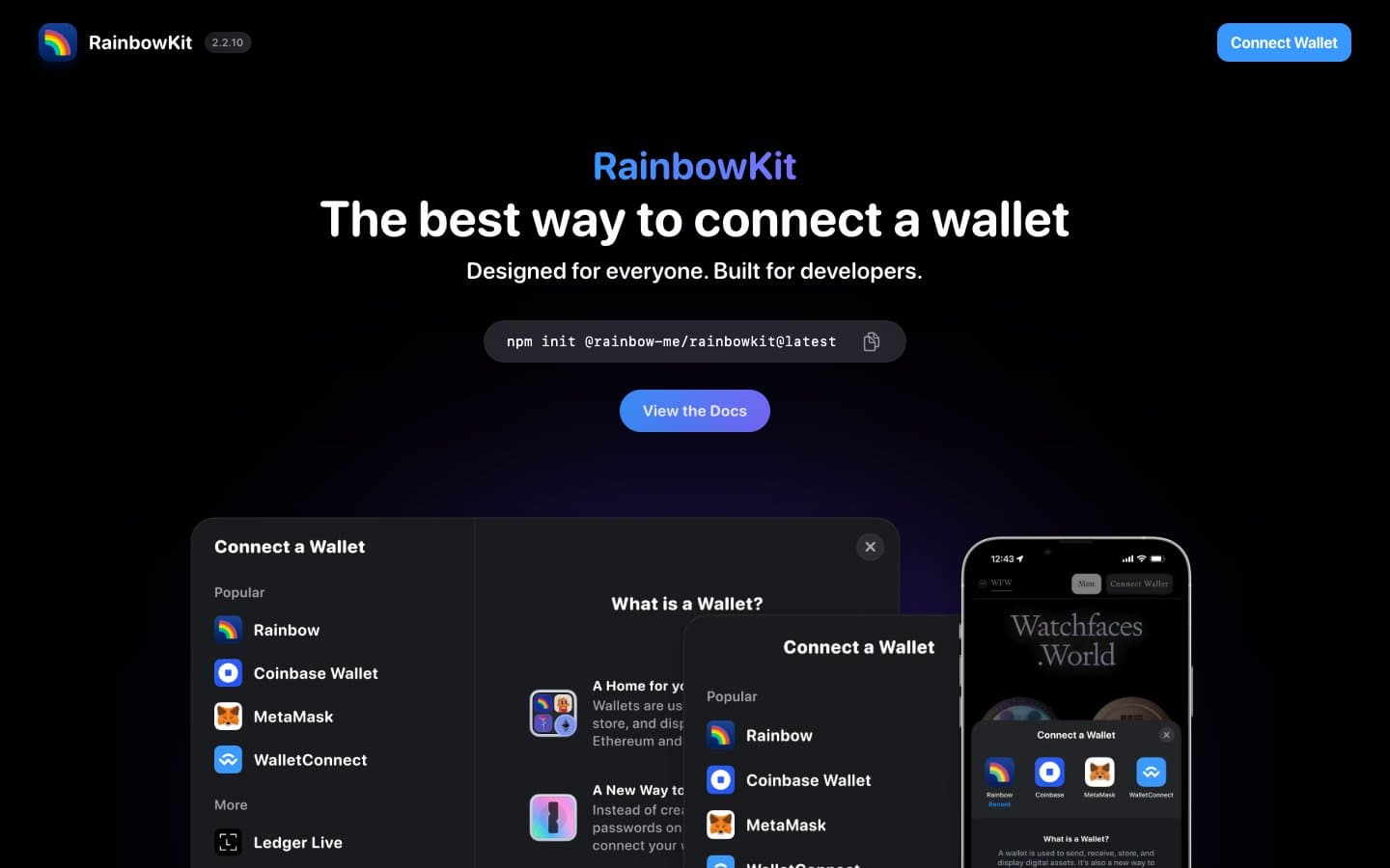
RainbowKit
Crypto
Safepal
Crypto


