
Auros. Abyssal terminal with bioluminescent data orbs.
- Crypto
- Dark theme
- 11 colors
- 2 typefaces
Auros operates as an abyssal fintech terminal: near-black teal canvas with bioluminescent data orbs and teal-to-pink light gradients that suggest depth, liquidity, and flow. The interface is sparse and cinematic, relying on a single custom display face (Matter) at medium weight with aggressive negative tracking to create scale without shouting. Color is rationed — achromatic whites and silvers carry almost all content, while the chromatic palette is reserved for atmospheric gradients, card surface differentiation, and one signature pill button that morphs from teal-cyan to lavender-pink. Cards float on subtle teal-tinted surface lifts (16px radius, no shadows) rather than using elevation, so the hierarchy reads as depth-of-water rather than shadow-on-paper. Components feel engineered and instrument-like: uppercase tracked labels, thin geometric arrow icons, large numerical stats in pale pink.
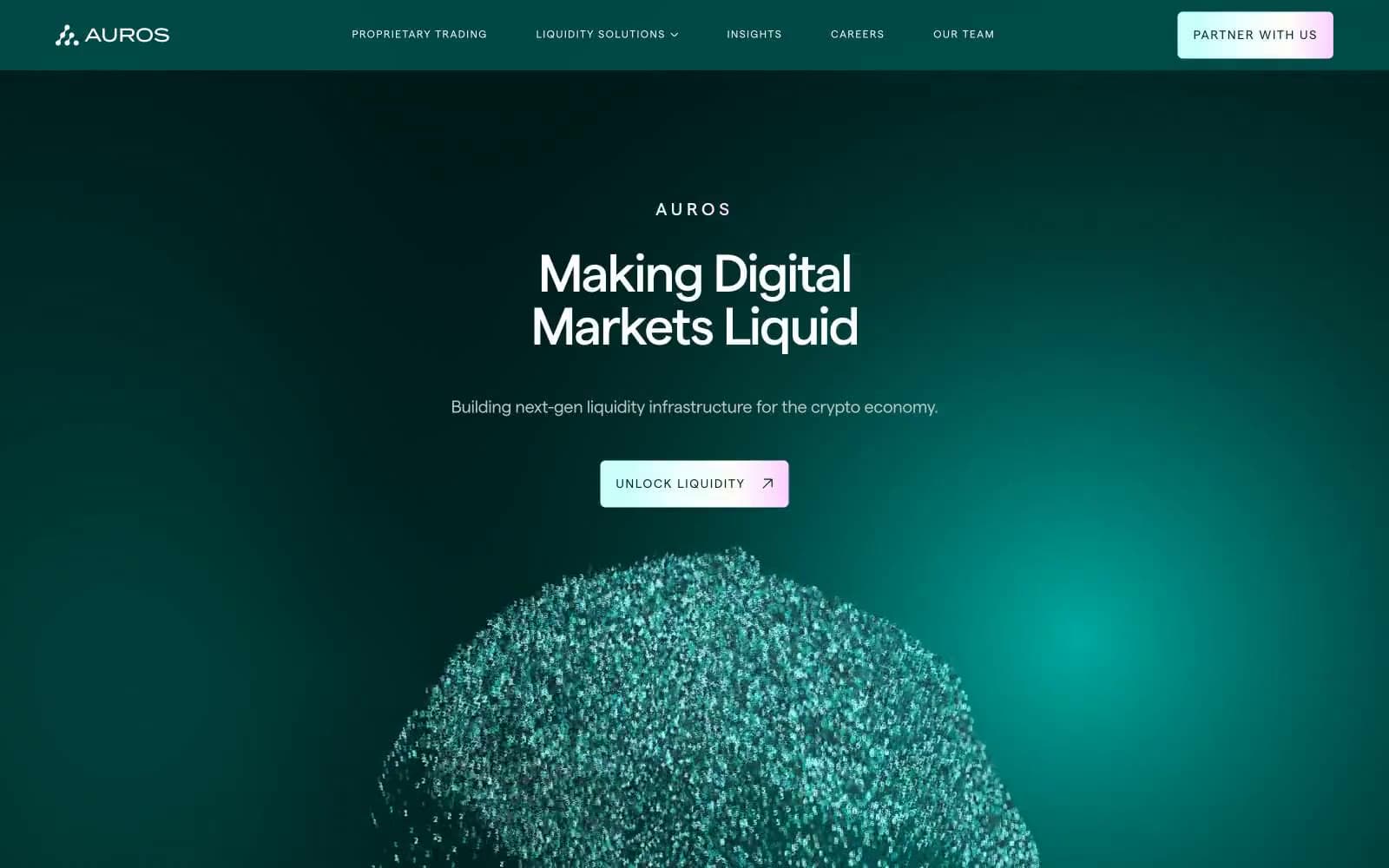
Auros design system

Brand3
Primary canvas — page background, header, hero, and the dominant dark-teal field. Establishes the deep-water atmosphere
Recessed surface level — footer background and deeper card panels. Reads as a half-step darker than the canvas, creating a subtle depth gradient downward
Raised card surface and primary button fill — the lifted surface that sits one step above the abyss. Used for feature cards, content panels, and the gradient button's origin point
Accent3
Highlight color for large statistics, counter numbers, and emphasis figures. The pink end of the signature gradient — used sparingly as luminous punctuation on dark surfaces
Signature button and UI gradient — linear sweep from teal-cyan through pale aqua into lavender-pink. The brand's signature chromatic gesture
Supporting palette color for small decorative accents when the core palette needs contrast.
Neutrals5
Subtle surface tint for inactive or low-emphasis backgrounds. Sits between canvas and card for very low-elevation differentiation
Secondary body text, muted descriptions, and link color in resting state. Carries a faint green undertone that harmonizes with the teal canvas
Tertiary text for pull-quotes and testimonial copy. A neutral cool-gray fallback when Silver Mist's teal undertone is too colored
Cool-tinted off-white for emphasized body text, section labels, and warm-light typographic moments. Carries a barely-perceptible cyan whisper that ties body text to the teal atmosphere
Pure white for headings, nav items, icon strokes, and high-contrast text. The dominant text color across all heading levels and the primary nav
Try a pairing
Pick any two colors from the palette to check whether text stays readable on top.
Aa
Platinum on Liquid Abyss
16.10 : 1 contrast
- Body textPasses AA 4.5
- Large textPasses AA 3
- StrictPasses AAA 7
More DESIGN.md files. Same web, different personalities.
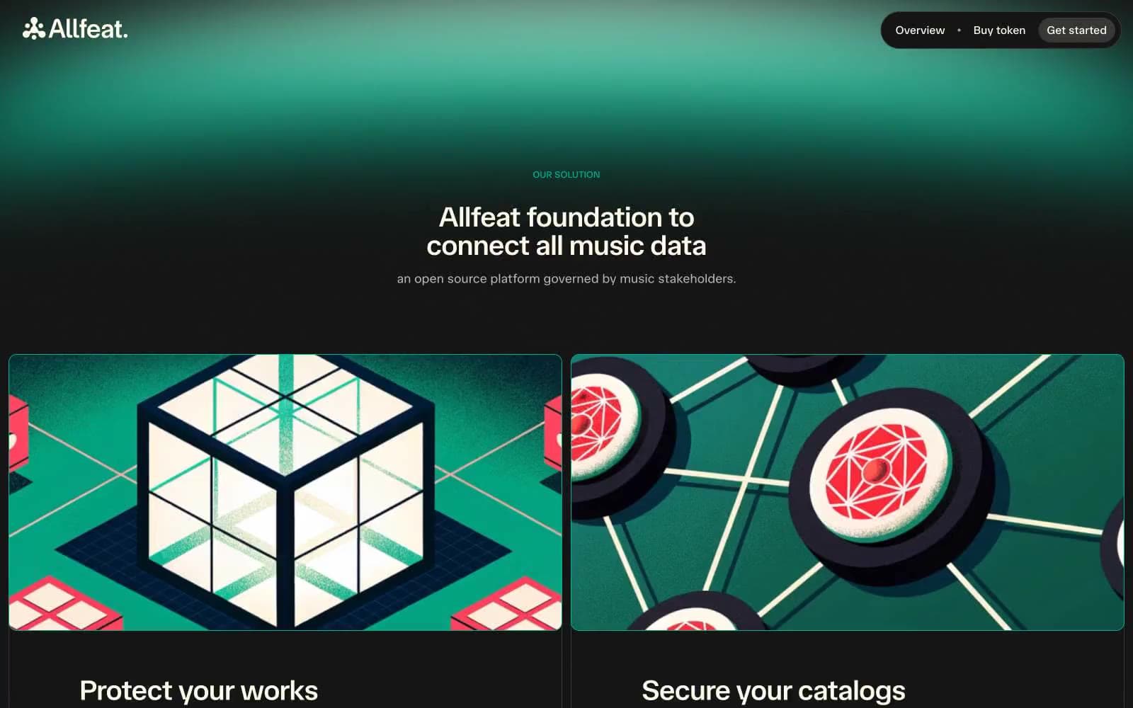
Allfeat
Crypto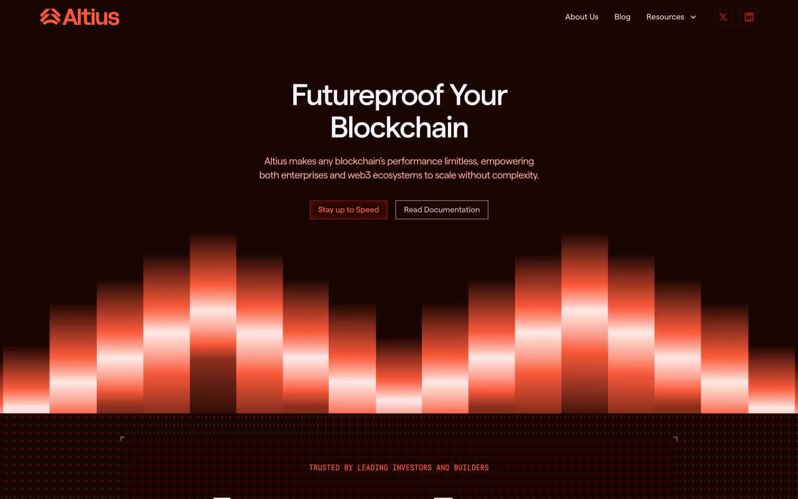
Altius
Crypto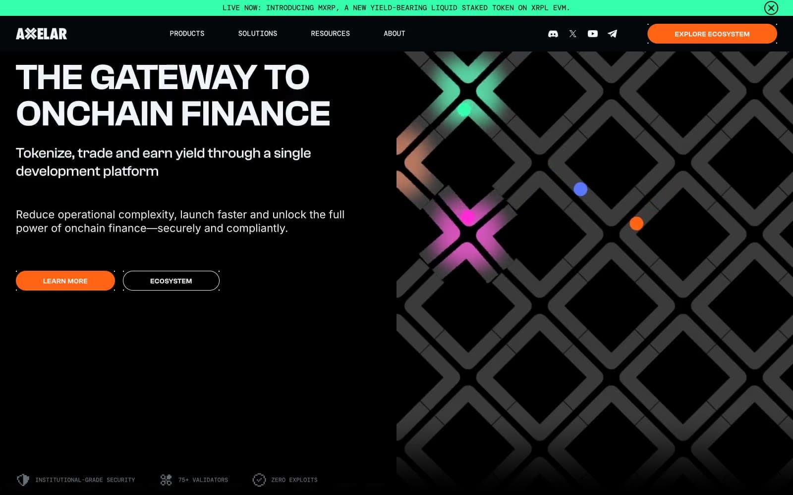
Axelar
Crypto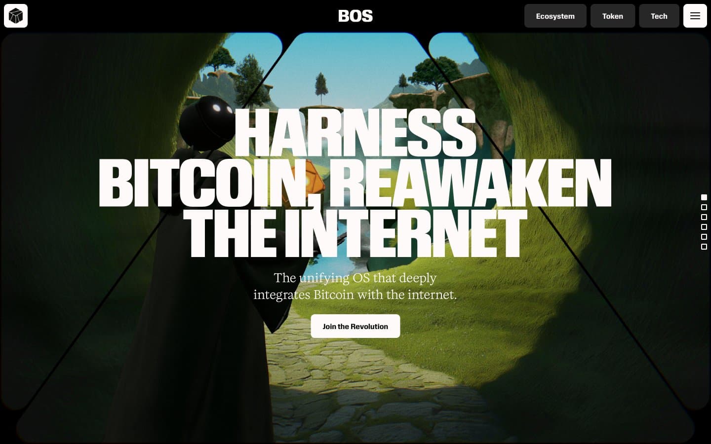
BitcoinOS
Crypto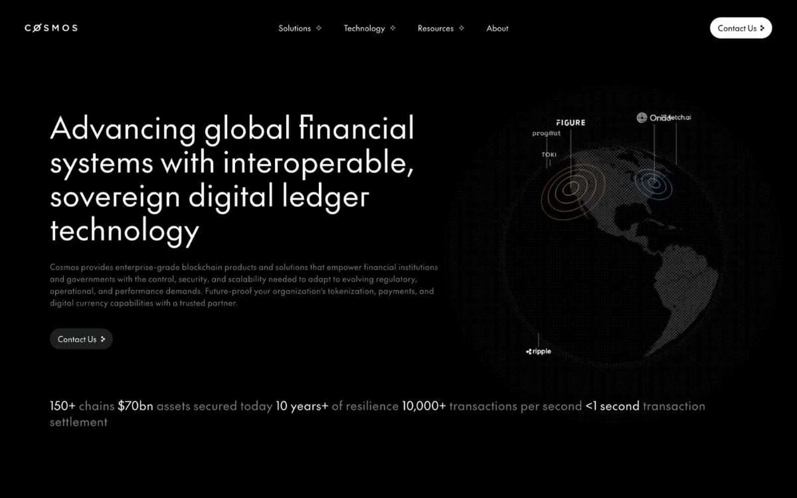
Cosmos Network
Crypto
Hyper Foundation
Crypto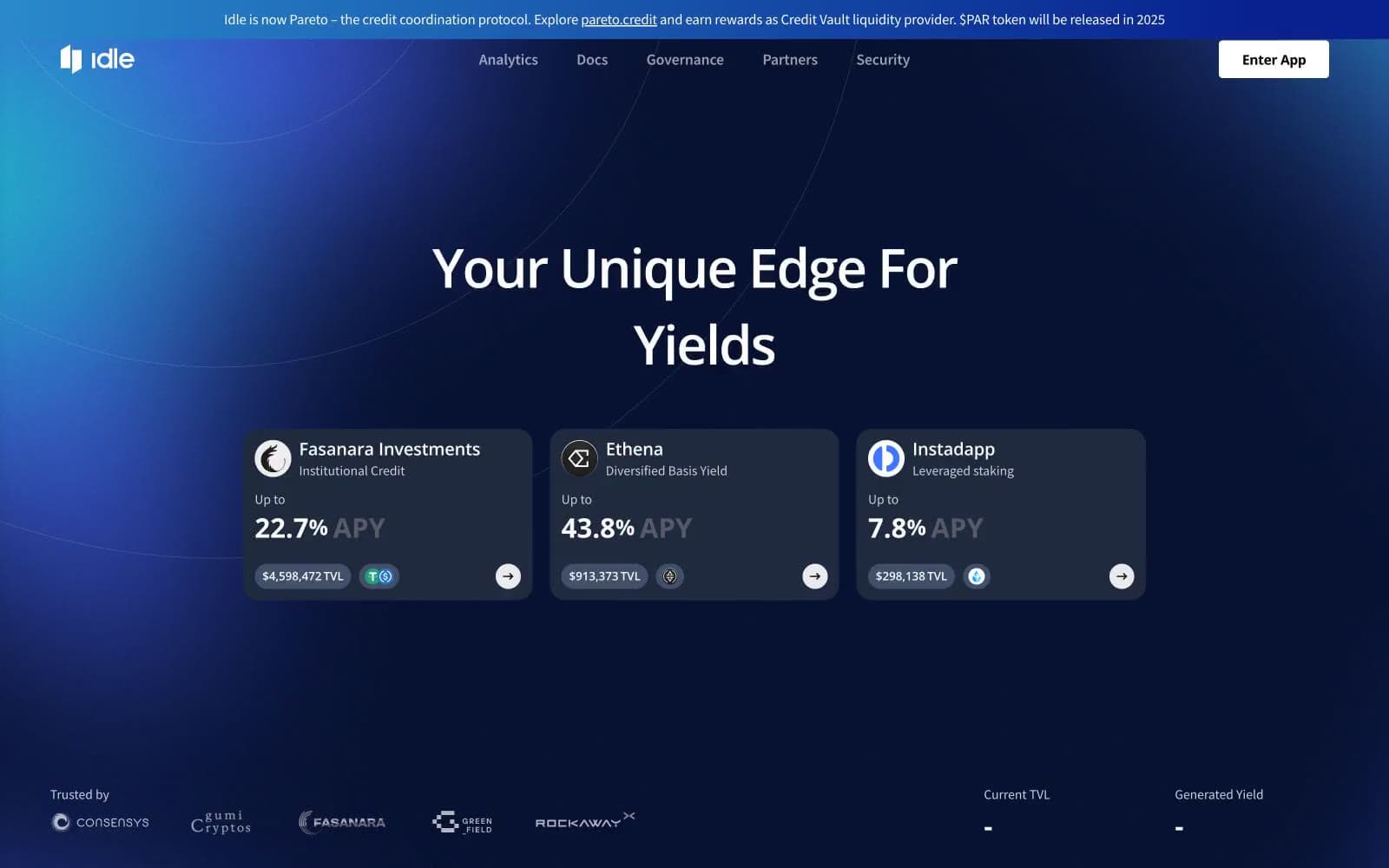
Idle Finance
Crypto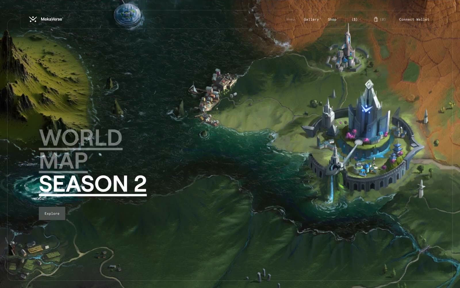
MekaVerse
Crypto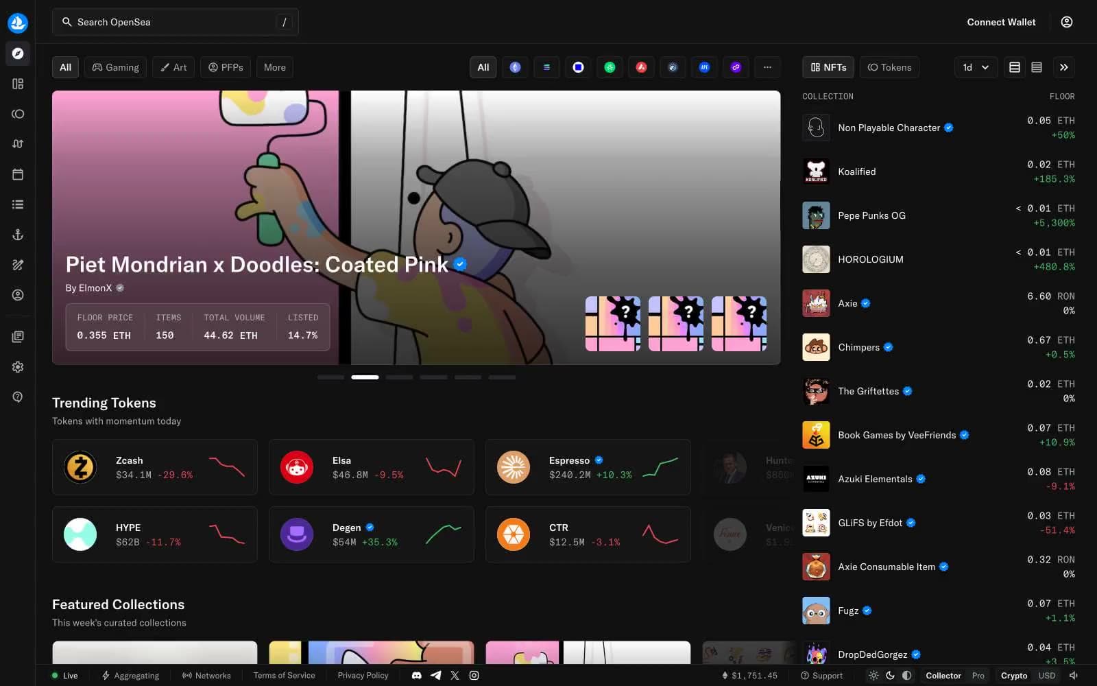
OpenSea
Crypto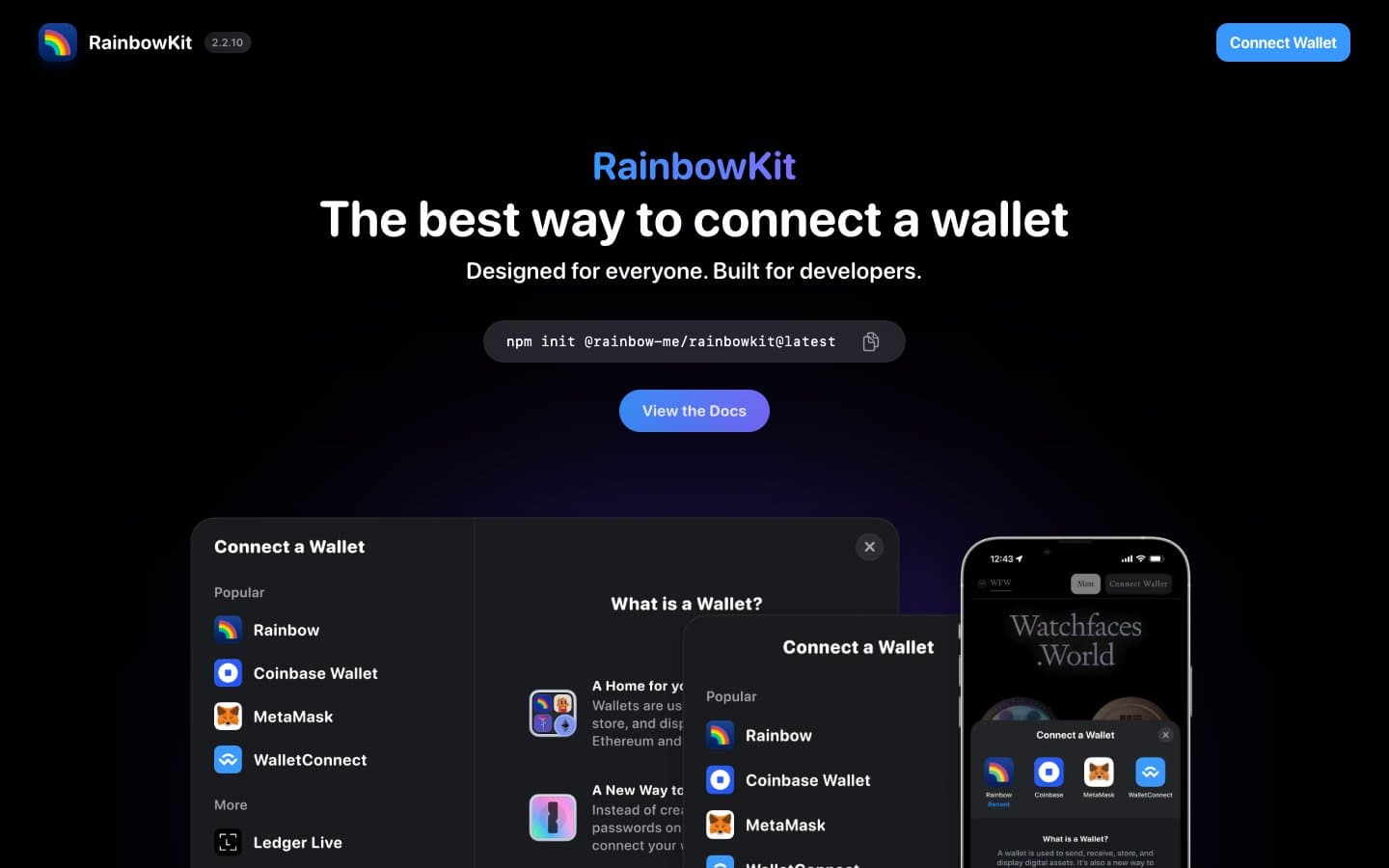
RainbowKit
Crypto
Safepal
Crypto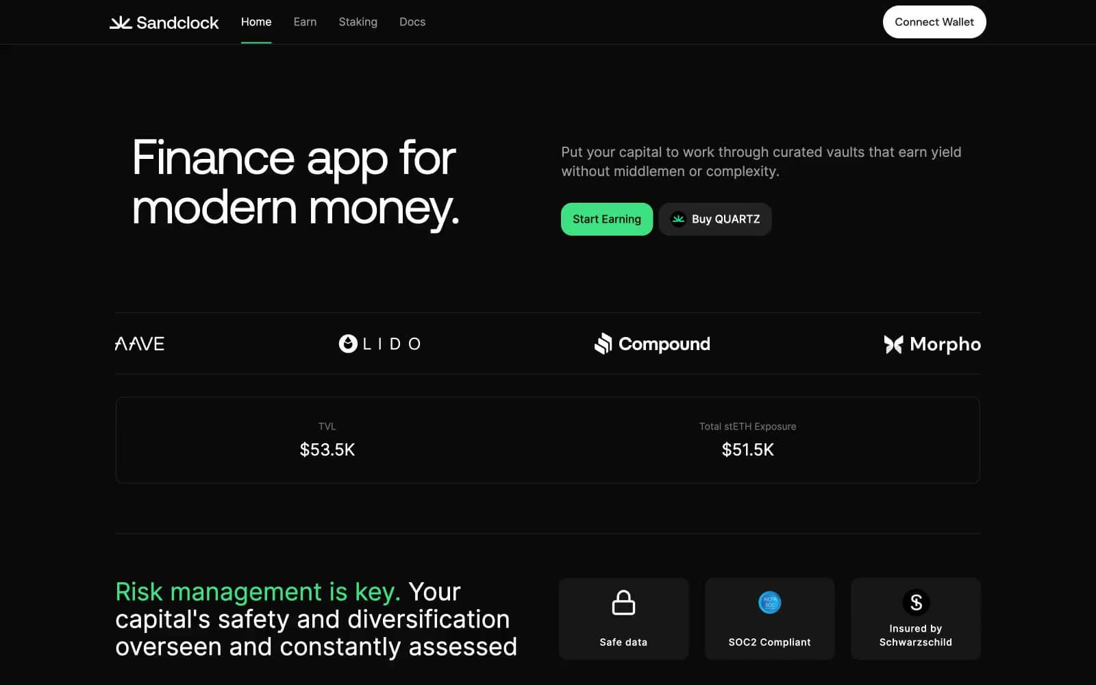
Sandclock
Crypto


