
Altius. Molten embers on obsidian.
- Crypto
- Dark theme
- 11 colors
- 2 typefaces
Altius operates in a volcanic-ember register: deep obsidian-brown surfaces warmed by coral and flare-orange highlights, like a blockchain control room rendered in molten glass and cooled lava. The page rhythm alternates between heavy dark sections and light peach breathing spaces, creating a thermal oscillation rather than the typical dark-mode-everywhere crypto UI. Typography is tight-tracked and weight-confident — Matter (sans) at weight 700 for display, with Fabrikatmono (monospace) as a technical accent for tags and labels. Components feel pressed-in rather than floating: buttons carry an inner ember-glow shadow, cards use hairline coral borders on dark, and the hero's vertical gradient bars suggest a sound wave or thermal spectrum. Color is the brand's primary voice — expect a dark, warm, confident system that treats coral-orange as functional punctuation across a near-black canvas.
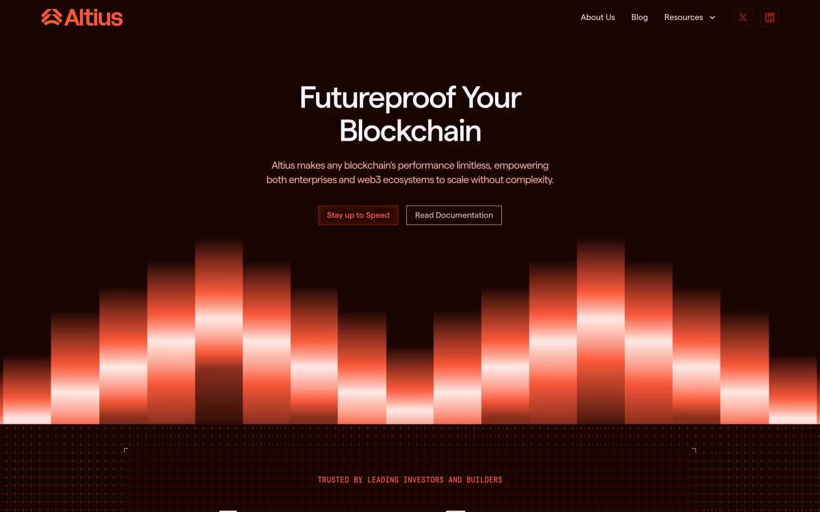
Altius design system

Brand3
Inset glow shadow source, deep red-brown accents — the pressed-ember tone that gives buttons their internal fire
Outlined/ghost action border, nav borders, icon strokes, interactive outlines — the chromatic action color used for outlined buttons and active control edges
Primary brand accent — links, decorative borders, the hero gradient spectrum, highlight washes. The single hottest color in the system; used sparingly as functional punctuation
Accent1
Soft surface wash, secondary peach background, decorative highlight fields — the diffused ember tone for breathing sections
Neutrals7
Decorative SVG fills, icon line art, graphical accents — high-contrast details that read as deep-ink on the warm canvas
Primary dark canvas — page background in dark sections, card surface, deepest borders. The black-with-warmth that defines the brand atmosphere
Secondary dark surface, deep link borders, icon outlines — one step lifted from obsidian for layering depth
Muted button borders on light sections, tertiary text, subtle dividers — a warm gray that softens edges without going cold
Input field borders on light backgrounds — the only cool-neutral in the system, used minimally for form controls
Light section background, light-mode card surface, body text on dark, ghost button text — the warm off-white that breaks the dark rhythm
Primary text on dark, crisp borders on dark sections, inverse text. The near-white that carries most typography on dark surfaces
Try a pairing
Pick any two colors from the palette to check whether text stays readable on top.
Aa
Linen on Molten Core
12.05 : 1 contrast
- Body textPasses AA 4.5
- Large textPasses AA 3
- StrictPasses AAA 7
More DESIGN.md files. Same web, different personalities.
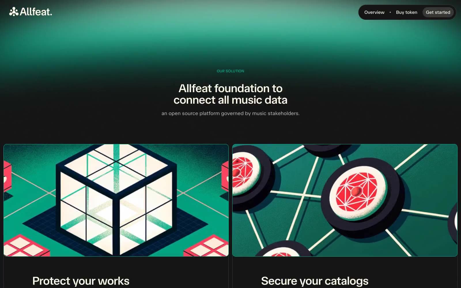
Allfeat
Crypto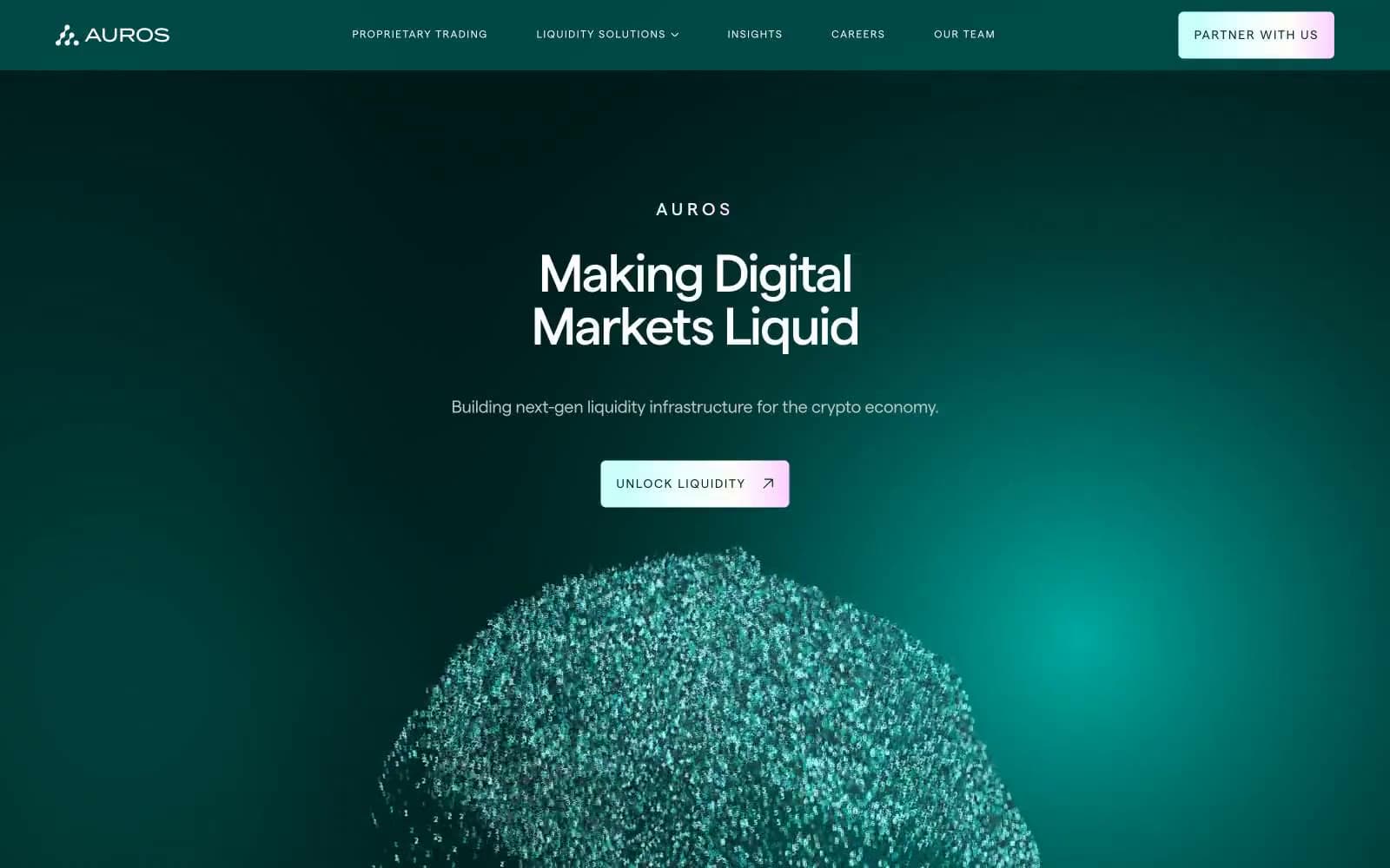
Auros
Crypto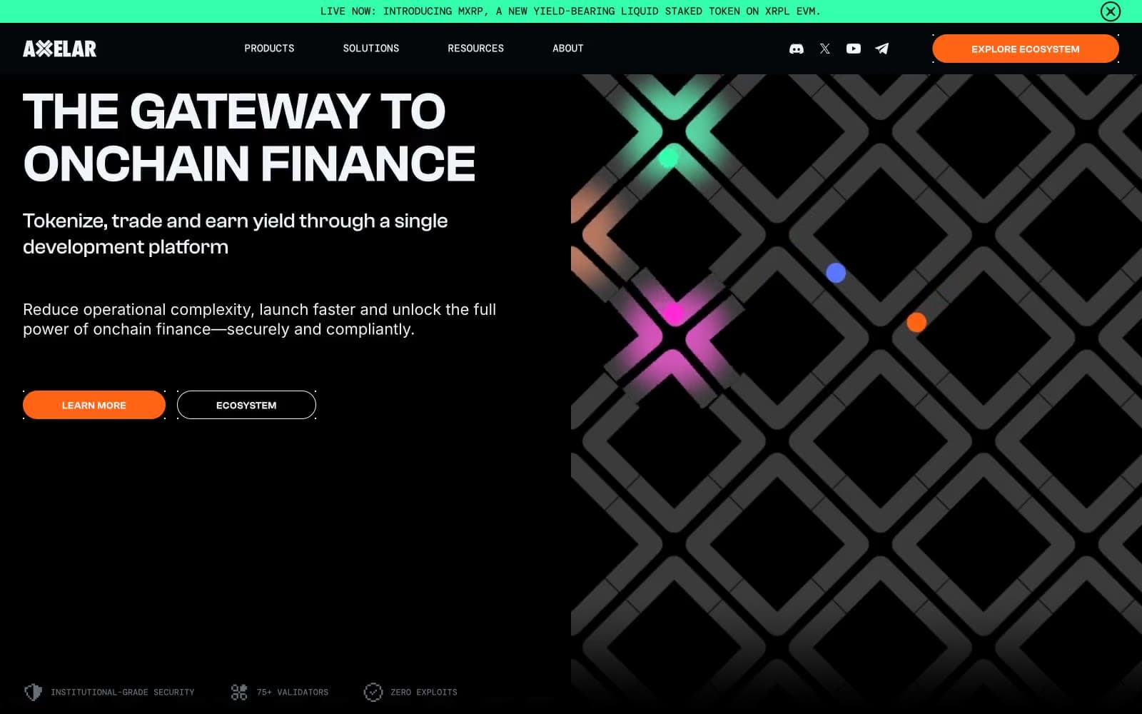
Axelar
Crypto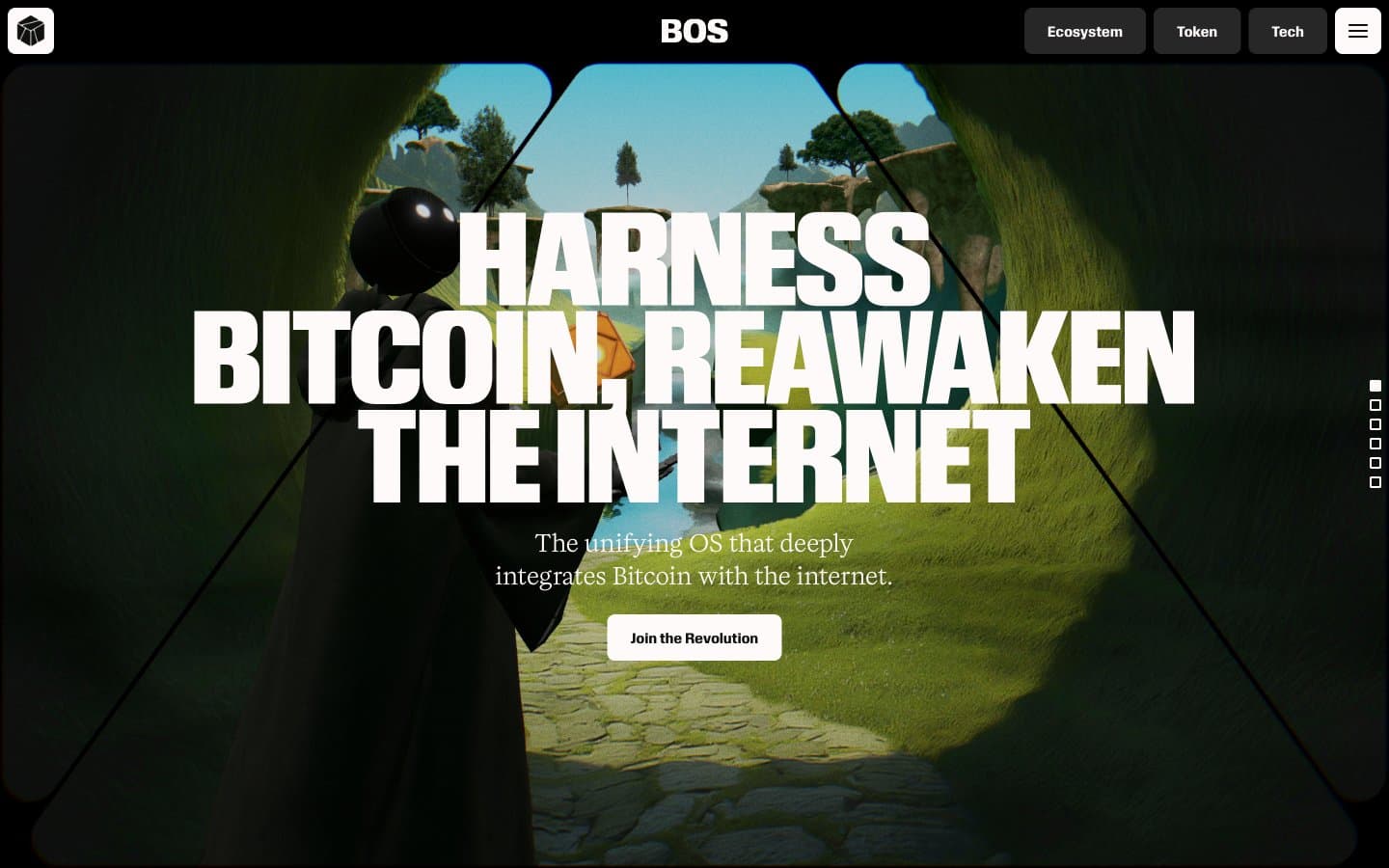
BitcoinOS
Crypto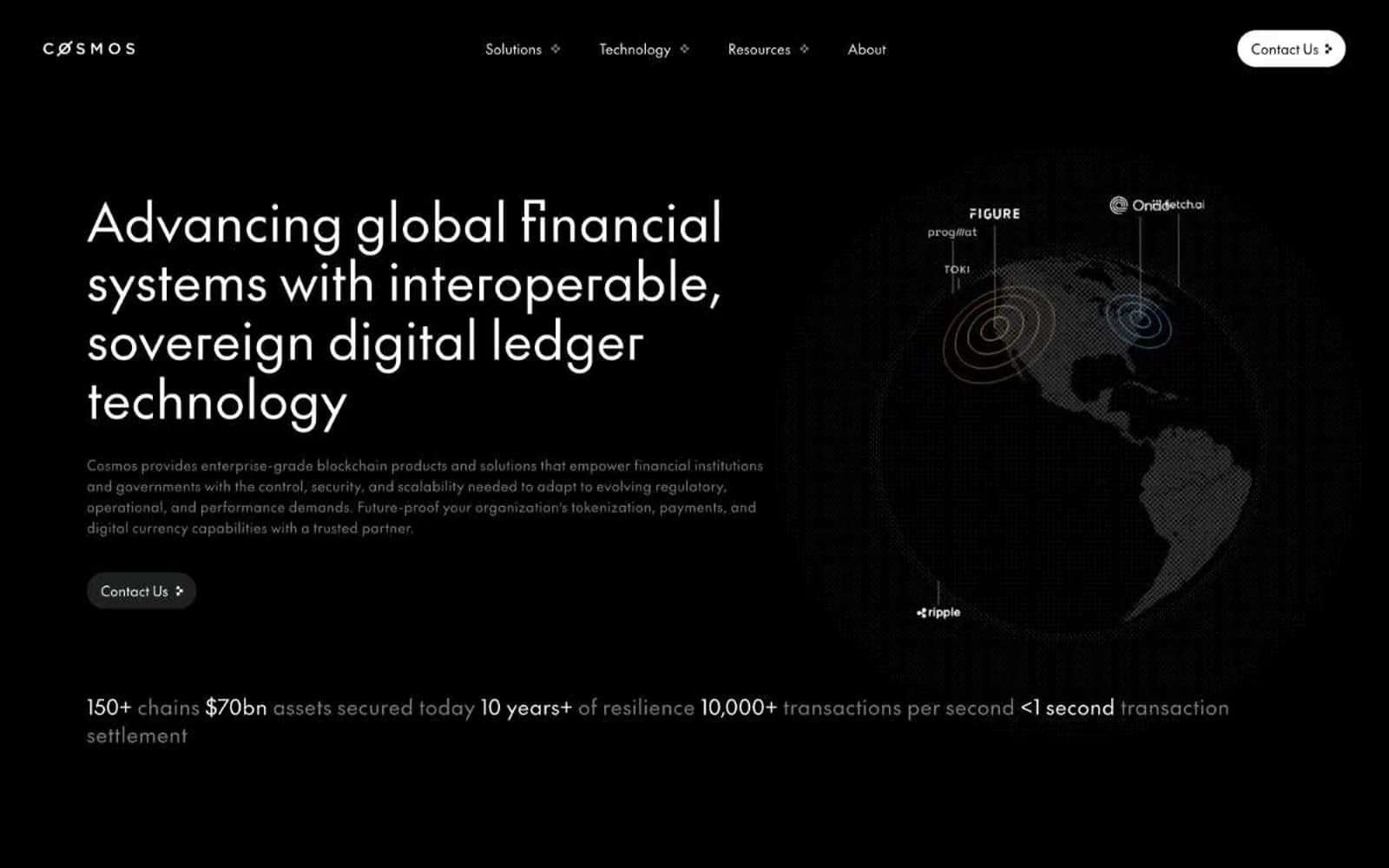
Cosmos Network
Crypto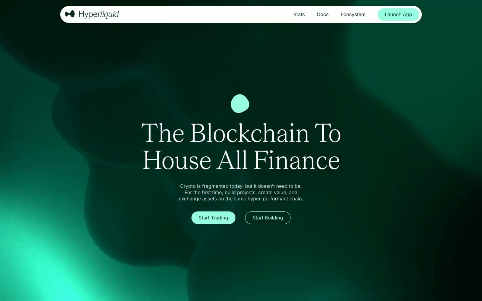
Hyper Foundation
Crypto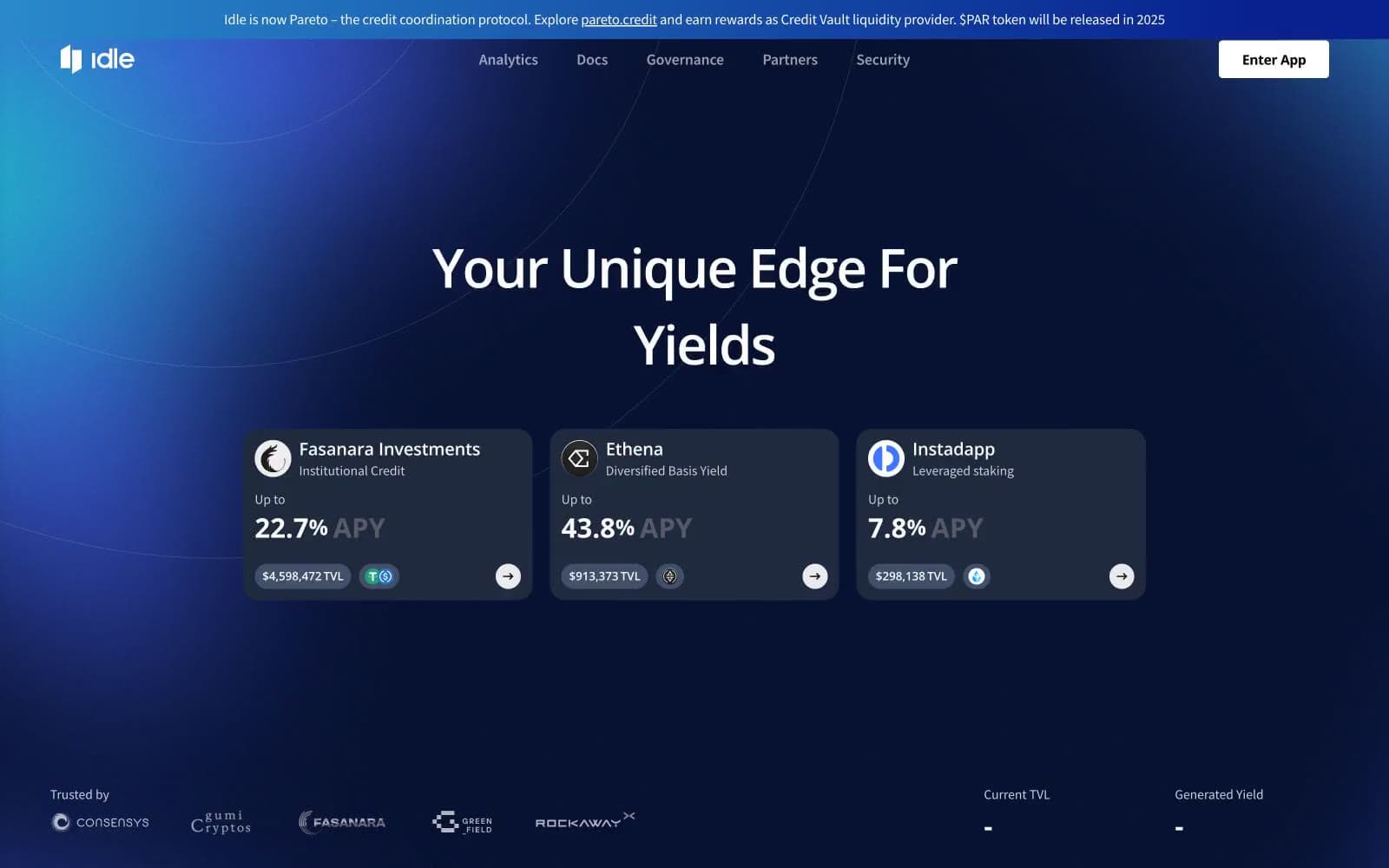
Idle Finance
Crypto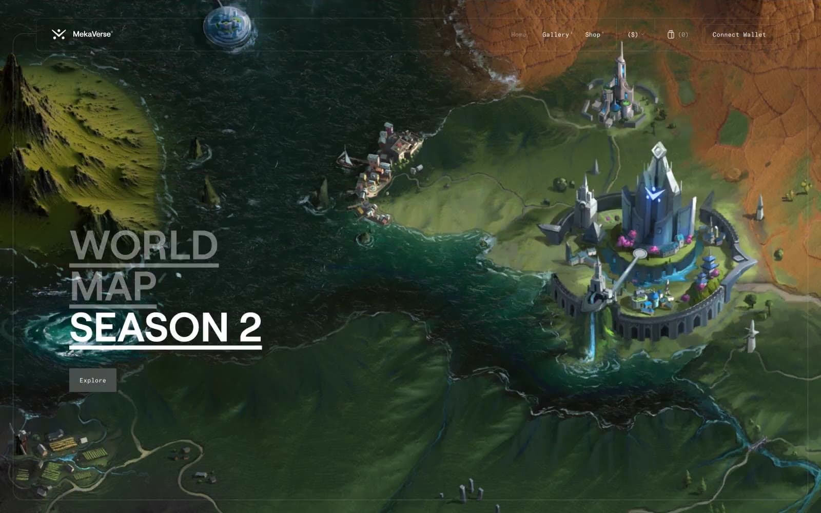
MekaVerse
Crypto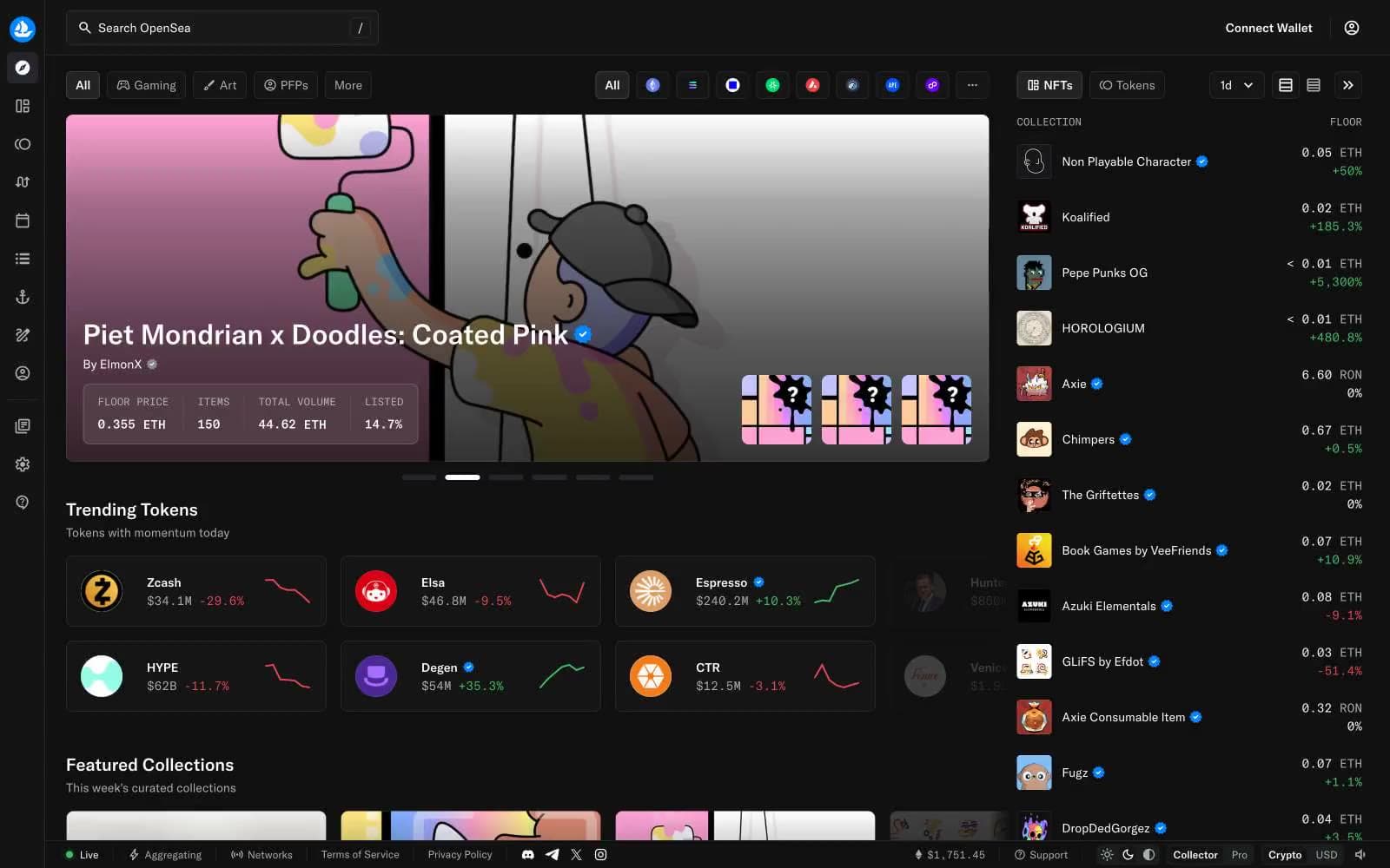
OpenSea
Crypto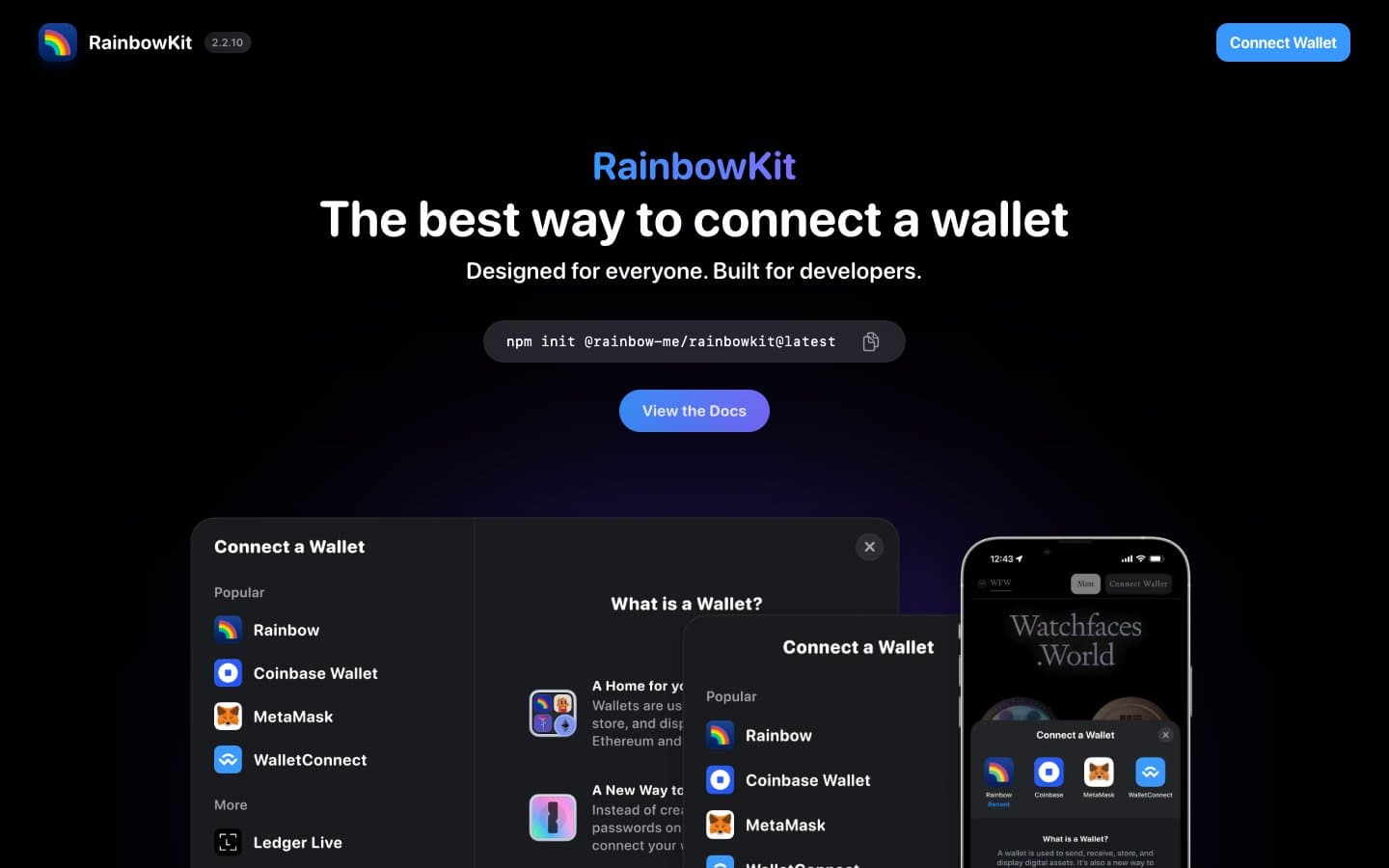
RainbowKit
Crypto
Safepal
Crypto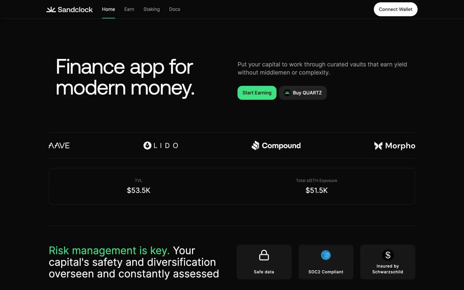
Sandclock
Crypto


