
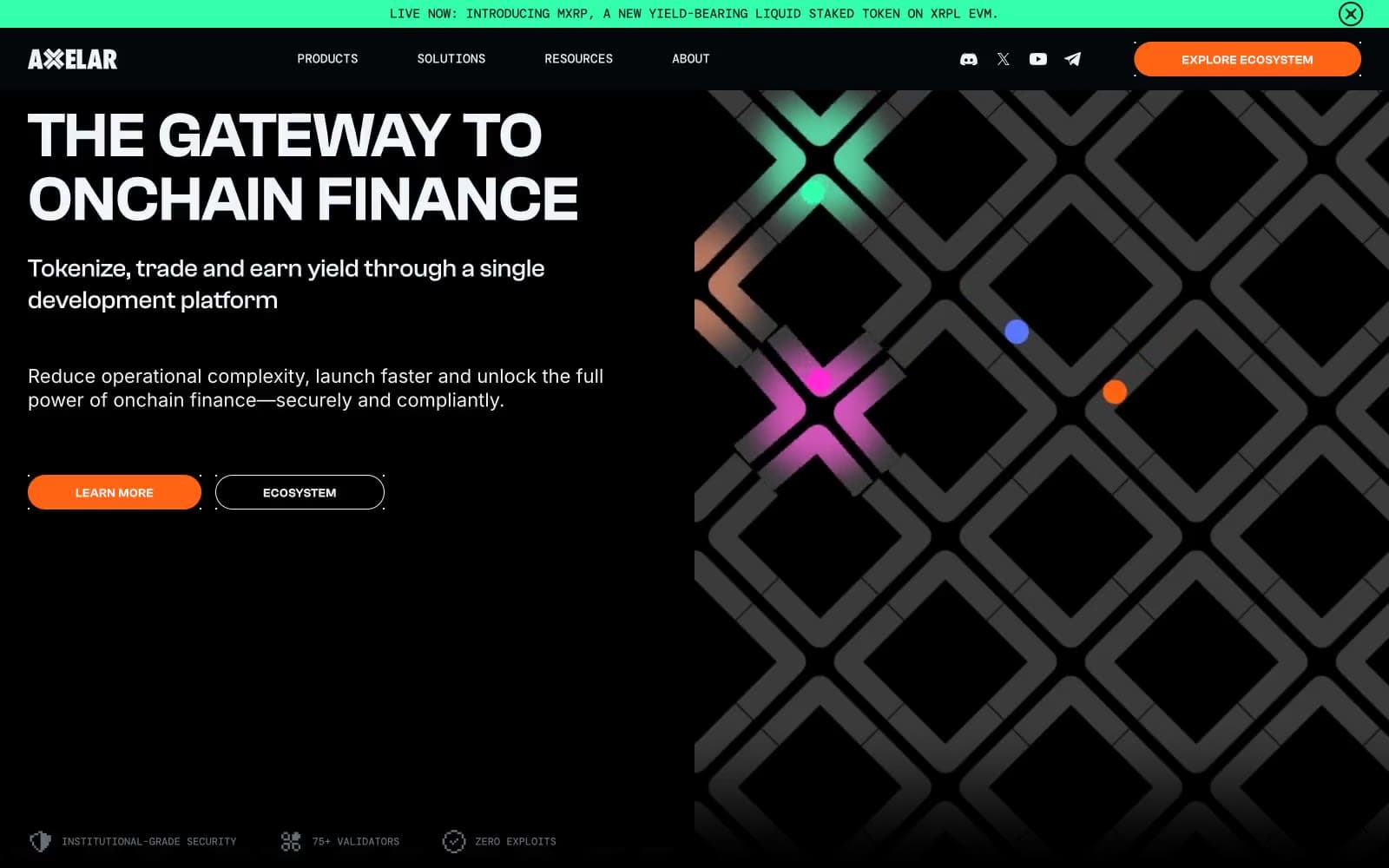
Axelar. Signal lights through dark lattice.
- Crypto
- Dark theme
- 15 colors
- 4 typefaces
Axelar's interface reads as infrastructure-grade crypto plumbing rendered in a dark command-center aesthetic. The canvas sits at near-black abyss (#04070a), with a deliberate surface hierarchy stepping up through progressively lighter grays for cards, nav, and elevated panels — depth without brightness. A single vivid orange (#ff6314) is the chromatic authority: every primary action, every product surface, every active state draws from it. Supporting accent hues (electric green, violet, magenta, cyan) appear only as tiny category dots and badges, functioning as node indicators in a network topology rather than decorative variety. Clashgrotesk carries the angular, geometric voice at 500/600 weights; Inter provides the readable body; DM Mono stamps technical labels and metadata. The hero's diamond-lattice pattern with scattered colored dots establishes a network/graph metaphor that recurs in the partner-section category indicators.
Axelar design system

Brand1
Orange action color for filled buttons, selected navigation states, and focused conversion moments.
Accent4
Category dot indicators, success-tinted badges — functions as a network-node status light, never as a full surface
Category dot indicators and info-adjacent badges — part of the node-light spectrum for category encoding
Category dot indicators and accent badges — part of the node-light spectrum for category encoding
Category dot indicators and accent badges — part of the node-light spectrum for category encoding
Neutrals10
Deepest layer beneath the canvas, SVG icon fills in nav and decorative contexts
Page canvas background, hero background, primary dark surface
Card surface fill — sits between canvas and nav, gives cards a subtle lift without changing brightness dramatically
Navigation bar background, link/button hover backgrounds — one step above the canvas
Card border lines, elevated surface borders, mid-tier separators on dark backgrounds
Muted helper text, secondary borders, nav dividers, badge outlines on dark backgrounds
Card border accent on light sections, subtle elevated borders
Light-section dividers, input inset borders, faint borders on light surfaces
Secondary text, nav text, light body copy on dark surfaces — slightly cool-tinted near-white
Primary headings, primary body text, high-contrast labels, icon strokes on dark surfaces
Try a pairing
Pick any two colors from the palette to check whether text stays readable on top.
Aa
Void on Signal Orange
7.05 : 1 contrast
- Body textPasses AA 4.5
- Large textPasses AA 3
- StrictPasses AAA 7
More DESIGN.md files. Same web, different personalities.
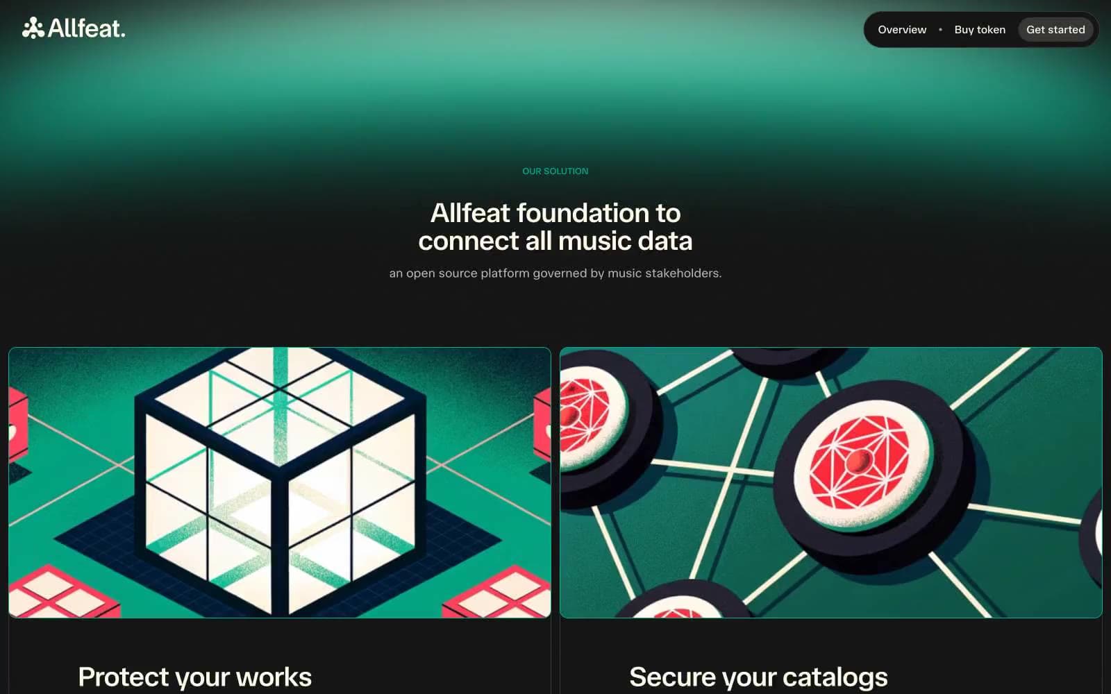
Allfeat
Crypto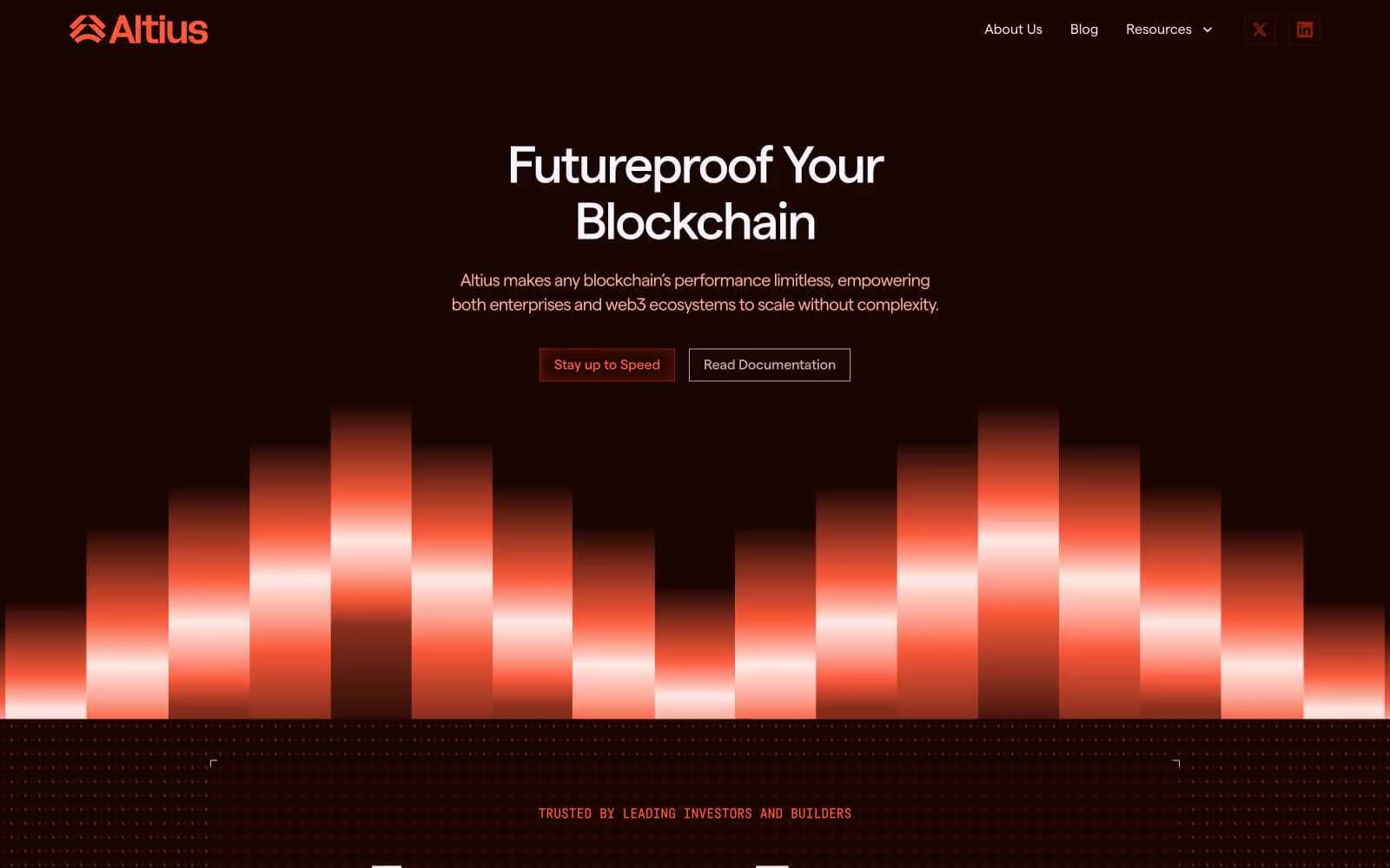
Altius
Crypto
Auros
Crypto
BitcoinOS
Crypto
Cosmos Network
Crypto
Hyper Foundation
Crypto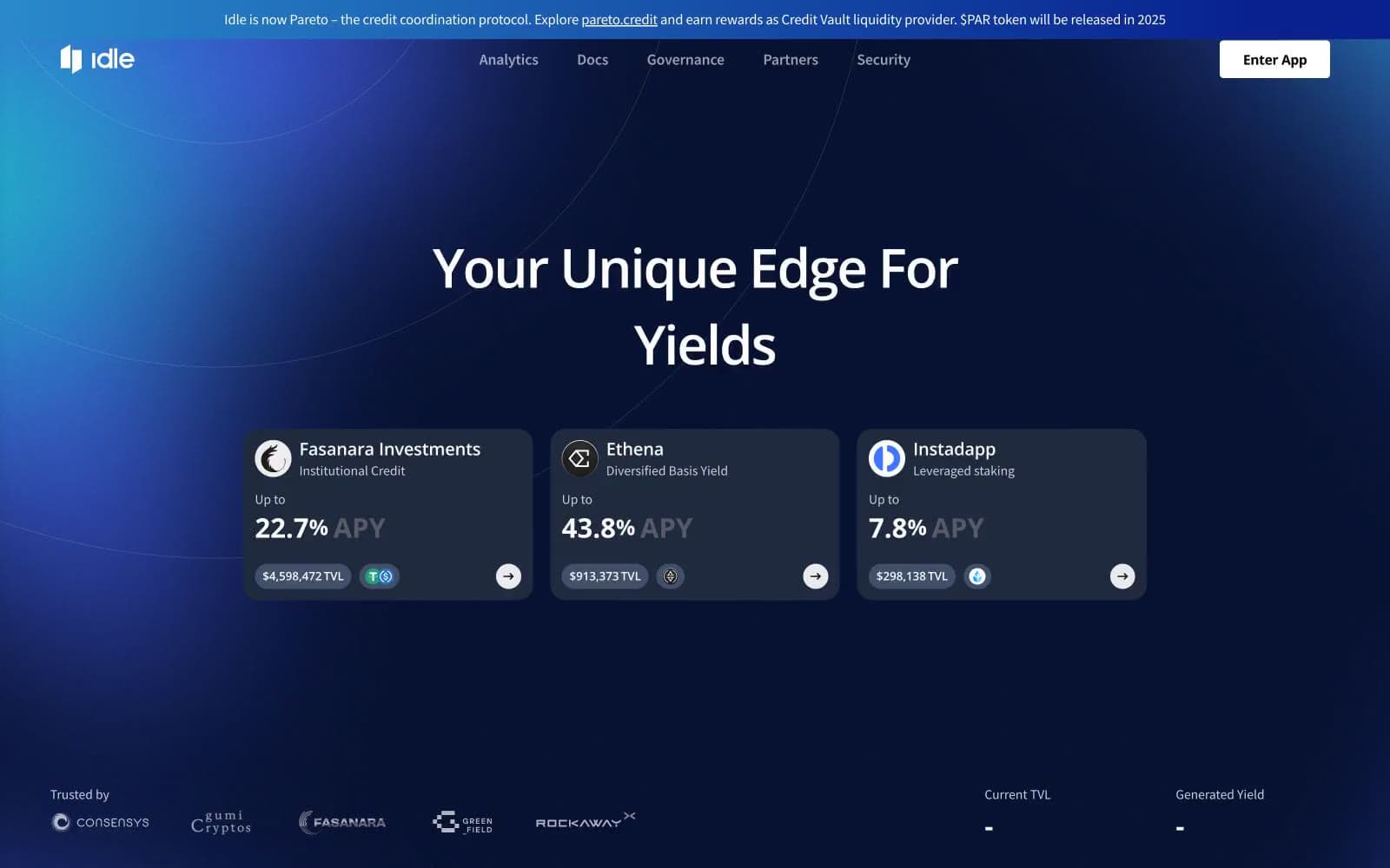
Idle Finance
Crypto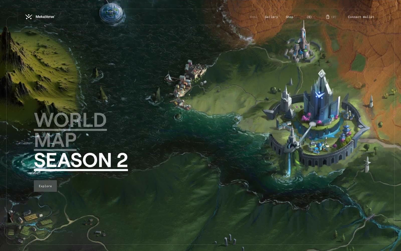
MekaVerse
Crypto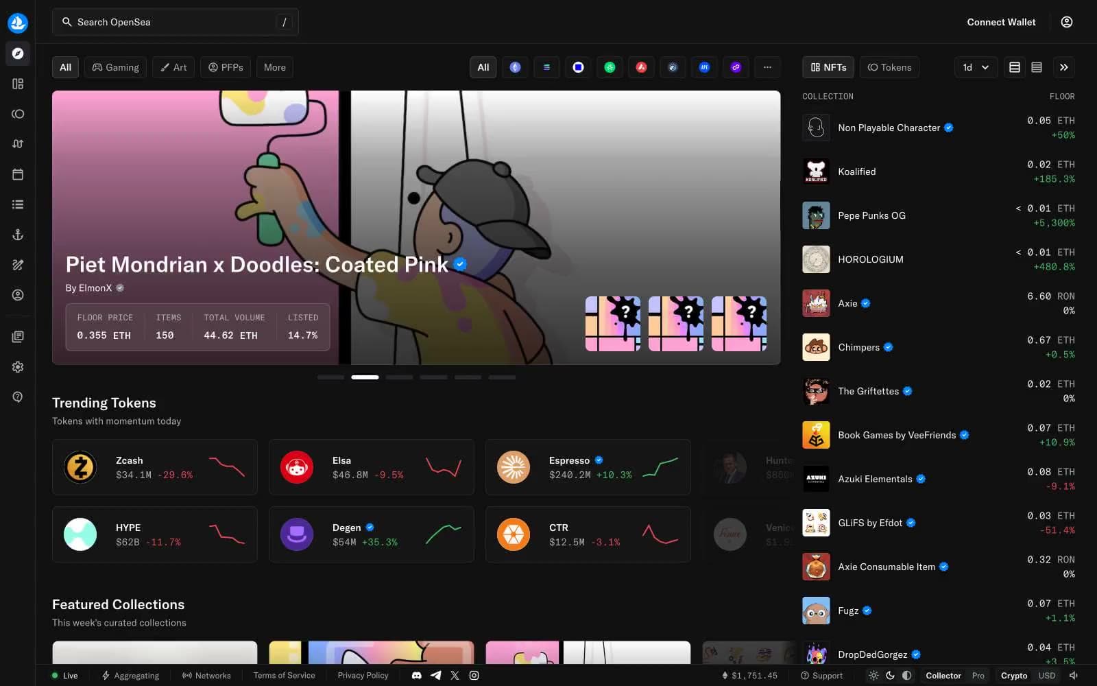
OpenSea
Crypto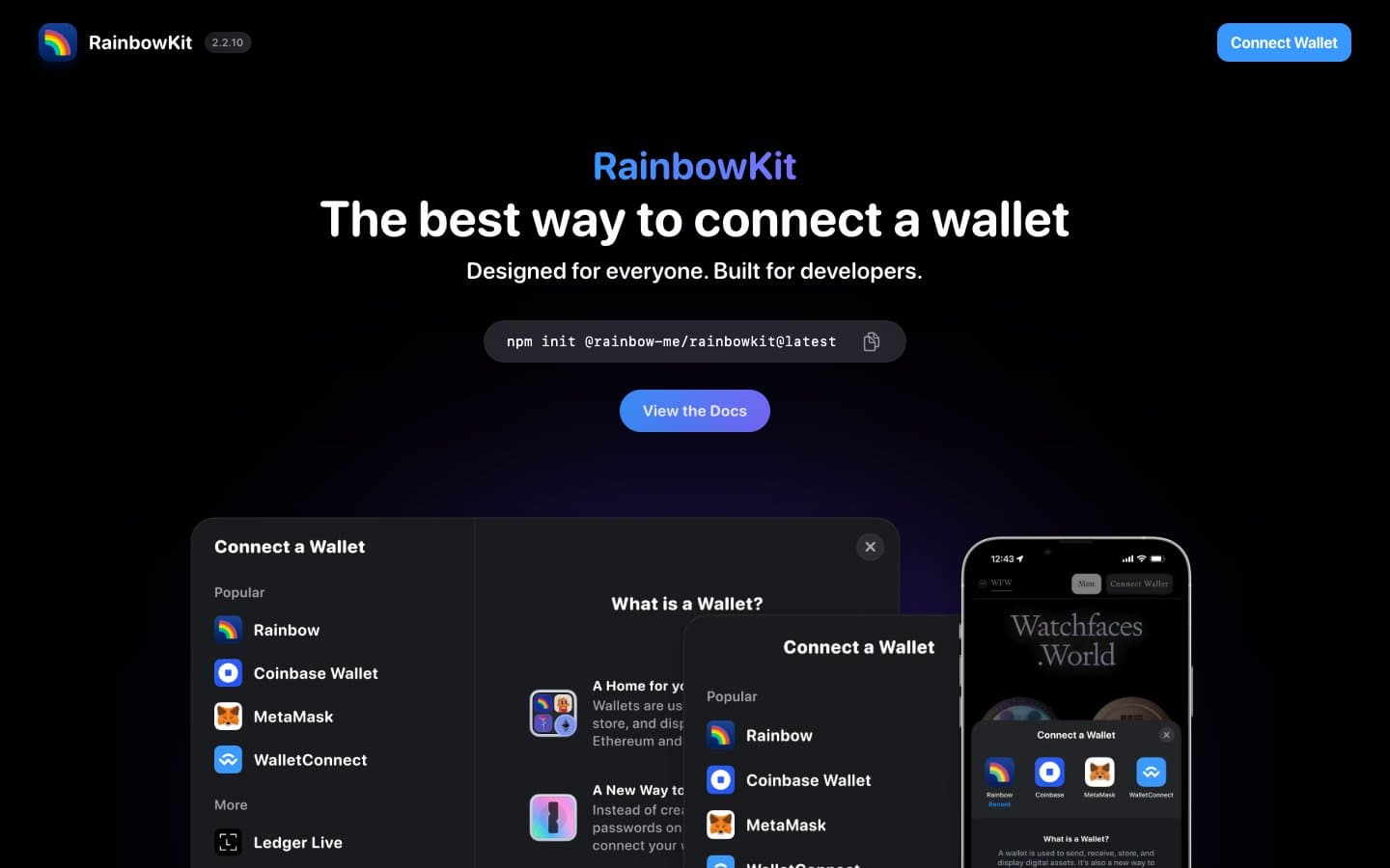
RainbowKit
Crypto
Safepal
Crypto
Sandclock
Crypto


