
RainbowKit. The blue-to-violet aurora glows through the dark.
- Crypto
- Dark theme
- 18 colors
- 4 typefaces
RainbowKit uses a midnight crypto-native language: a black canvas with floating dark cards, confident rounded sans-serif typography, and a single vivid blue-to-violet gradient as the brand's emotional core. The design lives in the gap between developer-tool severity and consumer-app approachability — heavy shadows create depth on a flat dark surface, inset white border highlights define button edges, and 9999px radii make every interactive feel like a friendly pill. Color is used surgically: a primary signal blue for action, the aurora gradient for the hero CTA, and pure white text against layered grays for hierarchy. Component modals float with dramatic 24px shadow stacks, previewing the toolkit's own product surfaces. The six-column partner grid below signals community trust at scale without resorting to testimonials.
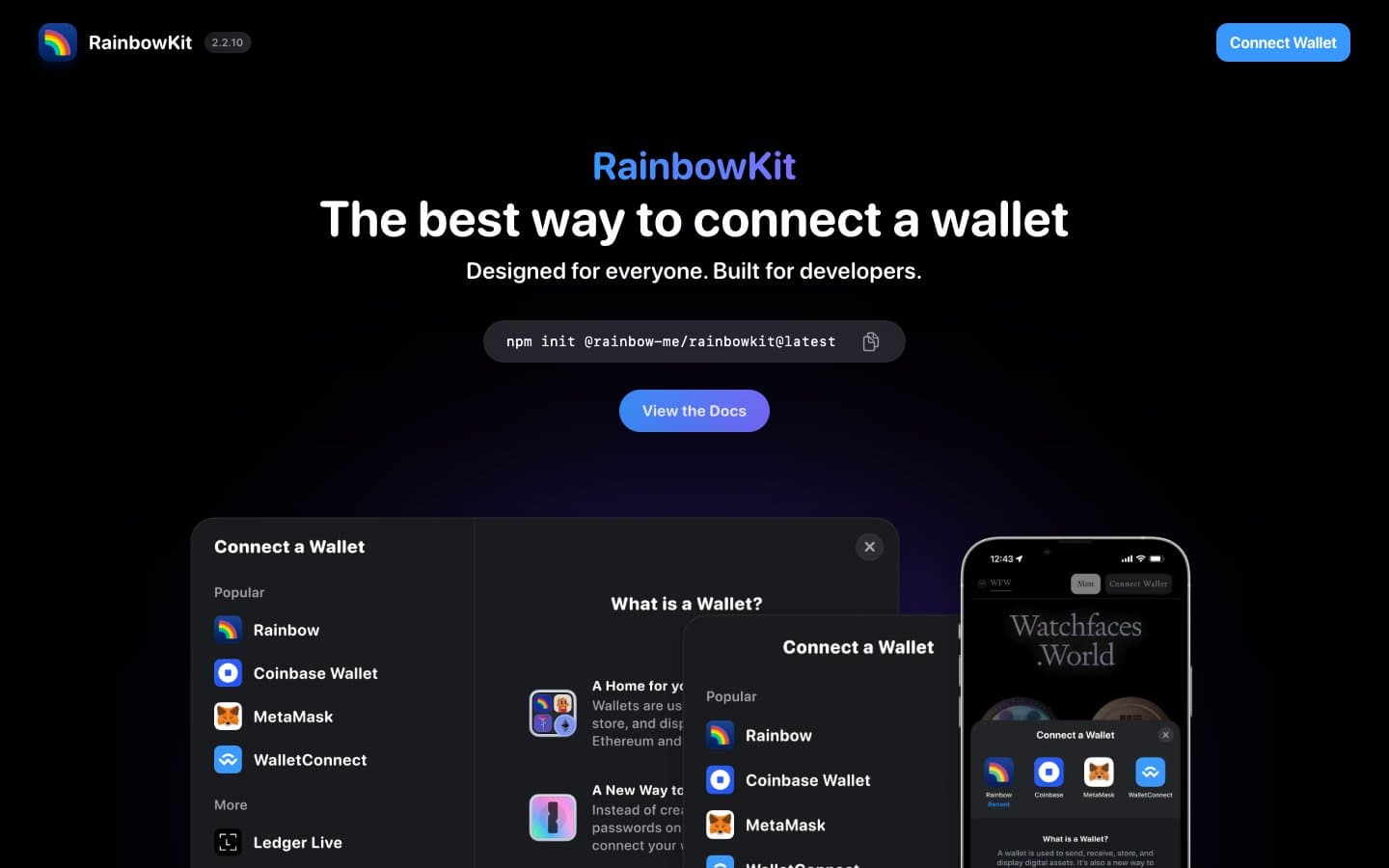
RainbowKit design system

Brand3
Primary CTA fill, active states, brand wordmark, link emphasis — the only chromatic blue with enough surface area to carry identity
Hero CTA gradient, brand wordmark highlight, selected-state washes — flows from sky-blue to electric violet
Gradient terminus, brand-secondary accent — appears only as the cool half of the aurora
Accent5
Violet wash for highlight backgrounds, decorative bands, and soft emphasis behind content.
Accent spectrum — demonstration option in the wallet-customization showcase, not a UI-state color
Accent spectrum — demonstration option in wallet-customization showcase
Accent spectrum — demonstration option in wallet-customization showcase
Accent spectrum — demonstration option in wallet-customization showcase
Neutrals10
Page canvas, deepest surfaces, inverted button borders — true black anchors the entire system
Shadow tint color (used in box-shadow rgba), near-black with a hint of warmth
Card surfaces, code blocks, modal containers, body text on light — the workhorse elevated surface
Hairline borders, dividers, icon stroke, secondary text on dark — the most-used neutral border in the system
Secondary borders, subtle dividers between sections — sits between Graphite and Pewter
Tertiary icon fills, disabled-state borders, subtle backgrounds
Disabled button background, low-emphasis surfaces — never for text
Muted helper text, icon secondary, placeholder text — the only gray that carries readable information
Light-theme surface fallback, very subtle off-white for section backgrounds on the demo
Primary text, inverted button fill, light-surface backgrounds, icon glyphs, hairline highlight borders
Try a pairing
Pick any two colors from the palette to check whether text stays readable on top.
Aa
Void on Signal Blue
5.03 : 1 contrast
- Body textPasses AA 4.5
- Large textPasses AA 3
- StrictFails AAA 7
More DESIGN.md files. Same web, different personalities.
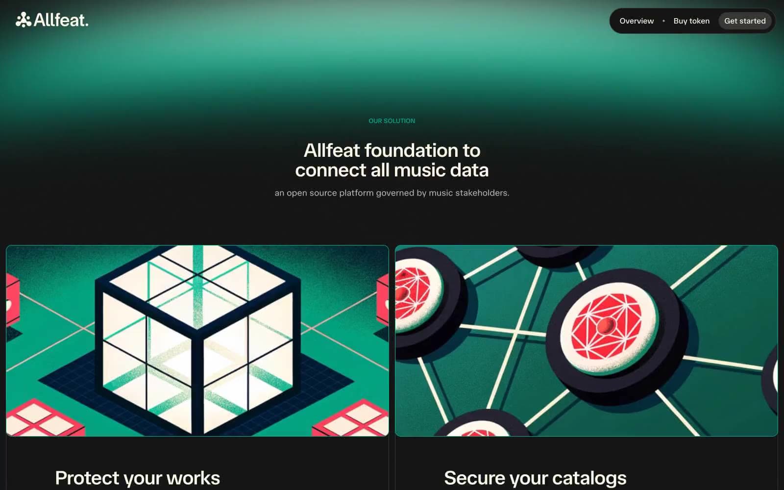
Allfeat
Crypto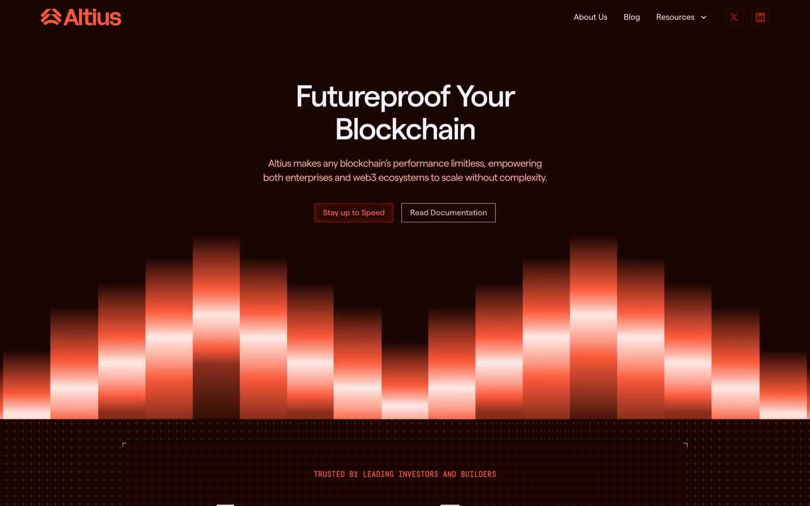
Altius
Crypto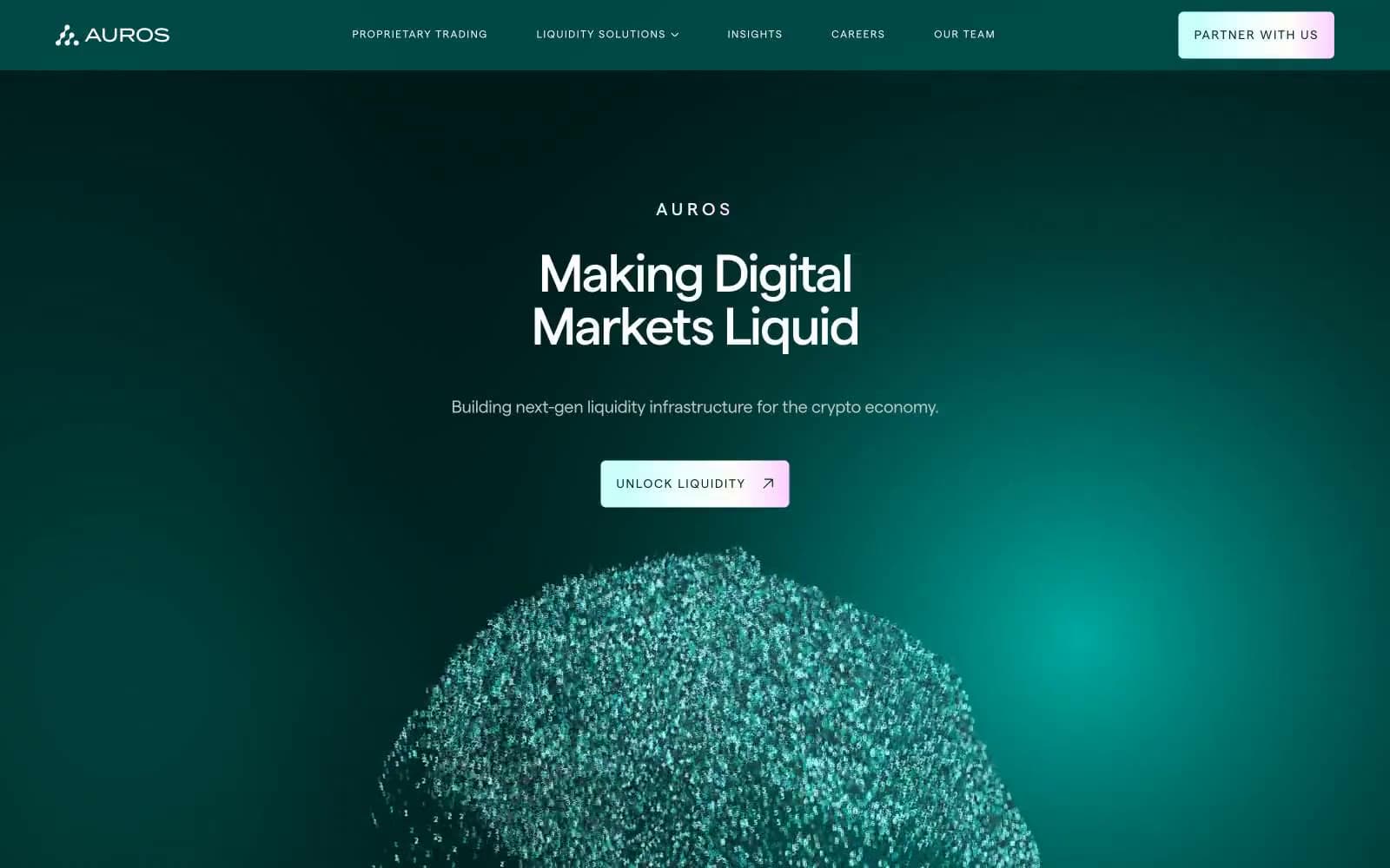
Auros
Crypto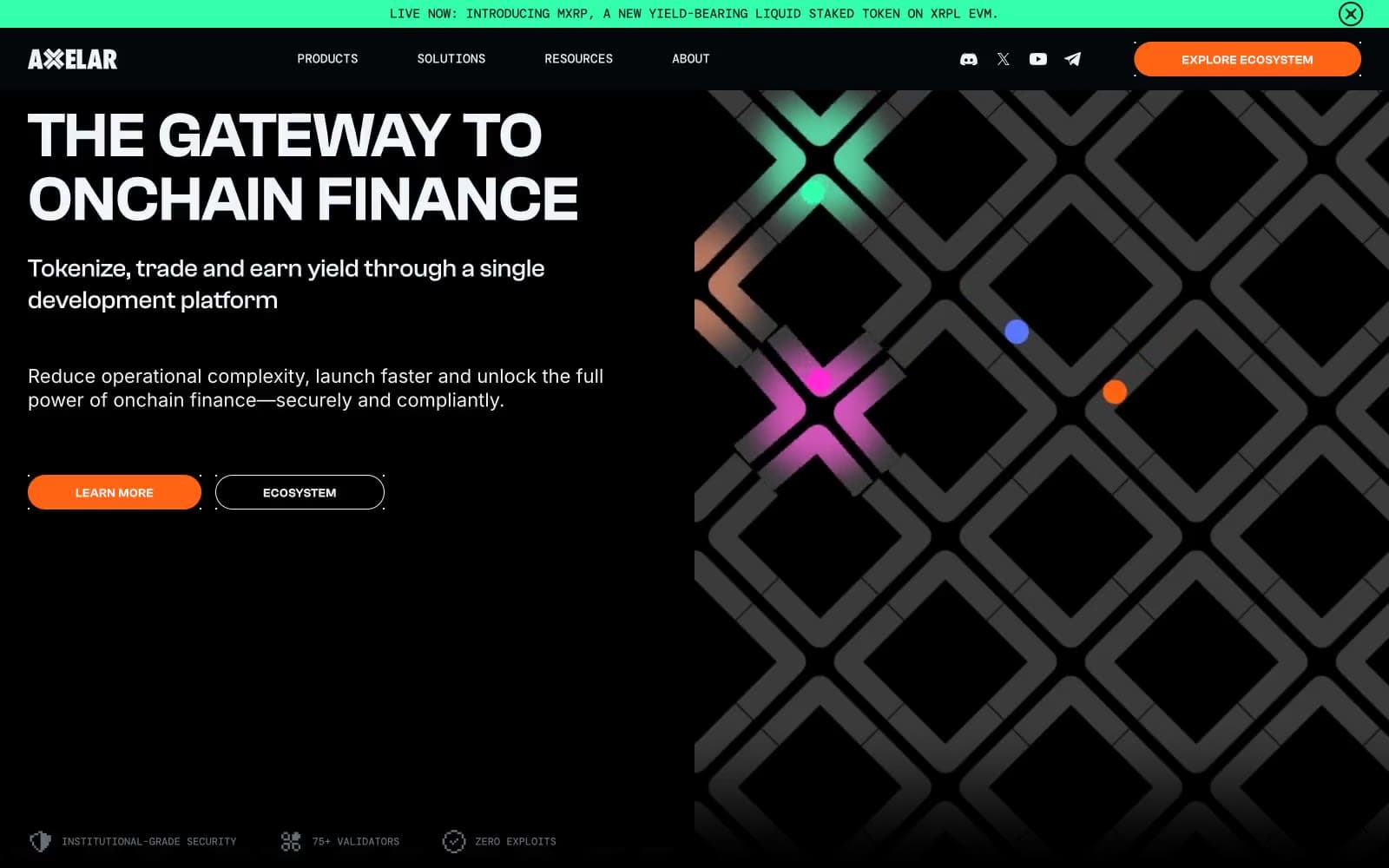
Axelar
Crypto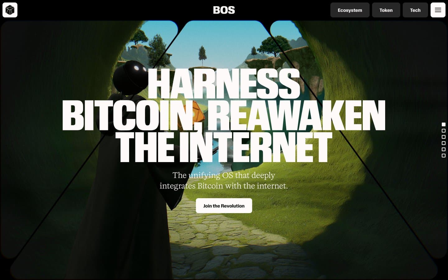
BitcoinOS
Crypto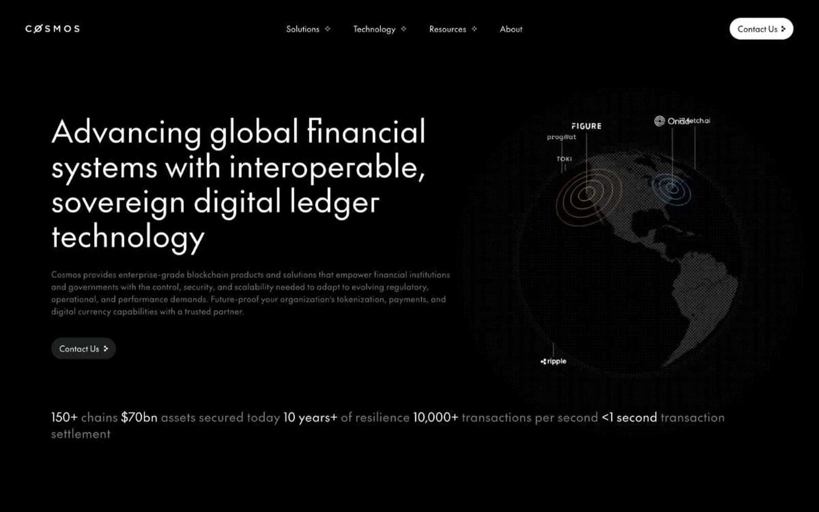
Cosmos Network
Crypto
Hyper Foundation
Crypto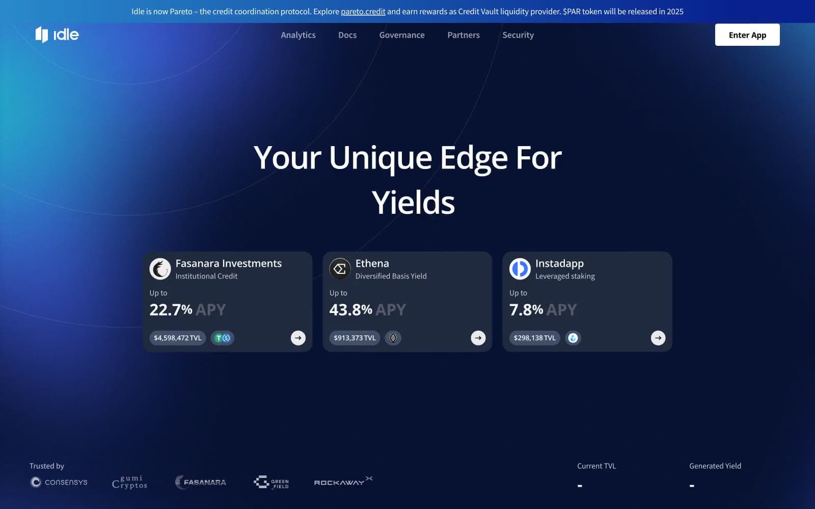
Idle Finance
Crypto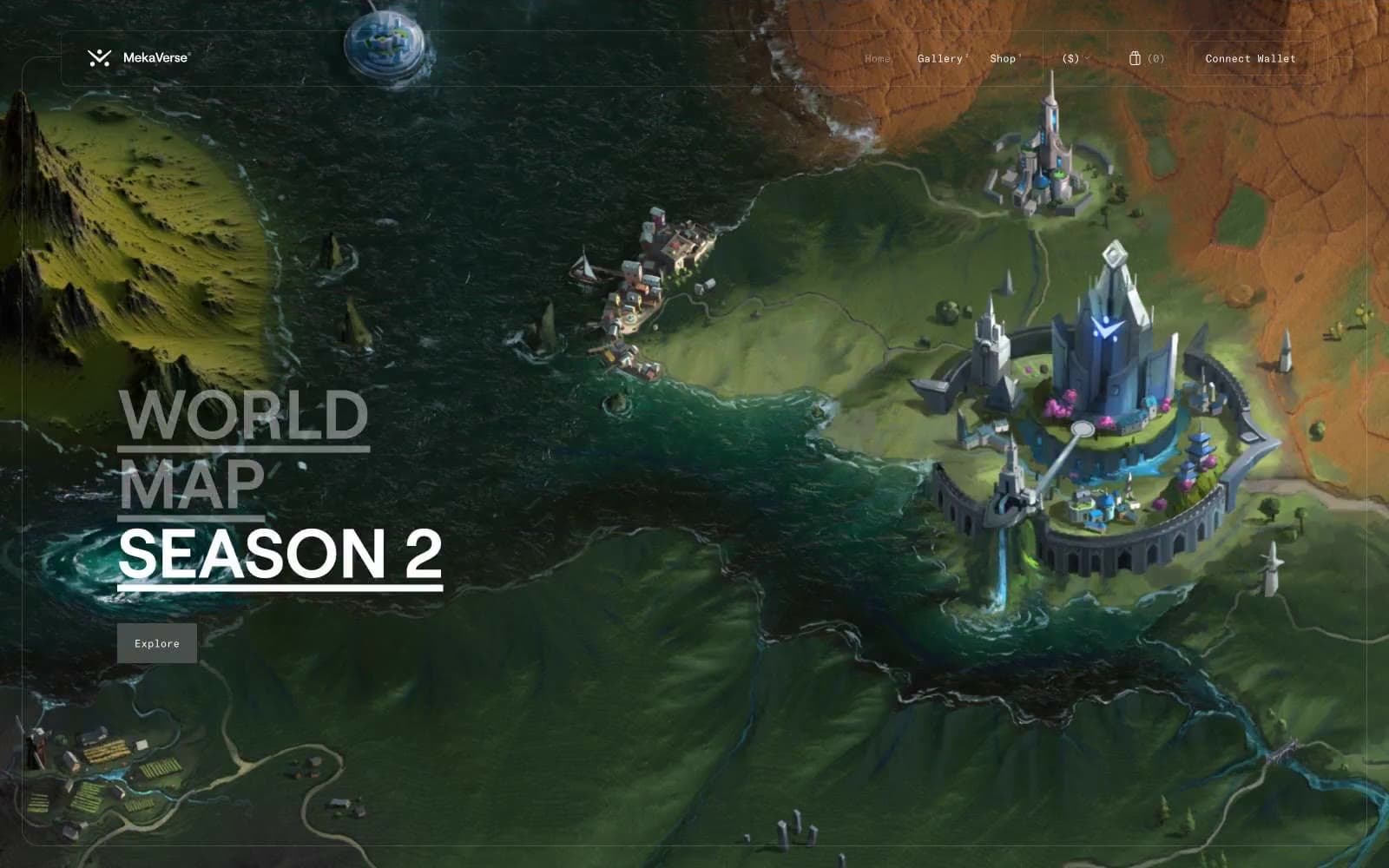
MekaVerse
Crypto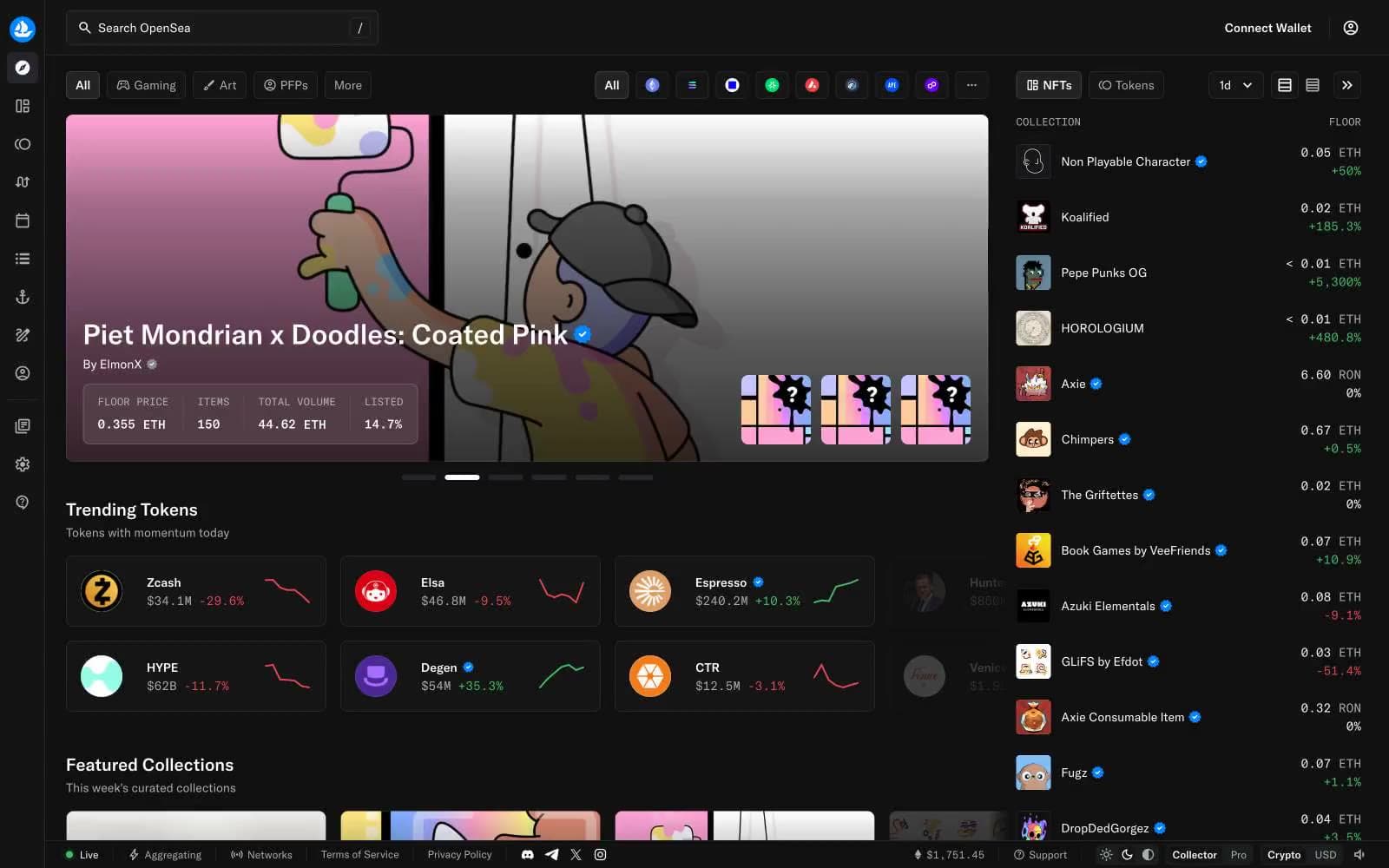
OpenSea
Crypto
Safepal
Crypto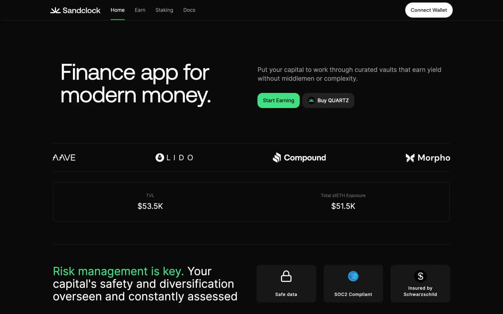
Sandclock
Crypto


