
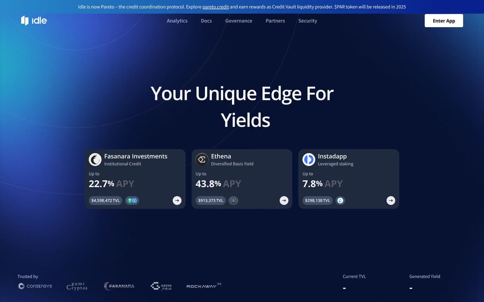
Idle Finance. A dark navy terminal where a single cyan signal pierces the gloom.
- Crypto
- Dark theme
- 8 colors
- 3 typefaces
Idle Finance uses a deep-ocean DeFi terminal language: near-black navy canvas with a single electric cyan accent that glows against the dark like a depth signal. The page behaves like a trading interface — dense, data-forward, atmospheric — with radial blue gradients creating a sense of horizon light emanating from behind content. Typography is the workhorse: Open Sans at heavy weights, with the hero statement split by a cyan highlight to break the headline into a branded mantra. Cards are nearly flat with hairline borders (no shadows, no elevation tricks), and the only chrome is a 1px border. Components are compact and utilitarian: pill-shaped action buttons, chip-style chain badges with extreme 80px radii, tab navigation that looks like an exchange filter bar.
Idle Finance design system

Brand1
Hero highlight word, outlined action borders, icon strokes, link borders — the single electric signal that draws the eye through the dark interface
Accent2
Gradient atmosphere — the midtone of the radial background bloom that makes the page feel lit from behind
Accent gradient for highlights and yield indicators — teal-to-cyan sweep signaling positive performance
Neutrals5
Hairline borders on dark surfaces and fine dividers — invisible structural lines that define cards without lifting them off the page
Page canvas and card surfaces — the foundational darkness every other element floats on
Elevated surface for nested cards, button backgrounds, and section containers — one step lighter than the canvas to imply depth without shadow
Secondary body copy and muted helper text — lowered brightness to create a clear reading hierarchy beneath Bone White
Primary text, filled action buttons, and high-contrast labels — the only fully white tone, reserved for reading and final calls-to-action
Try a pairing
Pick any two colors from the palette to check whether text stays readable on top.
Aa
Carbon Black on Spectral Cyan
14.15 : 1 contrast
- Body textPasses AA 4.5
- Large textPasses AA 3
- StrictPasses AAA 7
More DESIGN.md files. Same web, different personalities.
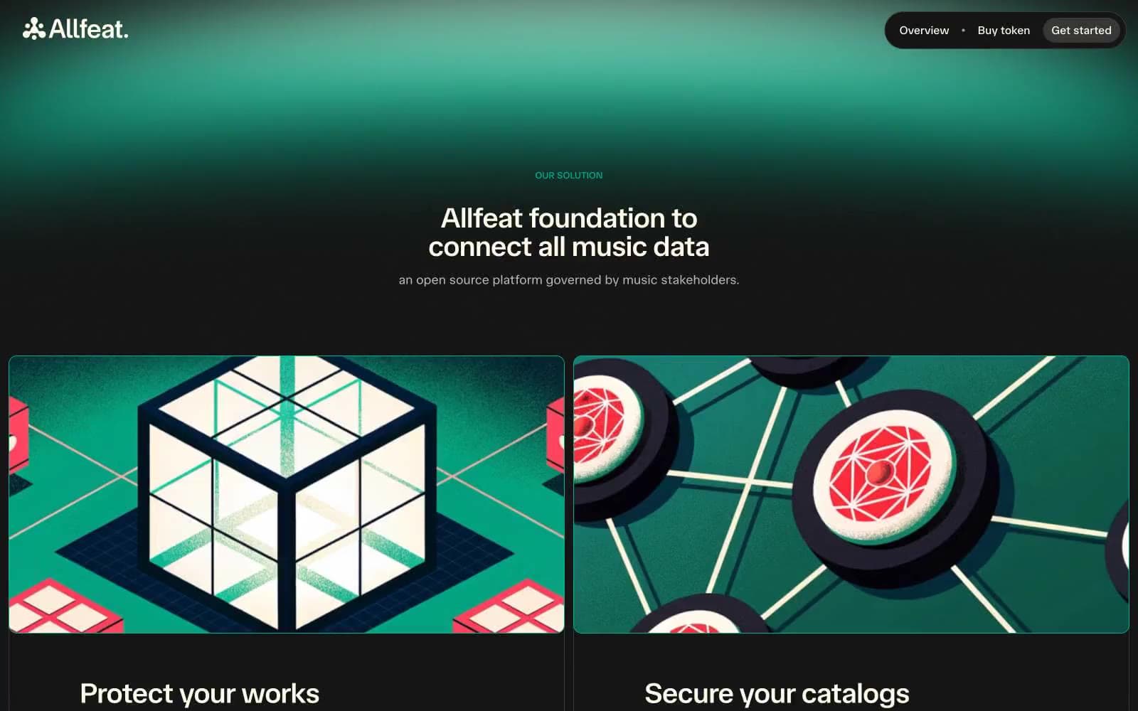
Allfeat
Crypto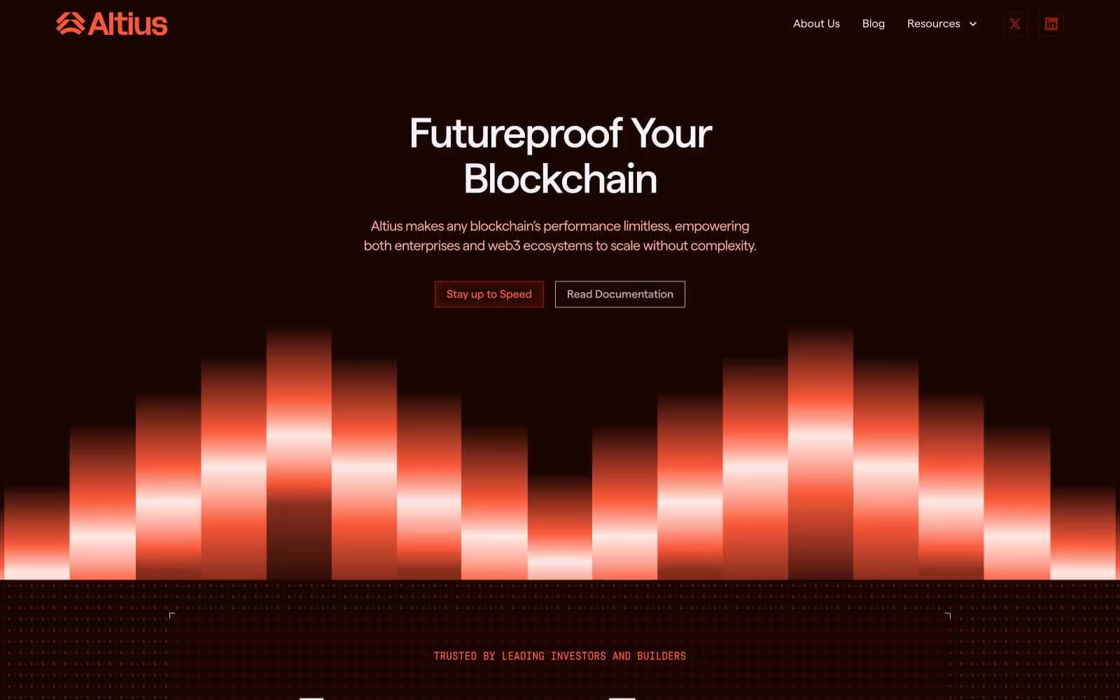
Altius
Crypto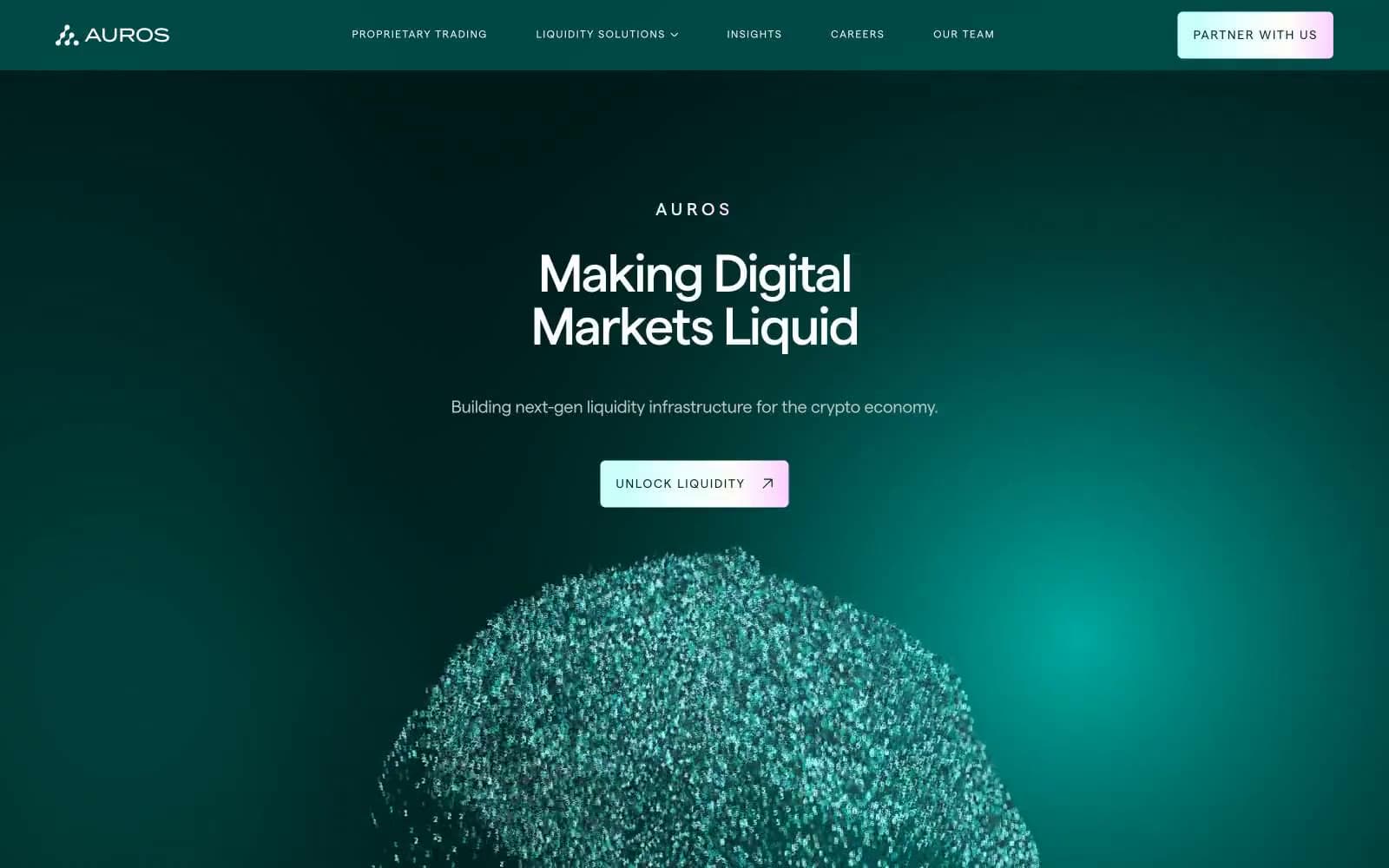
Auros
Crypto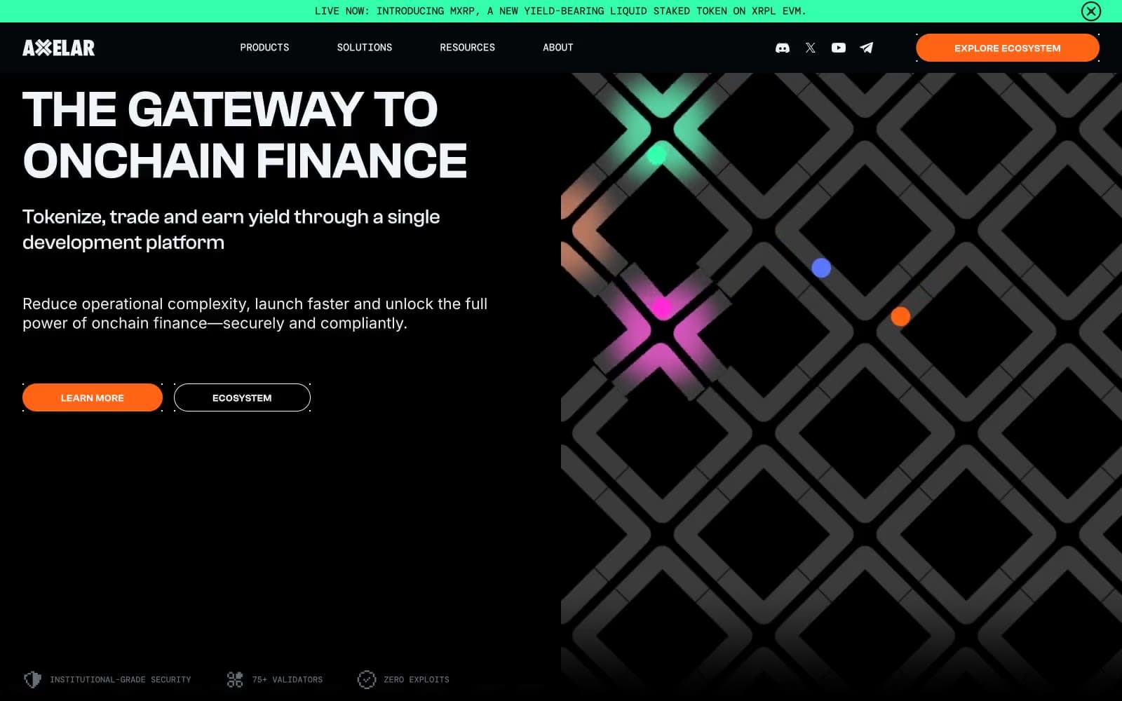
Axelar
Crypto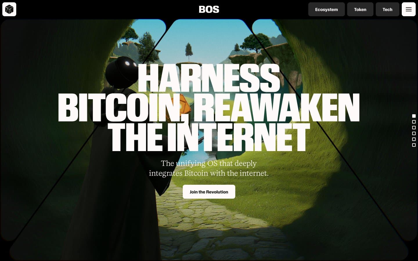
BitcoinOS
Crypto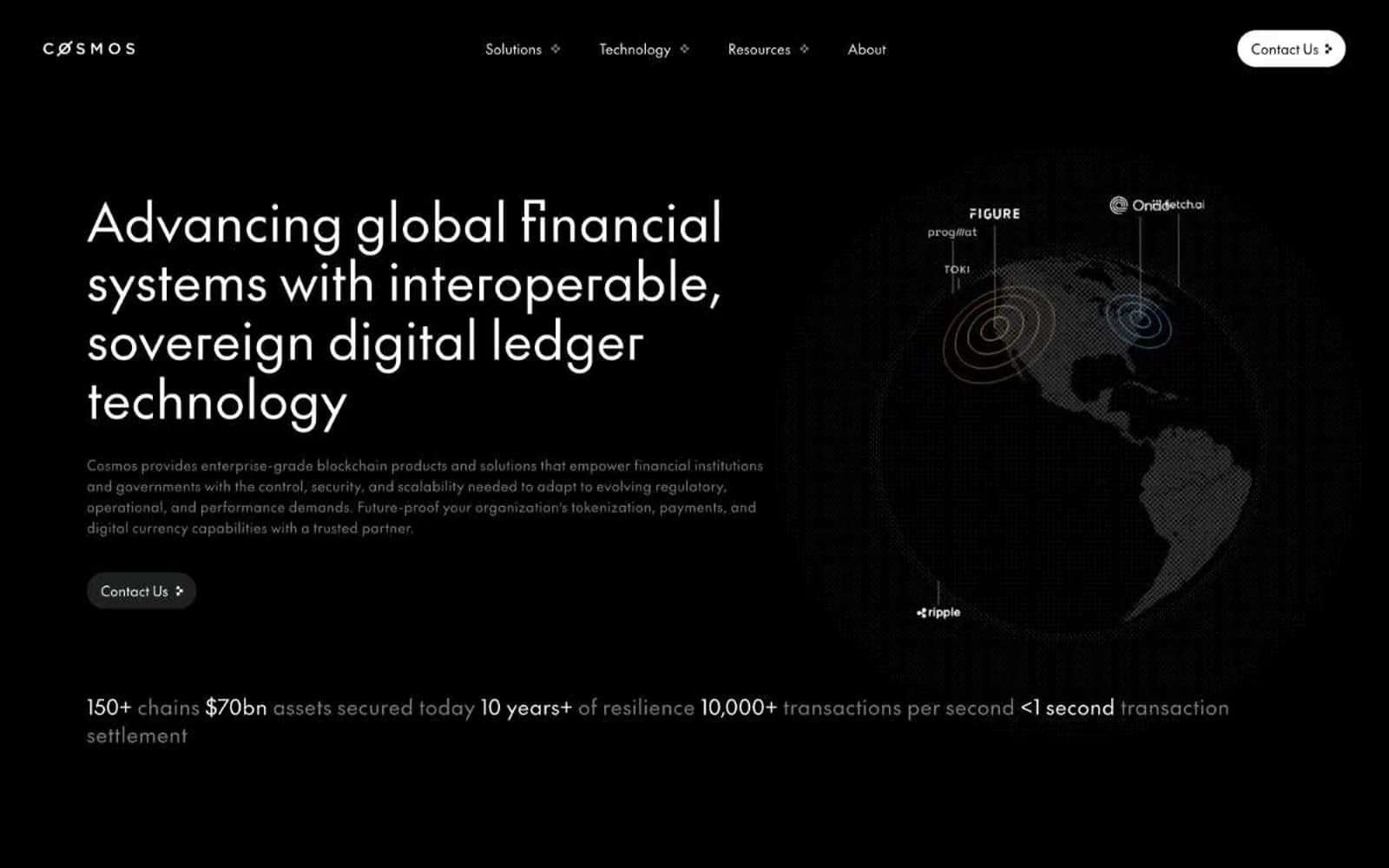
Cosmos Network
Crypto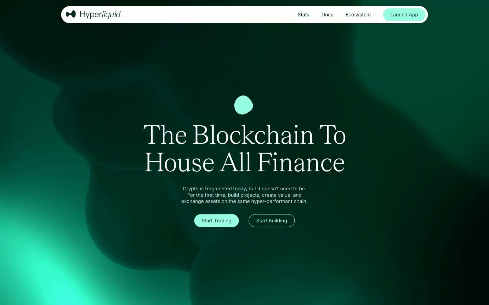
Hyper Foundation
Crypto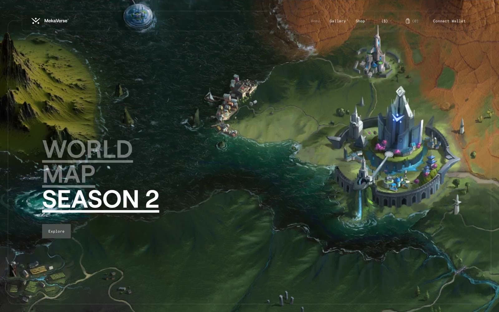
MekaVerse
Crypto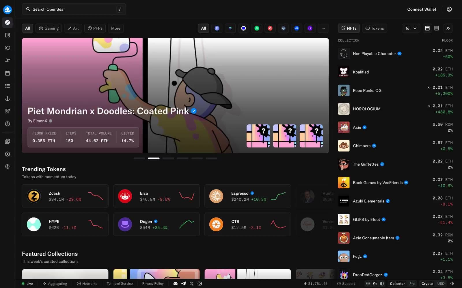
OpenSea
Crypto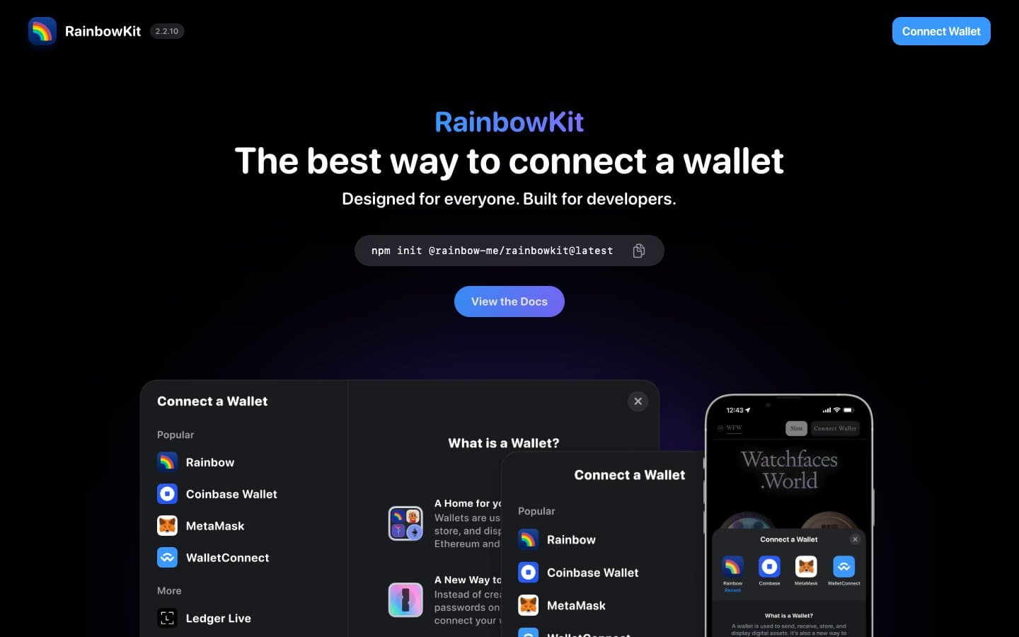
RainbowKit
Crypto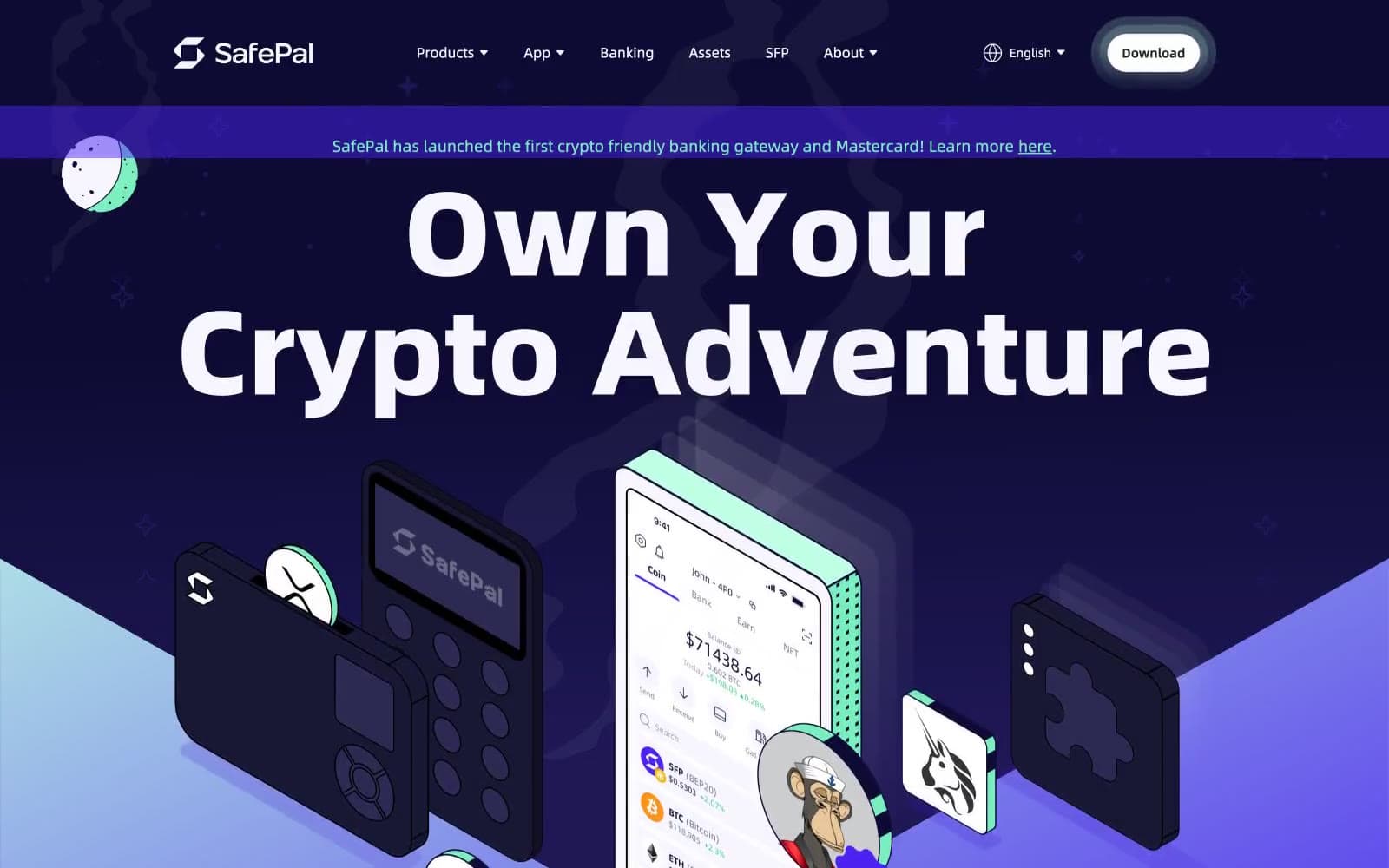
Safepal
Crypto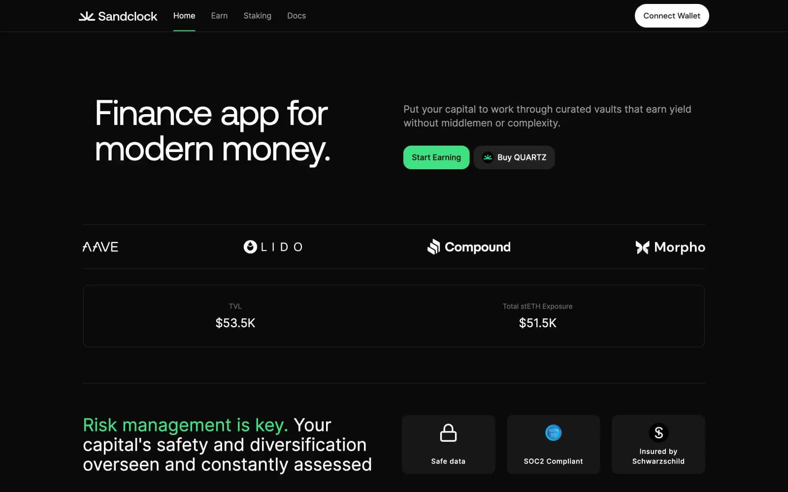
Sandclock
Crypto


