
Hyper Foundation. A deep forest vault where a single luminous mint glow breathes through organic, shadowed forms.
- Crypto
- Dark theme
- 10 colors
- 2 typefaces
Hyperliquid reads as a dark editorial cryptofinance environment: a deep forest-green canvas breathing with organic, softly glowing teal shapes that create depth without literal imagery. A single luminous mint accent provides all action, iconography, and typographic emphasis against the dark surface, producing a near-monochromatic palette where brightness is rationed as punctuation. Display headlines use a custom serif (Teodor) at 90px with tight 0.75 leading — an editorial, magazine-like gesture that contrasts with the lightweight Inter body text, which keeps a quiet conversational register. Pill-shaped controls at 60px radius are the primary interaction language, paired with generous negative space and a single signature mint-glow shadow that makes elevated surfaces feel like light sources rather than floating panels.

Hyper Foundation design system

Brand1
Green text accent for links, tags, and emphasized short phrases. Do not promote it to the primary CTA color
Accent1
Mid-saturation teal for SVG strokes, secondary decorative accents, hover/transition states between dark surface and mint highlight
Neutrals8
Page canvas, hero background, deep surface layer — the dominant dark field that everything else floats on
Decorative background blob — deepest atmospheric tint behind organic hero shapes
Primary text on canvas, strong borders, secondary surface tint — readable white-space-equivalent for dark mode
Subtle dividers and default 1px borders across cards, images, and icons — almost invisible on the dark canvas, used for structural quietness
Decorative mid-tone blob in the hero atmosphere, sits between canvas and surface
Elevated surface, card fills, subtle borders — one step lighter than the canvas for layer separation
Muted body text, secondary descriptions, captions — desaturated enough to recede behind the mint accent
Headline text on dark canvas, high-contrast text inside mint-filled buttons
Try a pairing
Pick any two colors from the palette to check whether text stays readable on top.
Aa
Forest Depths on Mint Glow
13.00 : 1 contrast
- Body textPasses AA 4.5
- Large textPasses AA 3
- StrictPasses AAA 7
More DESIGN.md files. Same web, different personalities.
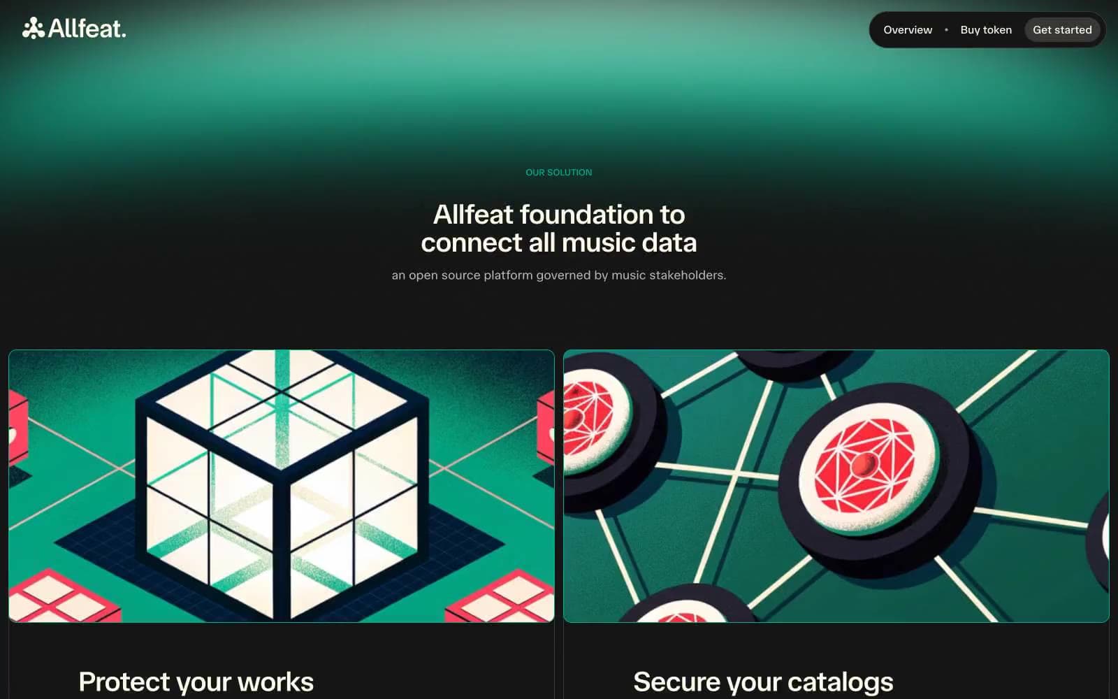
Allfeat
Crypto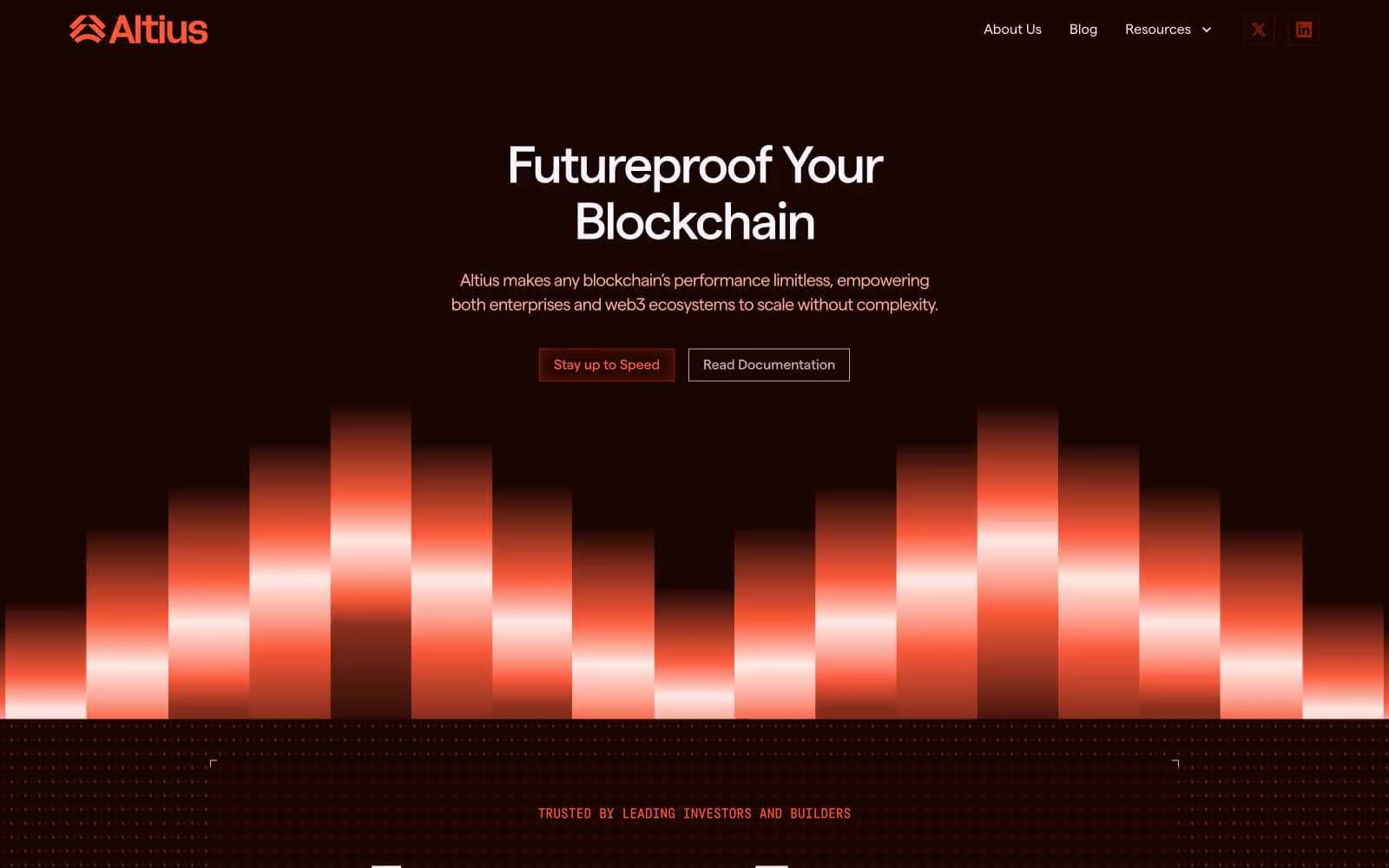
Altius
Crypto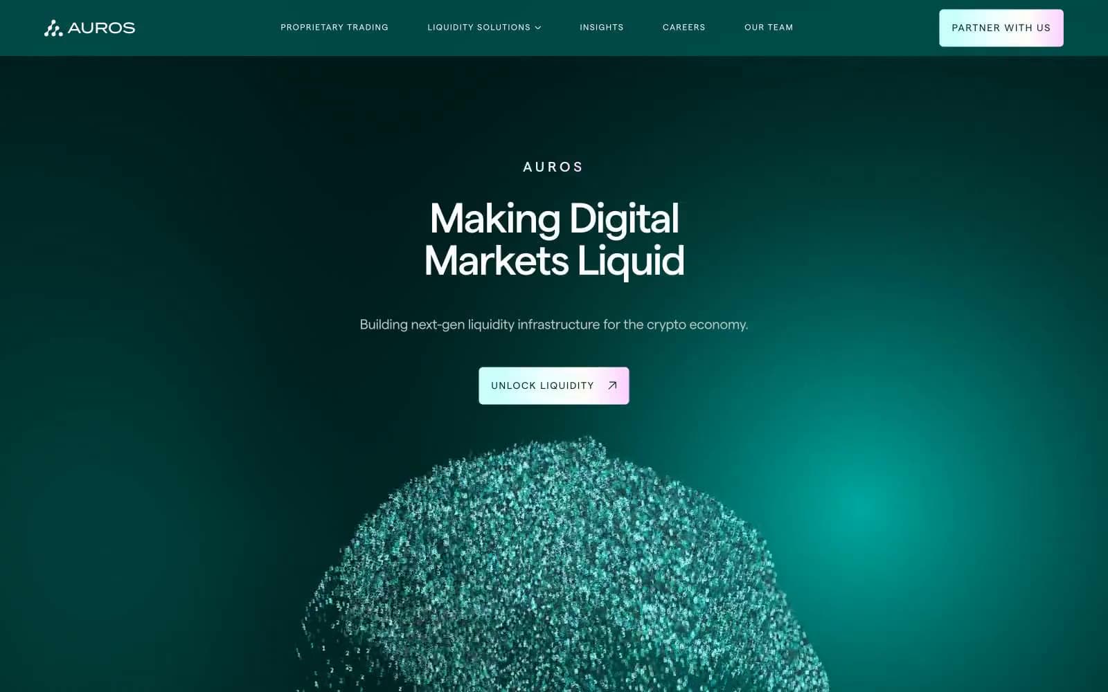
Auros
Crypto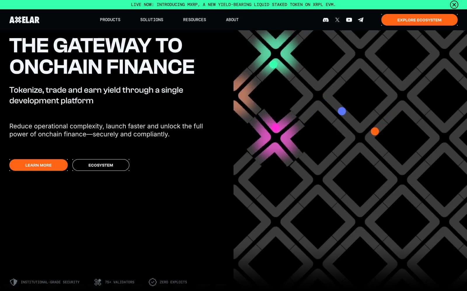
Axelar
Crypto
BitcoinOS
Crypto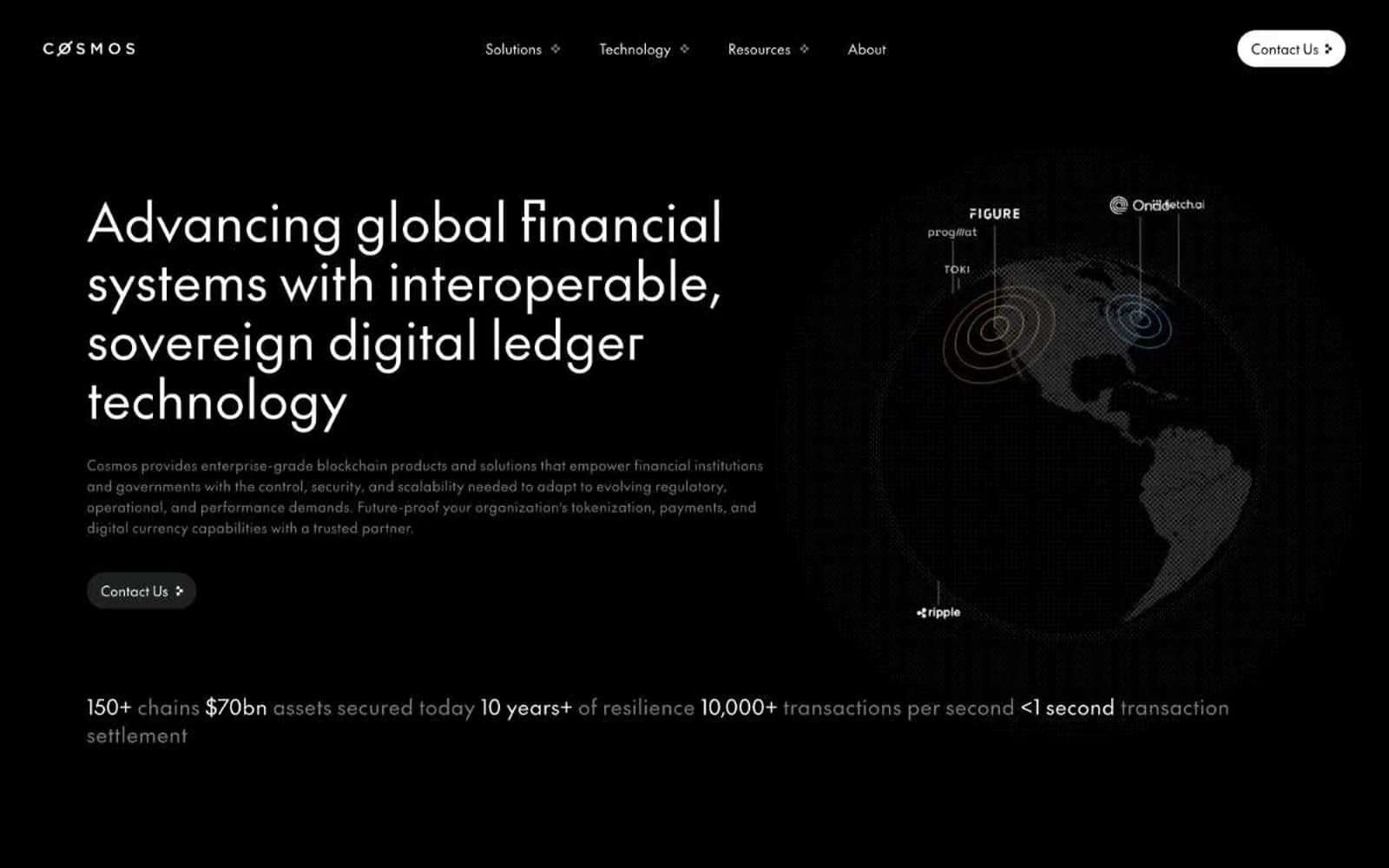
Cosmos Network
Crypto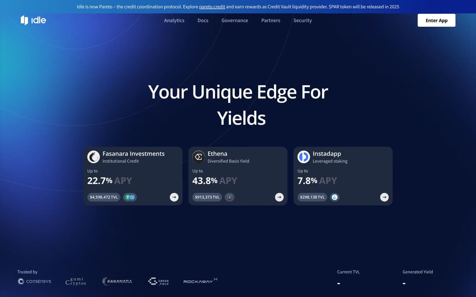
Idle Finance
Crypto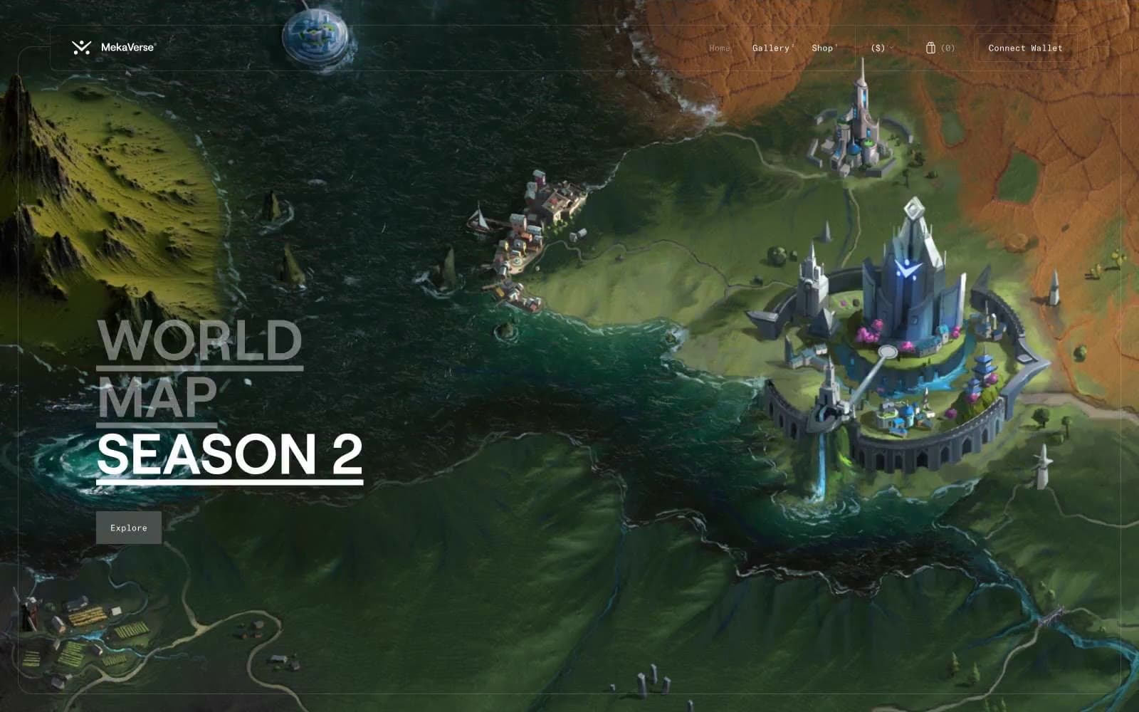
MekaVerse
Crypto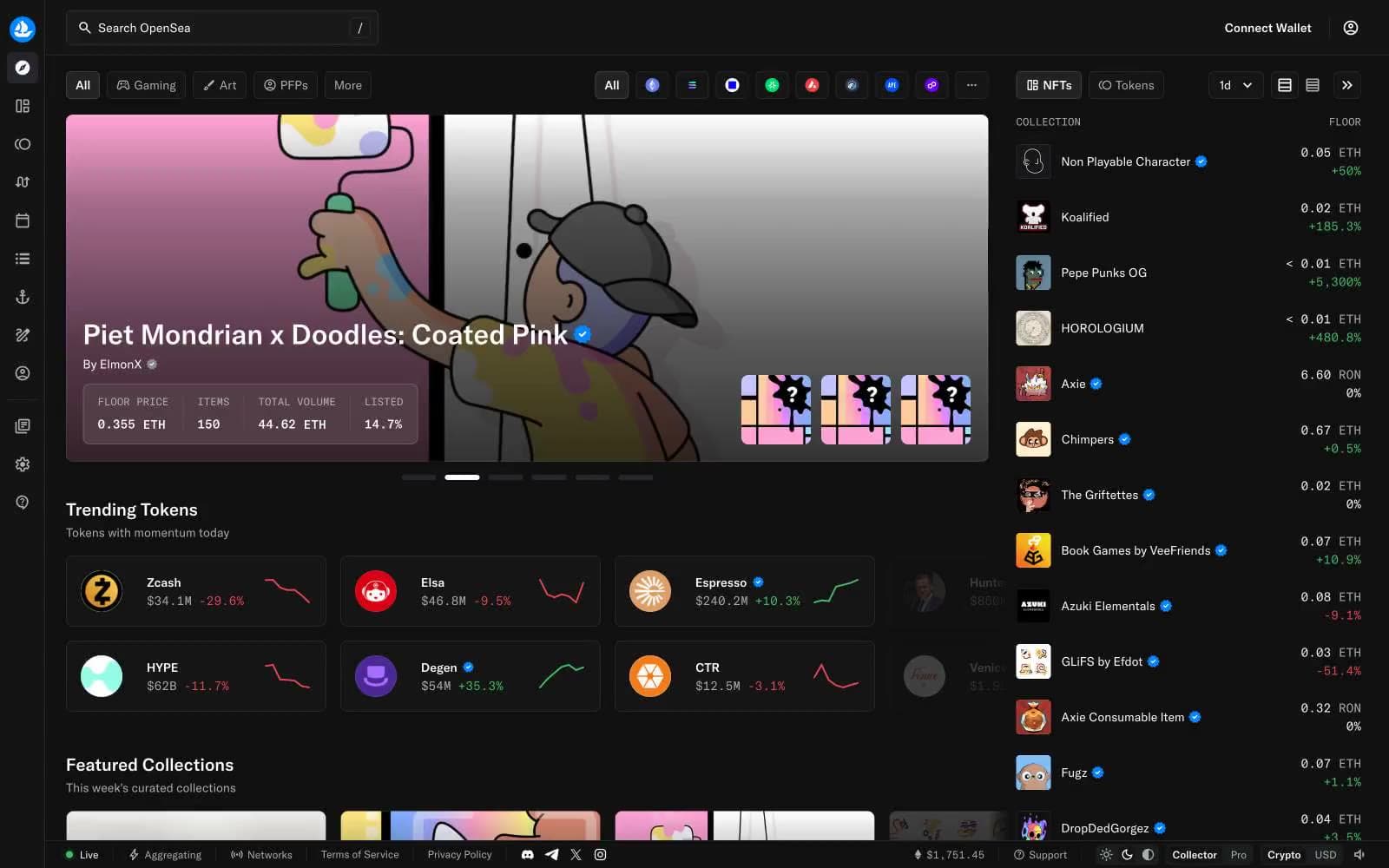
OpenSea
Crypto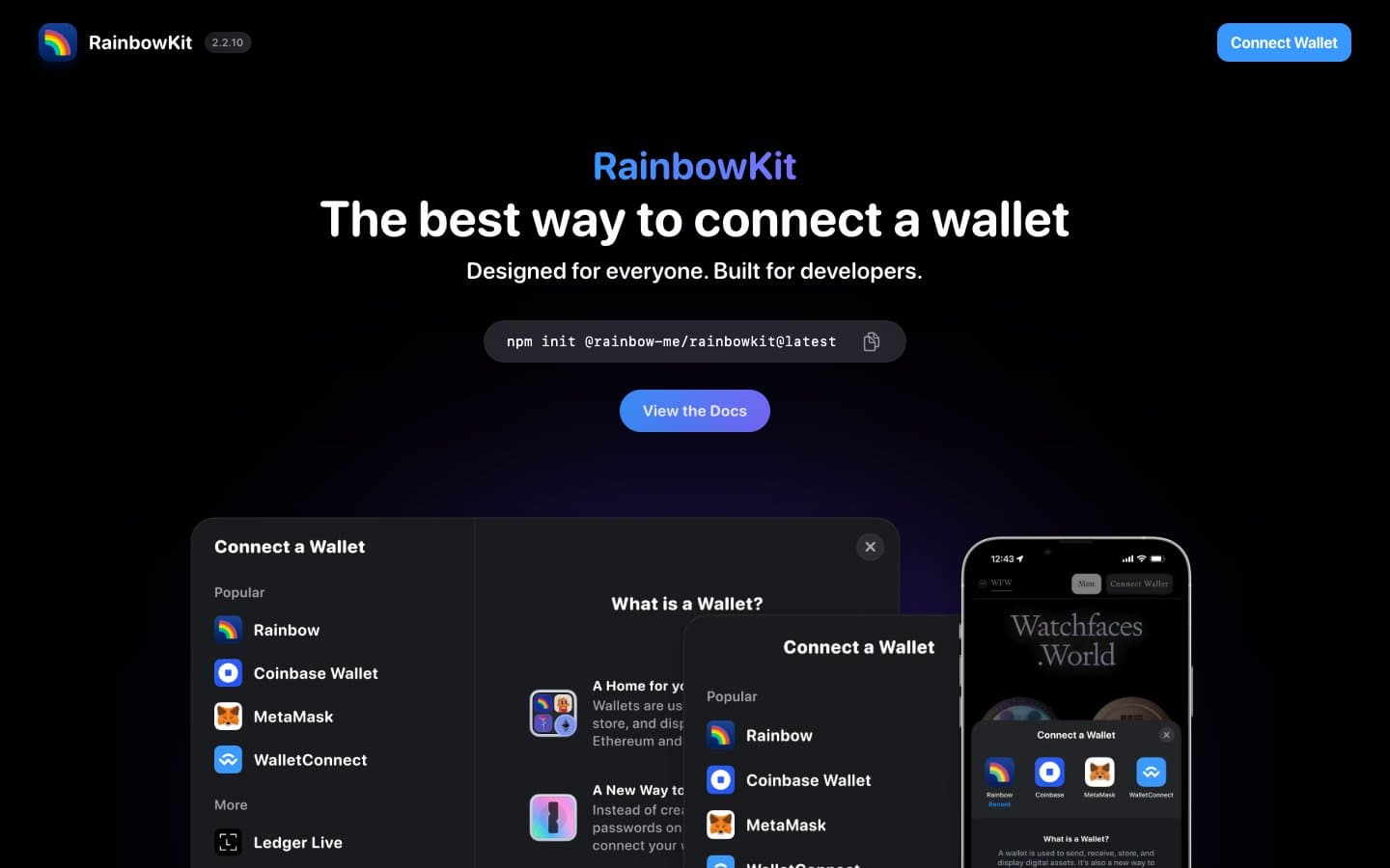
RainbowKit
Crypto
Safepal
Crypto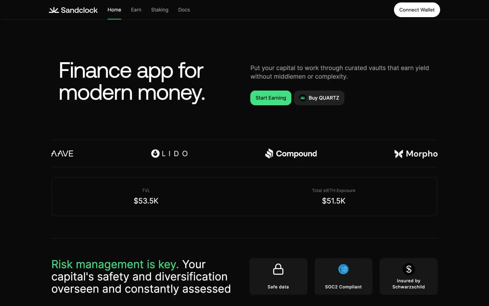
Sandclock
Crypto


