
Safepal. Electric violet cosmos with mint stars.
- Crypto
- Dark theme
- 8 colors
- 1 typeface
SafePal speaks in a cosmic violet vernacular: deep indigo canvases recede into atmospheric space while mint-green punctuation snaps focus back to the surface. The visual system rides on a vivid electric violet (#4a21ef) that saturates mid-page sections, paired with a luminous mint (#79efbd) that functions as the sole chromatic accent for headings, tags, and outlined action borders. Typography is monumental and assertive — the display headline at 80px with weight 800 demands ownership of the viewport, while body copy sits at a calm 16px. The 100px pill radius on buttons is the most recognizable shape signature, creating a soft contrast against the 24px card radius and the angular isometric illustrations of hardware wallets and phones that float in deep space. Surfaces stack from white cards over violet fields, with almost no shadows — depth is communicated through color contrast and illustrative floating elements rather than elevation.

Safepal design system

Brand2
Page backgrounds, section bands, gradient anchor — the dominant chromatic field that defines brand presence across mid-page sections; Hero atmospheric gradient bridging mint into violet — sets the cosmic mood
Headline text on violet fields, outlined action borders, pill button fills, accent highlights — the sole warm punctuation against the cool violet
Accent1
Green accent for outlined action borders, linked labels, and lightweight interactive emphasis. Use as a supporting accent, not as a status color
Neutrals5
Hero background, darkest surface layer, text on light surfaces, gradient terminus; Dark section backgrounds, depth gradient behind illustrations
Body text, heading text on light surfaces, high-contrast typography color
Muted body text, secondary labels, dividers, icon strokes at rest
Light card surfaces, subtle tints, nav backgrounds, gentle surface lift over white
Card surfaces, text on dark backgrounds, footer surfaces, badge fills
Try a pairing
Pick any two colors from the palette to check whether text stays readable on top.
Aa
Carbon on Mint Pulse
11.96 : 1 contrast
- Body textPasses AA 4.5
- Large textPasses AA 3
- StrictPasses AAA 7
More DESIGN.md files. Same web, different personalities.
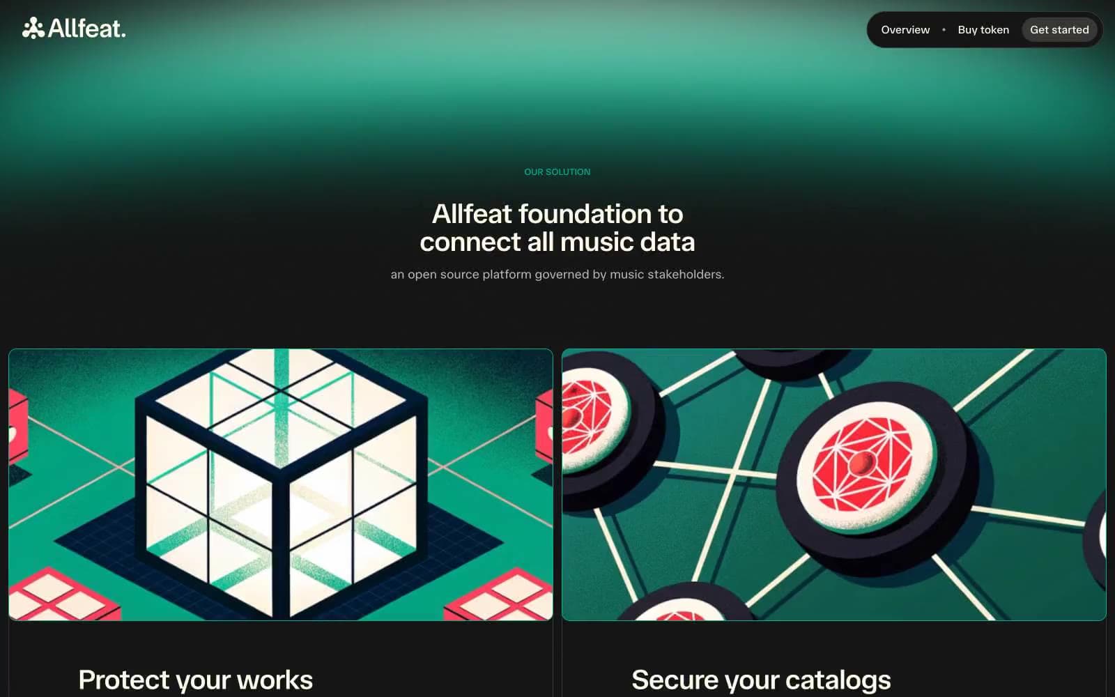
Allfeat
Crypto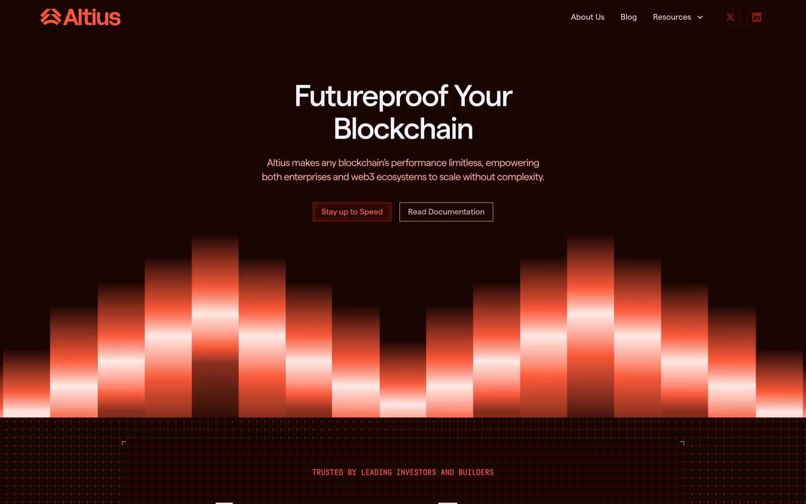
Altius
Crypto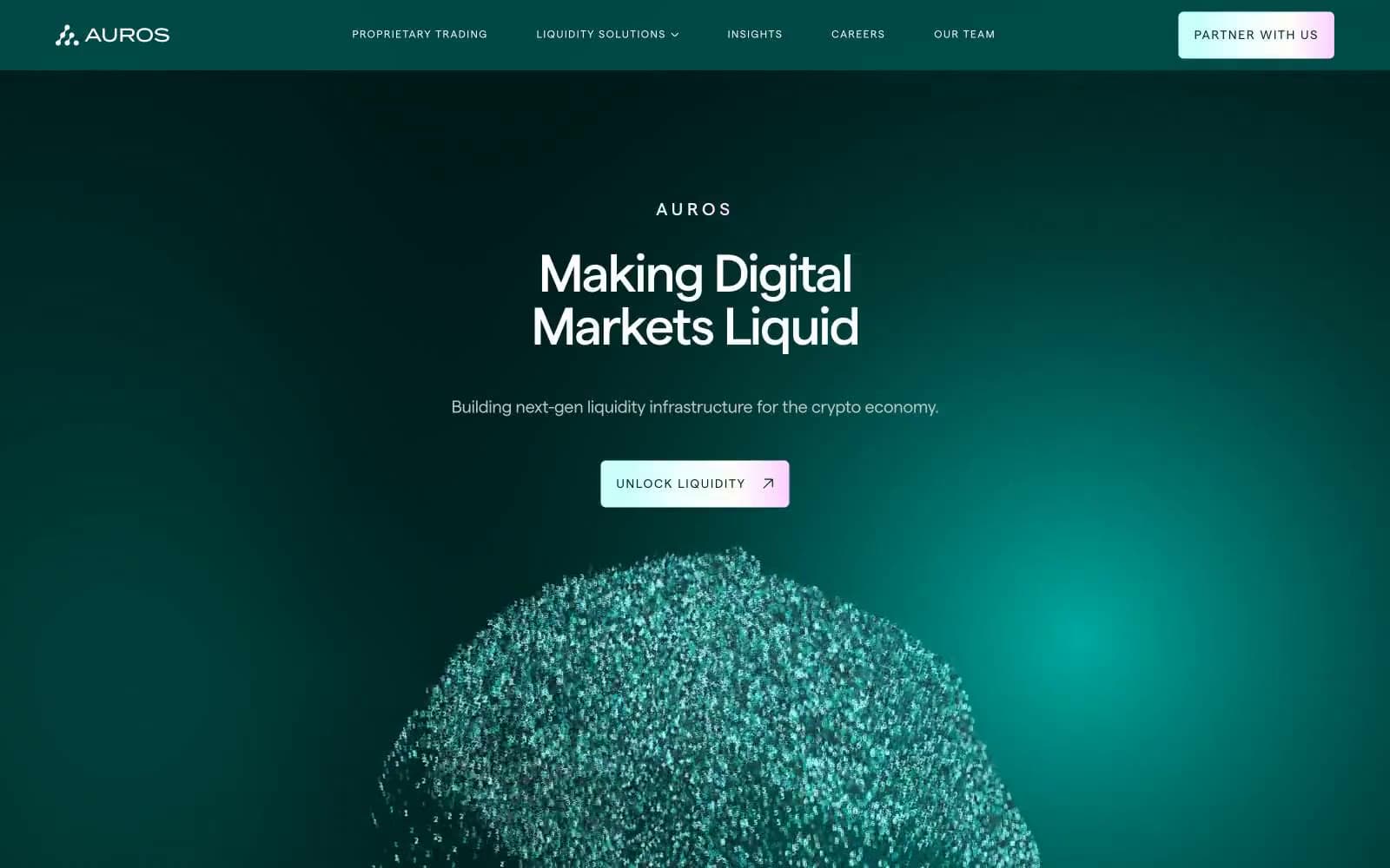
Auros
Crypto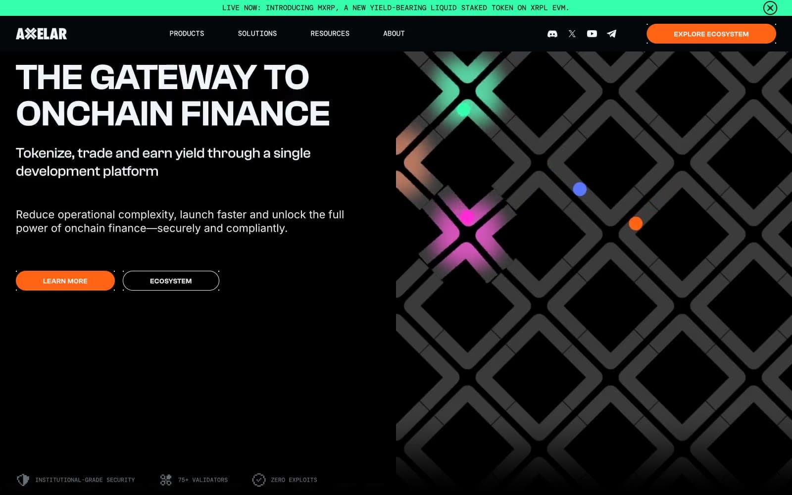
Axelar
Crypto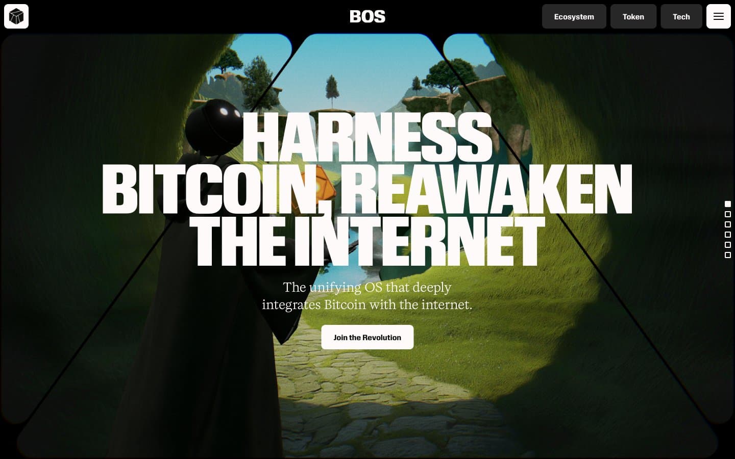
BitcoinOS
Crypto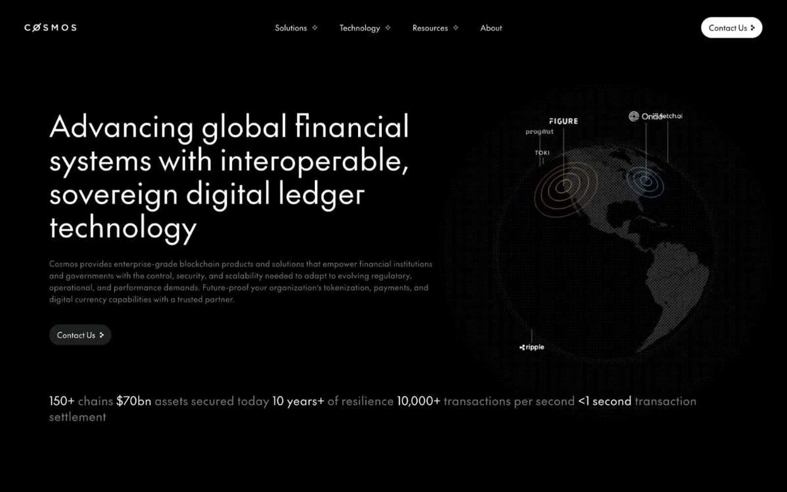
Cosmos Network
Crypto
Hyper Foundation
Crypto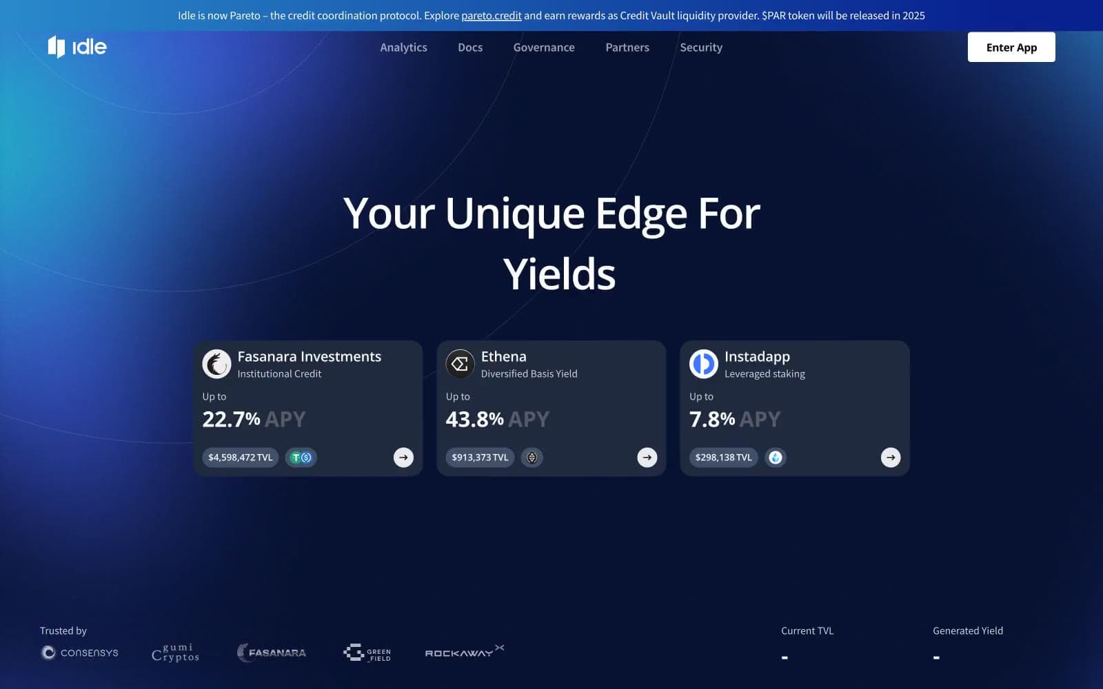
Idle Finance
Crypto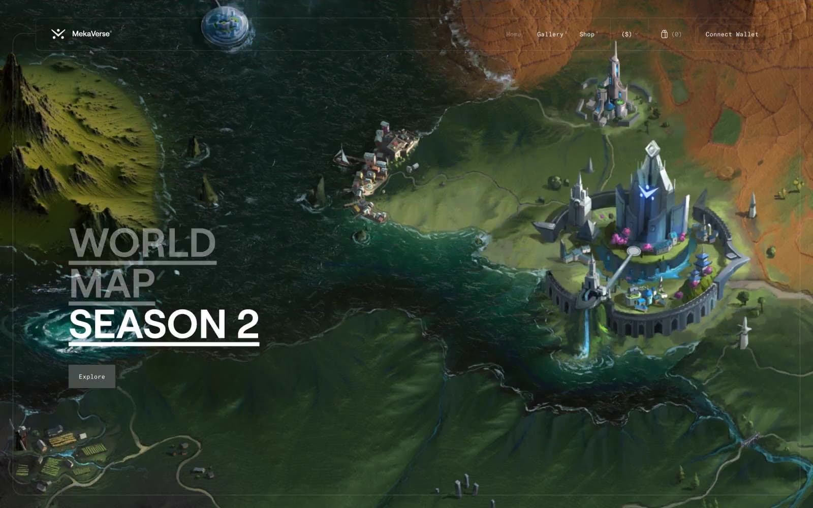
MekaVerse
Crypto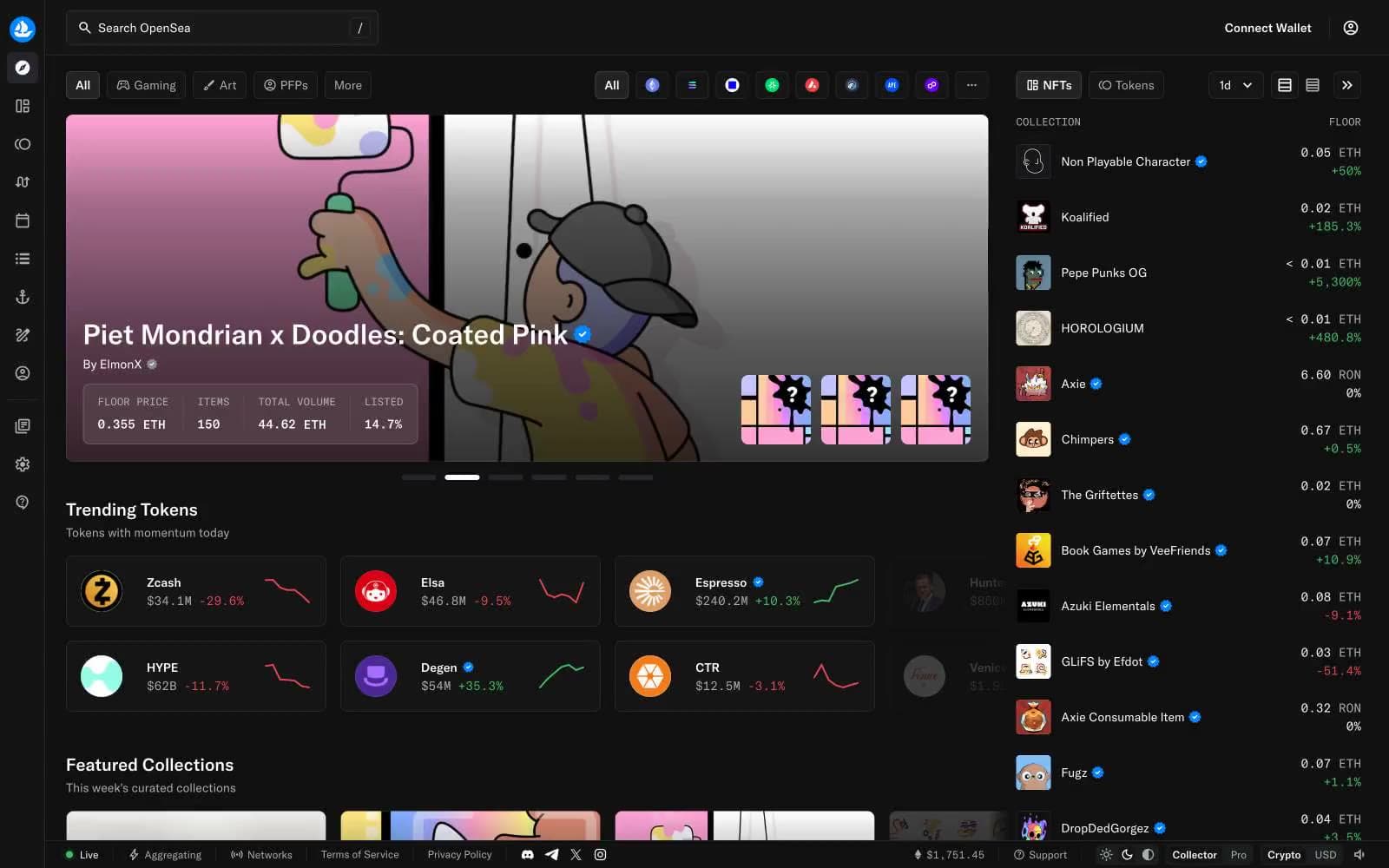
OpenSea
Crypto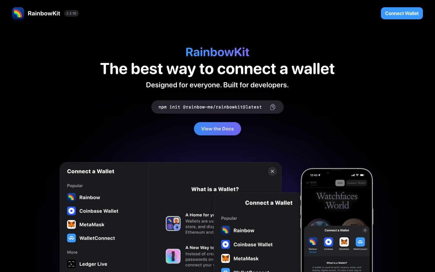
RainbowKit
Crypto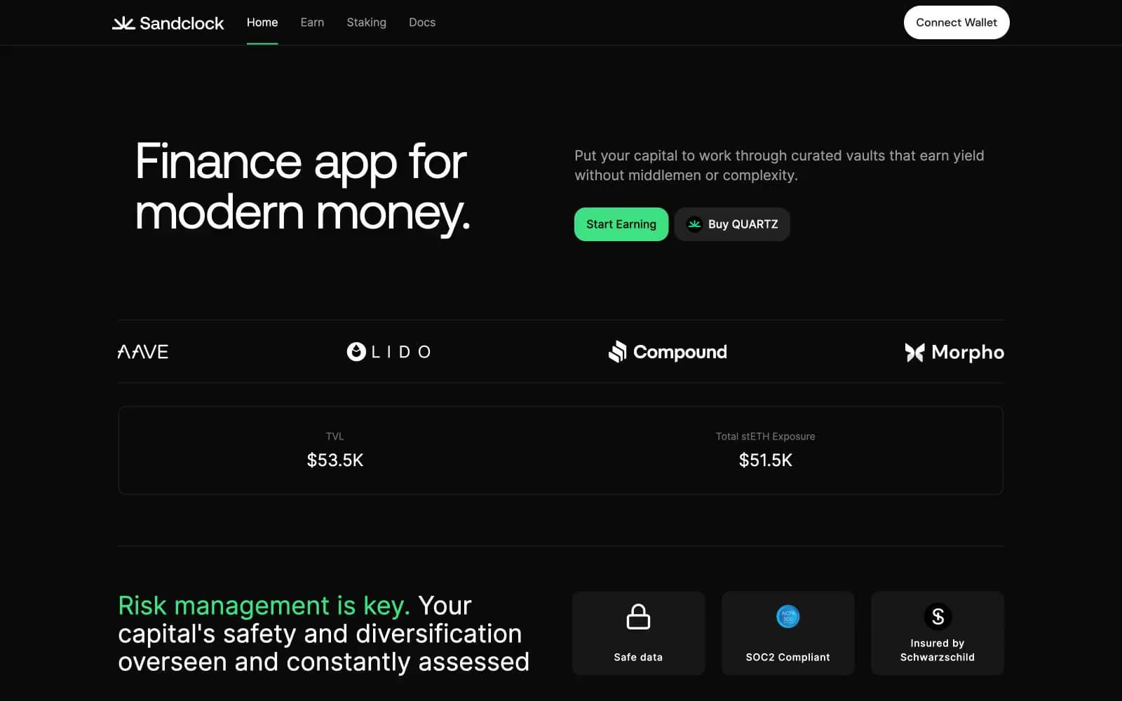
Sandclock
Crypto


