
Zed. Blueprint workshop, wide open.
- Developer tools
- Light theme
- 20 colors
- 4 typefaces
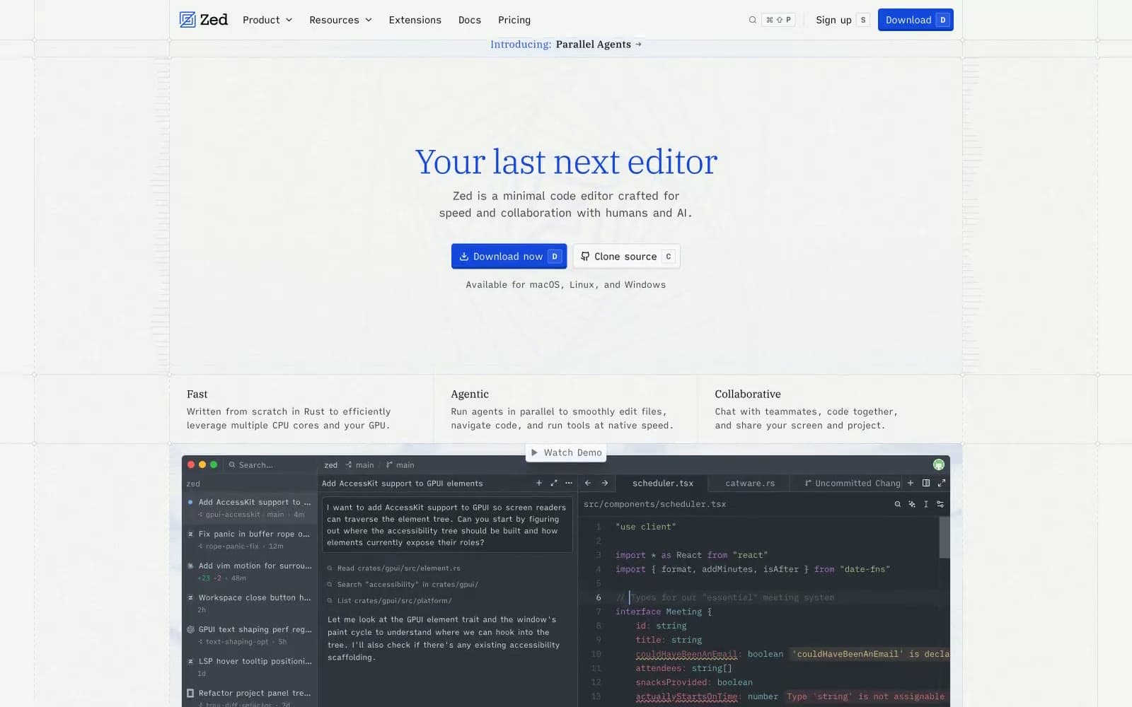
Zed reads as an open-source engineering notebook rendered on faint blueprint paper: a near-white grid canvas, a single deep violet-blue that carries every heading and link, and product chrome that stays almost entirely text and hairline borders. Typography is the personality — a humanist serif (Plex Serif) for headlines at surprisingly light weights (340), a custom Writer sans for UI and body, and a wide-tracked mono (Zed Mono) for labels and shortcuts. Components are sharp-cornered (2px radius), compact (6px gaps), and almost shadowless; structure is implied by 1px inset top-borders and the faint dotted grid beneath everything. The download CTA is the only saturated fill on the page, and surrounding it everything stays quiet, typographic, and editorial — closer to a technical whitepaper than a SaaS landing page.
Zed design system

Brand4
Headlines, primary text links, brand mark — the single chromatic anchor that carries identity across the page
Blue supporting accent for decorative details and low-frequency emphasis. Do not promote it to the primary CTA color
Blue supporting accent for decorative details and low-frequency emphasis. Do not promote it to the primary CTA color
Hairline blue borders, tag outlines, divider lines that need to read as on-brand rather than neutral
Accent3
Icon strokes, secondary blue text, nav active markers — cool blue for chrome, not headlines
Subtle background tints behind selected nav, soft blue drop-shadow tint, hover wash
Pressed-state inset shadow and the deepest brand blue — appears only as a 2px inset top line on active nav items
Neutrals13
Dark editor preview surface, code block backgrounds
Dark surface variant for framed code/editor insets
Primary body and heading text, logo lockup color
Strong body text, button text on light fills, dark UI labels
Secondary text, nav labels, supporting copy
Tertiary text, muted helper copy, disabled labels
Muted icons, placeholder strokes, very low-emphasis UI
Muted text, icon outlines, very low-contrast labels
Light borders, input borders at rest, disabled surfaces
Hairline dividers between rows, subtle background fills
Page canvas, dominant border color, the faint grid lines — the workhorse neutral that holds the system together
Warm white surface variant, image backings, slightly creamier than Pure White
Card surfaces, editor preview frames, raised content panels sitting on the Silver Mist canvas
Try a pairing
Pick any two colors from the palette to check whether text stays readable on top.
Aa
Pure White on Hero Violet
7.03 : 1 contrast
- Body textPasses AA 4.5
- Large textPasses AA 3
- StrictPasses AAA 7
More DESIGN.md files. Same web, different personalities.

Tailwind CSS
Developer tools
Atoms
Developer tools
Browserbase
Developer tools
Cursor
Developer tools
Deno
Developer tools
Drizzle ORM
Developer tools
Earlydog
Developer tools
Expo
Developer tools
Fingerprint
Developer tools
Flatfile
Developer tools
Flox
Developer tools
Fly.io
Developer tools


