
Flatfile. Quiet data journal on warm parchment.
- Developer tools
- Light theme
- 12 colors
- 6 typefaces
Flatfile presents a quiet, editorial design system on warm parchment — the entire canvas carries a faint cream-green wash rather than stark white, making data tooling feel like reading a printed report. The primary chromatic is a near-black midnight violet (#090b2b) that carries all headings, brand marks, and emphasis, while interactions are anchored by a single near-black pill button (#151515) and a single warm sage secondary button (#e5ebd3). Structure is built almost entirely from hairline #e5e7eb rules — there is barely a shadow in the system, and depth is achieved through surface shifts between #f8f8f8 card layers and the #e5ebd3 hero wash rather than elevation. Typography leans editorial: a geometric humanist sans (Flatfile Diatype) does all UI work, while Source Serif 4 enters exclusively for customer quotes, giving testimonials a printed-publication feel that contrasts with the data-product UI.

Flatfile design system

Brand1
Primary brand color for headings, logo, emphasized text, nav labels, and icon strokes — a near-black with a faint violet cast that reads as ink rather than pure black against the cream canvas
Accent1
Warm sage-cream wash used as the hero background and as the secondary button fill — gives the page its printed-paper atmosphere
Neutrals10
Dark elevated surface for cards, headers, and contained panels. Do not promote it to the primary CTA color
Primary body and heading text, dark card fills, and icon fills — the workhorse near-black with the faintest cool cast
Secondary dark surfaces and muted borders for inverted panels
Mid-gray for supporting UI marks, icon fills, and medium borders
Default link and breadcrumb text color, distinct from body text gray
Lighter mid-gray for tertiary text, placeholder copy, and decorative fills
Subtle border tone for ghost controls and quiet dividers
The system's structural hairline — dominant border, divider, and table-rule color across every layout context
Card and elevated surface background — one step off the page to create depth without shadows
Pure white reserved for inverted buttons, tag chips, and high-contrast list items where Mist would be too muted
Try a pairing
Pick any two colors from the palette to check whether text stays readable on top.
Aa
Paper on Midnight Ink
19.19 : 1 contrast
- Body textPasses AA 4.5
- Large textPasses AA 3
- StrictPasses AAA 7
More DESIGN.md files. Same web, different personalities.

Tailwind CSS
Developer tools
Atoms
Developer tools
Browserbase
Developer tools
Cursor
Developer tools
Deno
Developer tools
Drizzle ORM
Developer tools
Earlydog
Developer tools
Expo
Developer tools
Fingerprint
Developer tools
Flox
Developer tools
Fly.io
Developer tools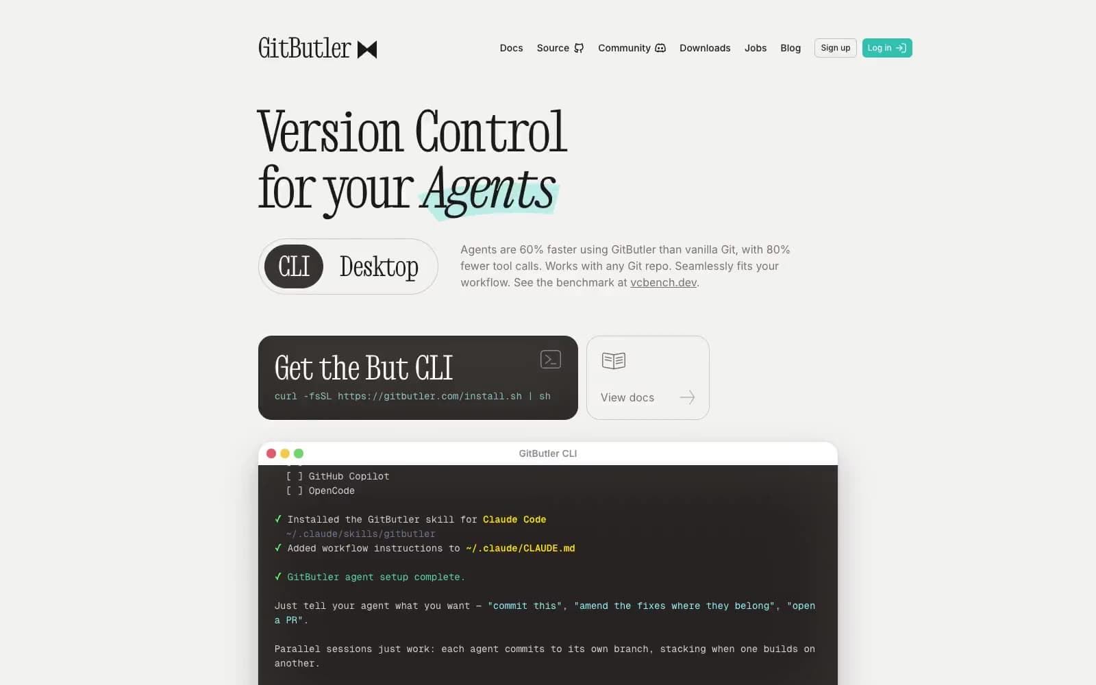
GitButler
Developer tools


