
Drizzle ORM. A clean developer workbench where ink-blue notes float over monochrome code, with little raindrop creatures as the only witnesses.
- Developer tools
- Light theme
- 15 colors
- 5 typefaces
Drizzle ORM presents as a quiet code workshop: a near-monochrome canvas where dark slate text sits on warm-white surfaces, with electric blue appearing only where intention demands it — in handwritten annotations sketched over the page, in performance graphs, and in the occasional code link. The visual language is deliberately restrained but not sterile: raindrop mascots and hand-drawn notes inject personality into an otherwise terminal-like layout, giving the interface a workbench feel rather than a polished marketing surface. Components stay compact and information-dense — thin borders at 8px radius, code blocks that look pasted from a real terminal, and cards that hold metrics rather than decoration. Color is rationed: two near-grays for text layers, one border gray, one bright blue, and the rest is whitespace and charts.

Drizzle ORM design system

Accent2
Handwritten annotations overlaid on headlines, heading-level emphasis, brand voice. The single saturated color in the system; its scarcity makes it feel like a marker pen picked up to circle something important
Blue supporting accent for decorative details and low-frequency emphasis. Do not promote it to the primary CTA color
Neutrals13
Maximum-contrast emphasis on icons and small inline marks where Slate is too soft
Primary body and heading text. Off-black with a hair of warmth so long passages never feel like printed laser output
High-density text color across the interface — appears in button labels, icon strokes, and link copy. The workhorse dark tone that carries most interface chrome
Muted headings and subdued text — used where you need emphasis over Ink but don't want true black. Pairs with borders
Secondary body text, list items, paragraph copy. One step lighter than Ink for hierarchy without changing weight
Icon strokes at rest, tertiary metadata, badge text. Cool enough to recede behind primary content
Hairline metadata, timestamps, count badges — present but not demanding attention
Placeholder text, disabled labels, the softest readable gray before content disappears
Image and screenshot frame borders, slightly cooler than Pebble to distinguish illustrated content blocks from UI borders
The system border color — dividers, input outlines, card edges, button outlines. This is the most-used neutral after Ink and carries structural separation across the layout
Tag and badge fills where a colored surface is too loud but Paper reads as unstyled
First surface step down from Paper — subtle panels, code-block fills, button hover grounds. Warm enough to read as intentional, not gray-by-default
Page canvas, card surfaces, input fields. The default light surface for every elevated component
Try a pairing
Pick any two colors from the palette to check whether text stays readable on top.
Aa
Pure Black on Electric Cobalt
5.50 : 1 contrast
- Body textPasses AA 4.5
- Large textPasses AA 3
- StrictFails AAA 7
More DESIGN.md files. Same web, different personalities.

Tailwind CSS
Developer tools
Atoms
Developer tools
Browserbase
Developer tools
Cursor
Developer tools
Deno
Developer tools
Earlydog
Developer tools
Expo
Developer tools
Fingerprint
Developer tools
Flatfile
Developer tools
Flox
Developer tools
Fly.io
Developer tools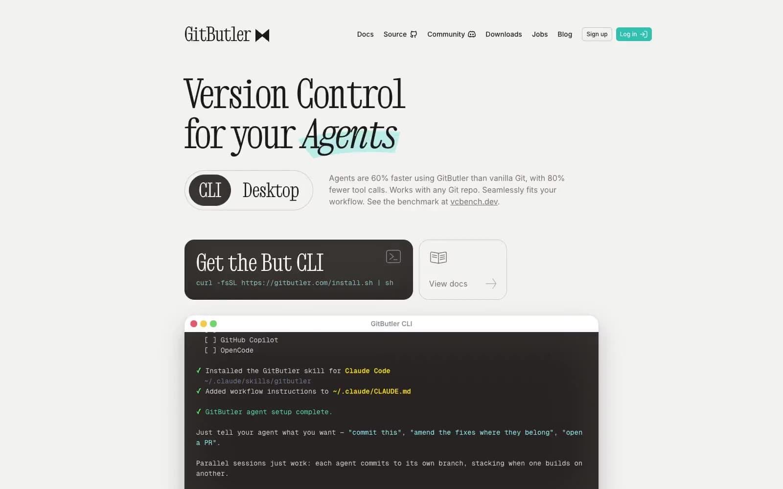
GitButler
Developer tools


