
Expo. Every control a rounded chip, every screen a quiet page of ink and paper until blue says "look here.".
- Developer tools
- Light theme
- 8 colors
- 1 typeface
Expo is a precision instrument for developers: near-monochrome canvas, generous pill-shaped radii, and a single signal-blue accent that lights up only when something matters. The visual language is text-first and utilitarian — Inter handles everything from UI labels to documentation prose, with weight doing the hierarchy work instead of size or color. Surfaces stay flat; separation comes from hairline borders and tonal steps in a narrow gray scale rather than shadows or gradients. Every interactive element leans toward the round — buttons, nav items, and tags all use 24-36px radii — making the UI feel softer than its developer-tool audience would expect. Color is rationed: near-black ink, three grays, white canvas, and one electric blue for the moments that need to register.

Expo design system

Accent2
Blue supporting accent for decorative details and low-frequency emphasis. Do not promote it to the primary CTA color
Darker accent variant for pressed/active states, gradient endpoints, and focused accent surfaces
Neutrals6
Supporting neutral for secondary UI, dividers, and muted labels. Do not promote it to the primary CTA color
Secondary body text, muted descriptions, secondary button text, icon strokes, inactive nav labels
Tertiary text, disabled states, subtle icon strokes, low-emphasis metadata
Hairline borders, subtle dividers, outlined button borders
Elevated surface wash, subtle background tints, nav hover surfaces
Page background, card surfaces, button text on filled dark buttons
Try a pairing
Pick any two colors from the palette to check whether text stays readable on top.
Aa
Ink on Signal Blue
5.02 : 1 contrast
- Body textPasses AA 4.5
- Large textPasses AA 3
- StrictFails AAA 7
More DESIGN.md files. Same web, different personalities.

Tailwind CSS
Developer tools
Atoms
Developer tools
Browserbase
Developer tools
Cursor
Developer tools
Deno
Developer tools
Drizzle ORM
Developer tools
Earlydog
Developer tools
Fingerprint
Developer tools
Flatfile
Developer tools
Flox
Developer tools
Fly.io
Developer tools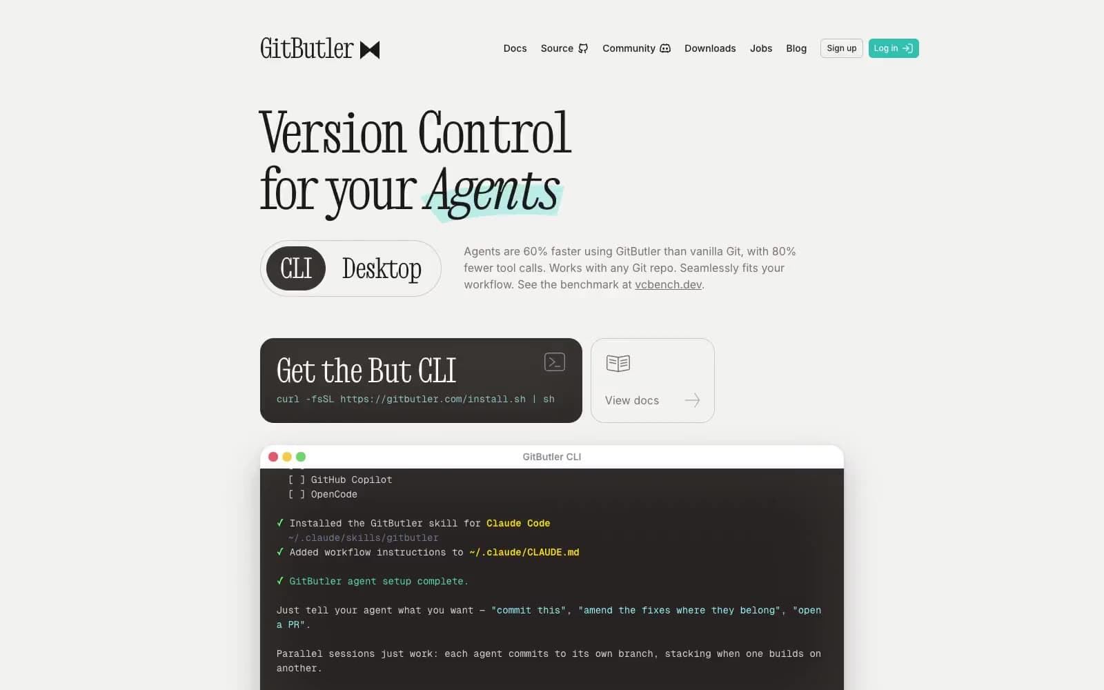
GitButler
Developer tools


