
Deno. A developer reading desk under daylight.
- Developer tools
- Light theme
- 20 colors
- 4 typefaces
Deno's interface is a bright, editorial devtool surface — near-white canvas, dense information blocks, and a single electric mint accent that punctuates an otherwise monochrome layout. Typography is bold and utilitarian: Moranga at display sizes carries weight 700 with tight tracking, while Inter handles body and UI at comfortable sizes with slightly negative letter-spacing. Cards sit flat on the canvas with hairline borders and one soft shadow tier; the 6px radius is the geometric constant, with full-pill used sparingly for tags and install-pills. The install command is the brand's signature surface — a code bar wrapped in a conic mint gradient that makes the copy glow as if backlit.

Deno design system

Brand1
Brand accent — stat labels, badge fills, primary highlight surface, install-pill glow; the single chromatic note that makes the monochrome system feel switched on
Accent7
Secondary highlight — small emphasis marks, version badges, accent dots
Blue supporting accent for decorative details and low-frequency emphasis. Do not promote it to the primary CTA color
Tinted background for blue-accented panels and muted blue surfaces
Green supporting accent for decorative details and low-frequency emphasis. Use as a supporting accent, not as a status color
Red supporting accent for decorative details and low-frequency emphasis. Use as a supporting accent, not as a status color
Violet supporting accent for decorative details and low-frequency emphasis. Use as a supporting accent, not as a status color
Blue supporting accent for decorative details and low-frequency emphasis. Use as a supporting accent, not as a status color
Neutrals12
Primary headings and body text — near-black with a faint cool tint that reads as black at any size
Deepest dark fill for primary CTAs and nav inversion
Supporting neutral for secondary UI, dividers, and muted labels. Do not promote it to the primary CTA color
Secondary headings and muted emphasis
Muted body text, helper labels, disabled copy
Tertiary text and nav idle state
De-emphasized labels and idle borders
Cool-tinted secondary text and icon fills
Cool dividers, section borders, subtle structural lines
Hairline borders, card edges, table separators — the dominant structural divider
Page background, hero canvas, alternating section bands
Card surfaces, elevated panels, code-block backgrounds
Try a pairing
Pick any two colors from the palette to check whether text stays readable on top.
Aa
Inkstone on Electric Mint
15.21 : 1 contrast
- Body textPasses AA 4.5
- Large textPasses AA 3
- StrictPasses AAA 7
More DESIGN.md files. Same web, different personalities.

Tailwind CSS
Developer tools
Atoms
Developer tools
Browserbase
Developer tools
Cursor
Developer tools
Drizzle ORM
Developer tools
Earlydog
Developer tools
Expo
Developer tools
Fingerprint
Developer tools
Flatfile
Developer tools
Flox
Developer tools
Fly.io
Developer tools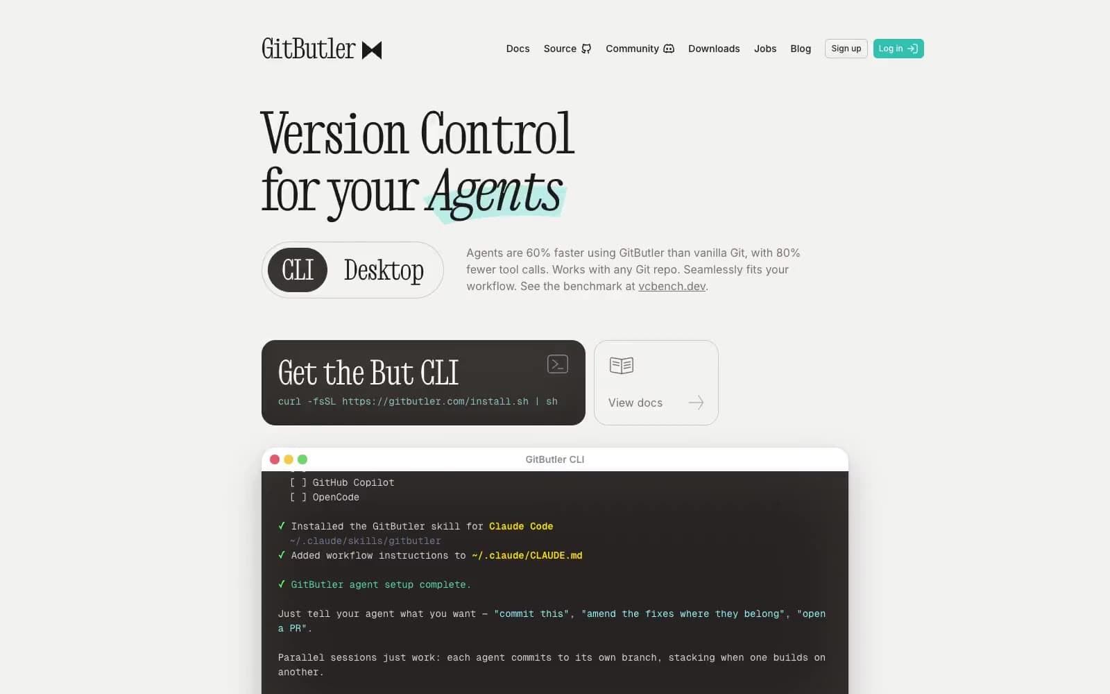
GitButler
Developer tools


