
Flox. Terminal at sunrise, violet glow.
- Developer tools
- Light theme
- 10 colors
- 2 typefaces
Flox is a precision-instrument developer environment: a white canvas, near-black graphite text, and a single violet-to-pink gradient that ignites only where the system wants to be noticed. The product vocabulary borrows from terminals — code blocks, mono accents, sparkles as punctuation — wrapped in generous display typography that makes infrastructure feel like a product launch. Color is rationed: most surfaces stay achromatic; the gradient appears on the primary CTA and as decorative sparkle accents, while category icons (violet, orange, pink) segment the audience without competing for hierarchy. Components are compact and confident — 6px button radii, 12px card radii, hairline #e2e8f0 borders — letting content do the talking rather than chrome.

Flox design system

Brand2
Supporting palette color for small decorative accents when the core palette needs contrast. Do not promote it to the primary CTA color
Supporting palette color for small decorative accents when the core palette needs contrast. Do not promote it to the primary CTA color
Accent2
Supporting palette color for small decorative accents when the core palette needs contrast.
Red text accent for links, tags, and emphasized short phrases.
Neutrals6
Primary text, headings, nav links, list markers — near-black with a faint cool cast gives ink-like density without the harshness of pure #000
High-contrast neutral action fill for primary buttons on light surfaces.
Secondary text, monospace body fills, subtle iconography — slightly warmer than graphite for code and terminal contexts
Borders, dividers, card outlines, image frames — the workhorse neutral that defines structural edges across every surface
Subtle surface lift, ghost button borders, soft section backgrounds — the second tier above pure white
Page canvas, card surfaces, text on dark fills — the base layer everything sits on
Try a pairing
Pick any two colors from the palette to check whether text stays readable on top.
Aa
Paper White on Iris Glow
4.89 : 1 contrast
- Body textPasses AA 4.5
- Large textPasses AA 3
- StrictFails AAA 7
More DESIGN.md files. Same web, different personalities.

Tailwind CSS
Developer tools
Atoms
Developer tools
Browserbase
Developer tools
Cursor
Developer tools
Deno
Developer tools
Drizzle ORM
Developer tools
Earlydog
Developer tools
Expo
Developer tools
Fingerprint
Developer tools
Flatfile
Developer tools
Fly.io
Developer tools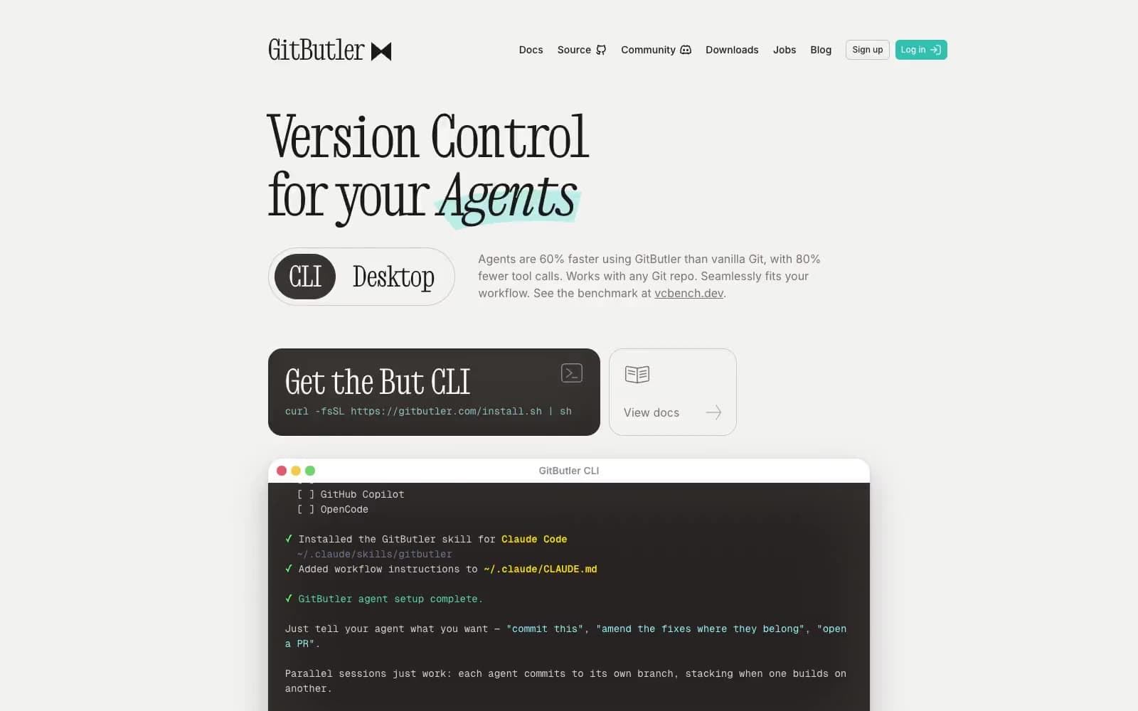
GitButler
Developer tools


