
Cursor. Warm parchment atelier lit by embers.
- Developer tools
- Light theme
- 13 colors
- 6 typefaces
Cursor uses a warm parchment editorial language: cream canvas, ink-black text, and a single ember-orange accent that activates links and emphasis rather than filling buttons. Headlines whisper at weight 400 in CursorGothic with progressively tighter tracking as size grows — authority comes from restraint and letter-tightening, never from bold weight. Surfaces stay flat and paper-like with hairline borders and soft warm-gray shadows; corners stay sharp at 4px throughout. EB Garamond appears selectively for editorial subheadings and prose, and berkeleyMono handles code, labels, and metadata, giving the system a typographic personality that feels closer to a literary journal than a SaaS dashboard.

Cursor design system

Accent5
Orange text accent for links, tags, and emphasized short phrases. Do not promote it to the primary CTA color
Warm action button fill (Build, Continue) and accent icon strokes — earthy companion to ember, used in product UI chrome
Green action color for filled buttons, selected navigation states, and focused conversion moments. Use as a supporting accent, not as a status color
Green text accent for links, tags, and emphasized short phrases. Use as a supporting accent, not as a status color
Red text accent for links, tags, and emphasized short phrases. Use as a supporting accent, not as a status color
Neutrals8
Primary text, primary action button background, nav text — warm-tinted near-black, never pure #000
Icon fills, tertiary body text, subdued UI labels — the workhorse muted tone
Secondary body text, table content — quieter than primary ink
Tertiary helper text, captions — between muted and secondary
Hairline borders, dividers, subtle separators — warm-tinted 1px rules
Light neutral action fill for buttons on dark surfaces.
Card surfaces and elevated containers — one step darker than canvas, creates paper-on-paper layering without borders
Page background, primary canvas — warm cream that softens contrast and makes ink feel printed rather than digital
Try a pairing
Pick any two colors from the palette to check whether text stays readable on top.
Aa
#111111 on Ember
5.37 : 1 contrast
- Body textPasses AA 4.5
- Large textPasses AA 3
- StrictFails AAA 7
More DESIGN.md files. Same web, different personalities.

Tailwind CSS
Developer tools
Atoms
Developer tools
Browserbase
Developer tools
Deno
Developer tools
Drizzle ORM
Developer tools
Earlydog
Developer tools
Expo
Developer tools
Fingerprint
Developer tools
Flatfile
Developer tools
Flox
Developer tools
Fly.io
Developer tools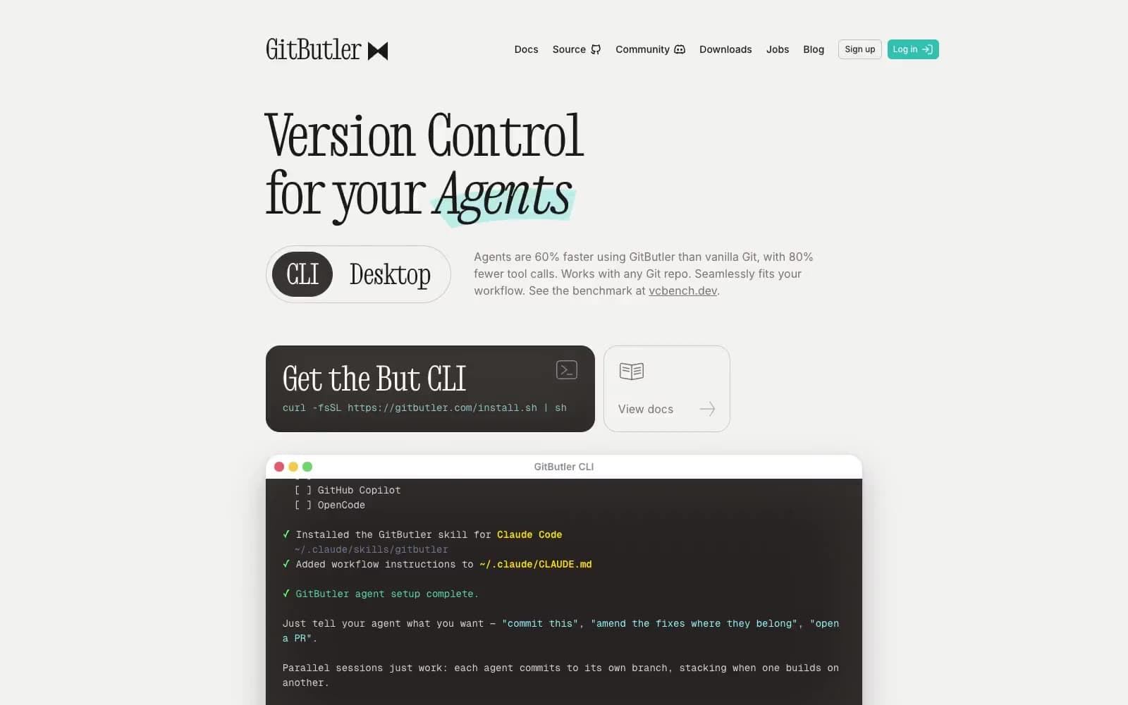
GitButler
Developer tools


