
Fingerprint. A fraud-detection lab notebook where code blocks are the main characters.
- Developer tools
- Light theme
- 24 colors
- 2 typefaces
Fingerprint reads as a developer tool that has been deliberately warmed up: a cream-paper canvas (#fafaf8) sits beneath sharp black type, a single vivid orange (#f35b22) does the work of a highlighter on key nouns, and the rest of the accent palette is borrowed from an IDE — teal, blue, pink, green as code-syntax tokens. Surfaces are flat with hairline borders; elevation is whispered, not announced. The hero alternates between editorial typography (Inter, tight tracking) and a dark CRT-style terminal panel, establishing a two-mode visual rhythm: light prose, dark code. Orange never decorates — it annotates, turning one word per headline into a call-to-action, and turning the primary button into the only filled rectangle on the page.

Fingerprint design system

Brand6
Orange supporting accent for decorative details and low-frequency emphasis. Do not promote it to the primary CTA color
Hover state for Signal Orange, secondary highlight orange for icons and micro-emphasis
Lighter orange for inline links, secondary text accents, and warm icon strokes
Deep orange for borders on featured elements, hover borders, and dark-mode accent strokes
Darkest orange for high-contrast text accents on light surfaces and breadcrumb separators
Pale orange wash for decorative borders and soft highlight backgrounds
Accent7
IDE syntax-highlight color for strings and identifiers in code blocks — repeated at scale gives the page its terminal texture
IDE syntax-highlight for keys, booleans, and object properties in code blocks
IDE syntax-highlight for keywords and function names in code blocks
Green supporting accent for decorative details and low-frequency emphasis. Use as a supporting accent, not as a status color
Green supporting accent for decorative details and low-frequency emphasis. Use as a supporting accent, not as a status color
Red supporting accent for decorative details and low-frequency emphasis. Use as a supporting accent, not as a status color
Red supporting accent for decorative details and low-frequency emphasis. Use as a supporting accent, not as a status color
Neutrals11
Primary headings, body text, and the near-black terminal panel background
Dark elevated surfaces for code blocks and terminal mockups
Secondary text, button text on light backgrounds, icon strokes
Muted helper text and meta-information
Tertiary captions, timestamps, inactive nav items
Light placeholder text, icon tints on muted backgrounds
Disabled controls, placeholder shapes, and de-emphasized borders
Hairline dividers, card borders, and table separators — the dominant structural line color
Secondary surface for section bands, subtle backgrounds behind grouped content
Page canvas and primary surface — warm off-white that softens the otherwise stark black/orange system
Elevated card surfaces and input backgrounds — sits one step above the cream canvas
Try a pairing
Pick any two colors from the palette to check whether text stays readable on top.
Aa
Ink on Signal Orange
5.55 : 1 contrast
- Body textPasses AA 4.5
- Large textPasses AA 3
- StrictFails AAA 7
More DESIGN.md files. Same web, different personalities.

Tailwind CSS
Developer tools
Atoms
Developer tools
Browserbase
Developer tools
Cursor
Developer tools
Deno
Developer tools
Drizzle ORM
Developer tools
Earlydog
Developer tools
Expo
Developer tools
Flatfile
Developer tools
Flox
Developer tools
Fly.io
Developer tools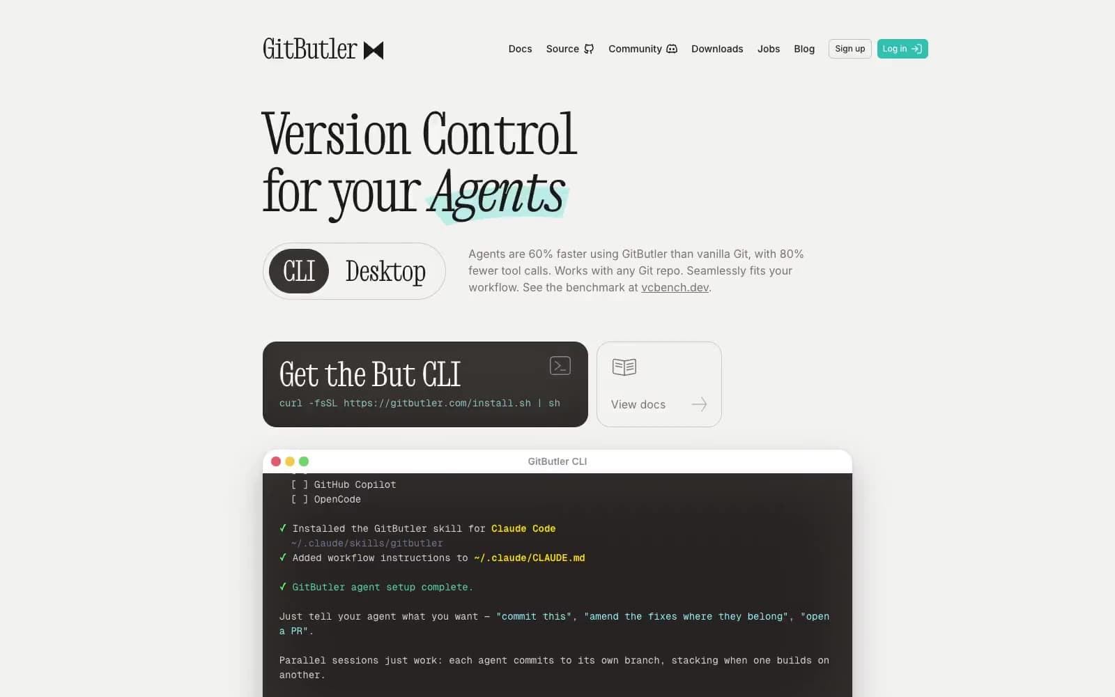
GitButler
Developer tools


