Vimeo. Spotlight on matte white.
- Media
- Mixed theme
- 11 colors
- 2 typefaces
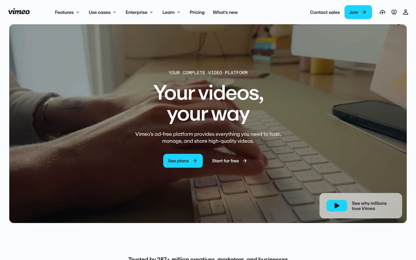
Vimeo's visual language treats the page as a matte white gallery wall where one electric cyan accent acts as the only spotlight. The dominant canvas is near-white (#fafcfd) with a deep ink (#141a20) used sparingly for cinematic dark bands, and a single vivid #17d5ff cyan that appears exclusively on action elements — never on decoration, illustration, or background fills. Typography carries the brand's editorial weight: a custom neo-grotesque (ABCRepro) at 400/500/700 with aggressive negative tracking at display sizes (-0.05em at 72px), tight 1.20 leading on body, and 1.00 leading on oversized headlines that makes them feel architectural. The layout alternates between breathing light sections and dense dark platforms, creating a vertical rhythm that mirrors the site's own product (lightness for browsing, darkness for viewing). Components are flat, low-elevation, and slightly rounded — 8px on buttons and inputs, 16px on cards, 9999px on tags. Density is compact: 8px and 16px do the heavy lifting, with 24px marking section breaks rather than breathing room.
Vimeo design system

Brand2
Primary action background, active nav, the single brand chromatic — filled CTAs and selected states. Electric against matte white, cool enough to feel like light rather than pigment
Blue wash for highlight backgrounds, decorative bands, and soft emphasis behind content. Do not promote it to the primary CTA color
Neutrals9
Primary text, heading color, strongest dark neutral for text on light surfaces and borders on dark surfaces
Dark section backgrounds (platform showcase bands, footer), filled dark buttons. Near-black with a cool blue undertone that keeps it on-brand rather than neutral
Dark card surface, elevated dark panels above #141a20 backgrounds. Used for layered dark UI
Secondary text, footer borders, muted UI elements. Cool gray-blue that bridges between the dark ink and mid-grays
Tertiary text, outlined action borders, link colors. The mid-tone that carries most secondary information
Navigation borders, body text secondary level, card text. Lighter mid-gray for tertiary UI structure
Muted helper text, disabled states, low-emphasis borders. The softest mid-gray for de-emphasized content
Subtle background fills, nav hover states, light surface layer above the white canvas
Page canvas, card surfaces, primary background. The near-white with a barely-perceptible cool tint — cleaner than pure white, warmer than #fff
Try a pairing
Pick any two colors from the palette to check whether text stays readable on top.
Aa
Carbon on Cyan Signal
11.06 : 1 contrast
- Body textPasses AA 4.5
- Large textPasses AA 3
- StrictPasses AAA 7