Instagram Sans Typeface. Living type museum.
- Media
- Mixed theme
- 10 colors
- 3 typefaces
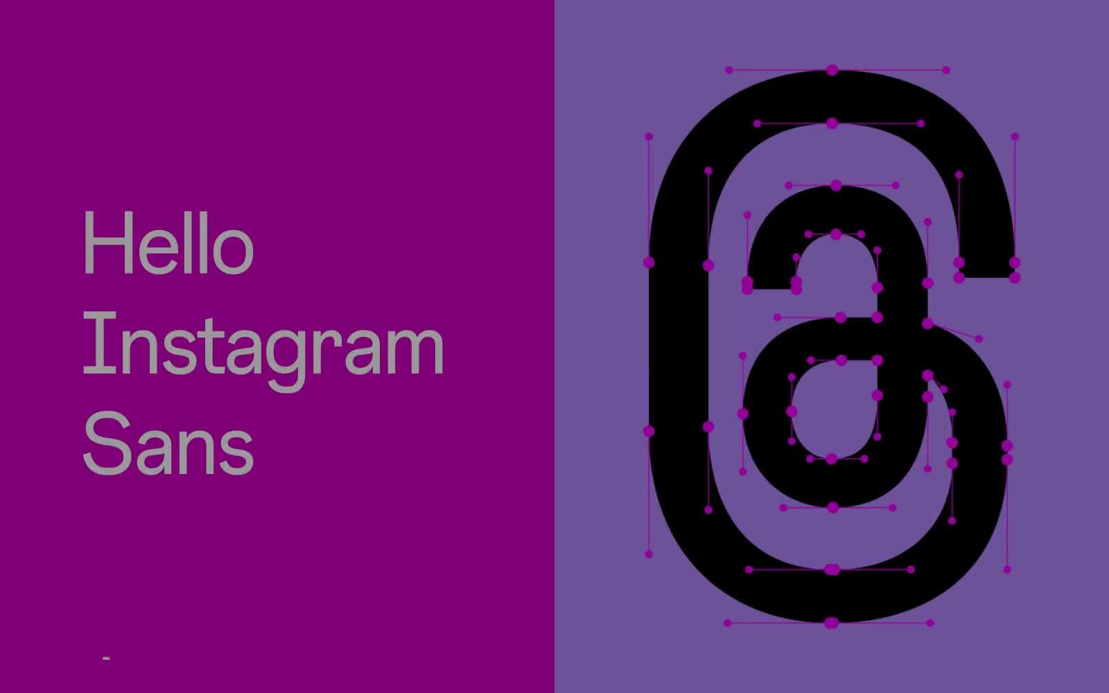
Instagram's brand/type page treats the custom Instagram Sans typeface as a physical specimen on display, not as interface chrome. The visual system alternates between two modes: full-bleed solid color panels (hot magenta and lavender) where oversized black letterforms act as both content and hero artwork, and white gallery-style text blocks with warm near-black type at comfortable sizes. The Instagram brand gradient — signal pink through plasma magenta into ultraviolet — appears once or twice as the sole decorative mark, never as a background wash. Everything breathes: 51px lateral gutters, 48–64px vertical section padding, and a 4px base unit enforce generous spacing. The design language is confident, editorial, and monochromatic where it isn't loud — color is deployed as full-bleed band, never as tint or wash.
Instagram Sans Typeface design system

Brand5
Gradient origin — Instagram brand gradient start point, the chromatic anchor in the system
Gradient midpoint — bridges hot pink into ultraviolet, used in the brand gradient only
Gradient terminus — deep violet end of the Instagram brand gradient, the cool counterweight
Full-bleed color panel — left half of the hero split, the loudest single surface in the system
Full-bleed accent band — right half of the hero split and secondary color sections, softens the magenta
Accent1
Violet accent for outlined action borders, linked labels, and lightweight interactive emphasis. Do not promote it to the primary CTA color
Neutrals4
Specimen letterforms, Instagram camera icon outlines, high-contrast graphic moments — flat black with no warmth
Body text, button borders, list dividers, nav borders — the primary near-black for all text and hairline rules
Subtle button borders and disabled-state rules
Content canvas, text on color panels, button text, input backgrounds — the neutral ground that lets color panels pop
Try a pairing
Pick any two colors from the palette to check whether text stays readable on top.
Aa
Pure Black on Signal Pink
5.46 : 1 contrast
- Body textPasses AA 4.5
- Large textPasses AA 3
- StrictFails AAA 7