Fable. The book is the art.
- Media
- Mixed theme
- 9 colors
- 3 typefaces
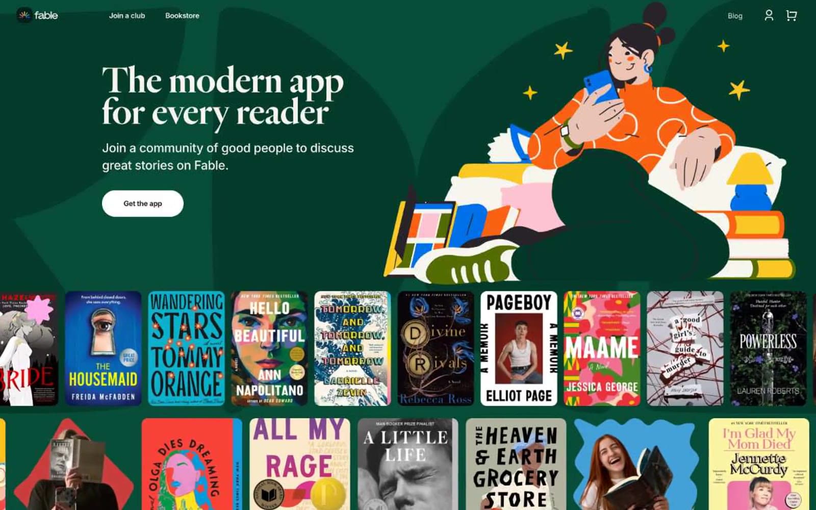
Fable reads like an editorial book club brought to life: generous cream surfaces, large warm serif headlines, and alternating full-bleed colored bands (forest green and sky blue) that frame colorful flat-illustration scenes. Typography is the loudest voice — Heldane Display at near-black weight with tight 0.86–0.94 line-heights produces a literary, slightly compressed headline look, while Inter handles every utility and body line at modest sizes with strong negative tracking. Buttons are stadium-pill shapes (60px radius) in two tones — dark on cream, white on color — and book covers themselves become the primary decorative motif, treated as editorial artwork rather than thumbnails. The overall rhythm is section-band driven: each full-bleed color block introduces a single concept with a headline, supporting copy, a single pill CTA, and an illustration or product preview on the right.
Fable design system

Brand2
Full-bleed dark section background, first-screen hero band — deep botanical green that makes the warm cream and orange illustration pop
Full-bleed mid section background — cerulean blue band that carries product-feature storytelling between cream and green sections
Neutrals7
Footer background, darkest surface — reserved for terminal bands and footer chrome
Primary heading and display text — near-black with a violet undertone that warms the editorial serif without losing contrast
Filled pill button background, dark card surfaces, secondary heading color
Body text, paragraph copy, secondary UI text — warm dark gray that reads softer than pure black on cream
Subtle image placeholders, soft dividers, muted card backgrounds when a lighter neutral than cream is needed
Hairline borders, dividers, input outlines, and card edges on light surfaces.
Page background, reverse-mode button fill (on dark sections), text on dark surfaces
Try a pairing
Pick any two colors from the palette to check whether text stays readable on top.
Aa
Pure White on Fable Forest
10.02 : 1 contrast
- Body textPasses AA 4.5
- Large textPasses AA 3
- StrictPasses AAA 7