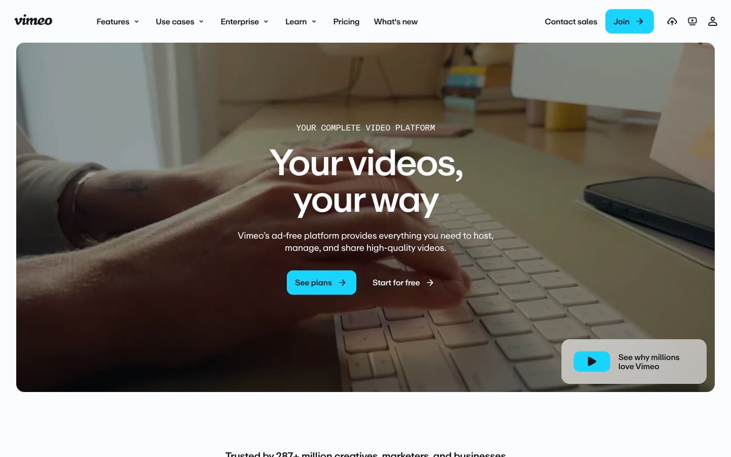
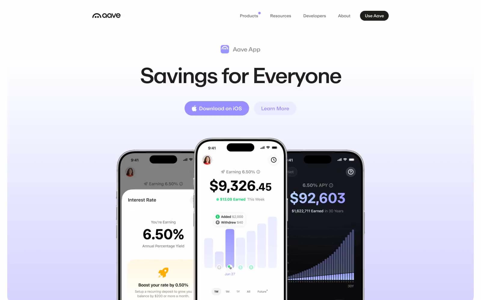
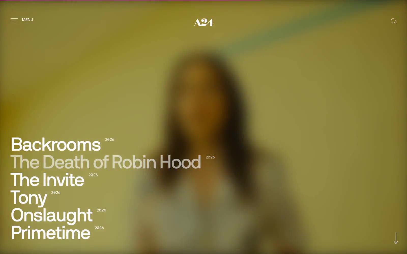
A24. Opening title sequence on pure black.
- Media
- Mixed theme
- 5 colors
- 2 typefaces
A24 operates as a cinematic editorial system: pure monochrome pages where typography does all the emotional work. The design alternates full-bleed black and white bands, using a custom humanist sans-serif (NB International) at extreme sizes — up to 74px display — to let film titles and headlines become visual artifacts rather than mere labels. Every UI element is stripped to its barest form: hairline borders, zero radius, zero shadow, zero chromatic accent. The site's restraint IS the brand; it borrows the visual grammar of a film opening title sequence — high contrast, generous negative space, and confidence through absence rather than addition.
A24 design system

Neutrals5
Section backgrounds for dark bands, primary body text on light surfaces, hairline borders and dividers throughout — the structural backbone of every page
Muted secondary text, subdued nav labels, low-emphasis borders — sits just above AA contrast for accessibility
Light hairline borders on white surfaces, minimal separator lines, very low-emphasis UI strokes
Subtle surface variant for product showcase panels and soft background shifts on light sections
Light section backgrounds, card surfaces, product image containers, modal/overlay panels, primary text on dark backgrounds
Try a pairing
Pick any two colors from the palette to check whether text stays readable on top.
Aa
Paper White on Obsidian
21.00 : 1 contrast
- Body textPasses AA 4.5
- Large textPasses AA 3
- StrictPasses AAA 7