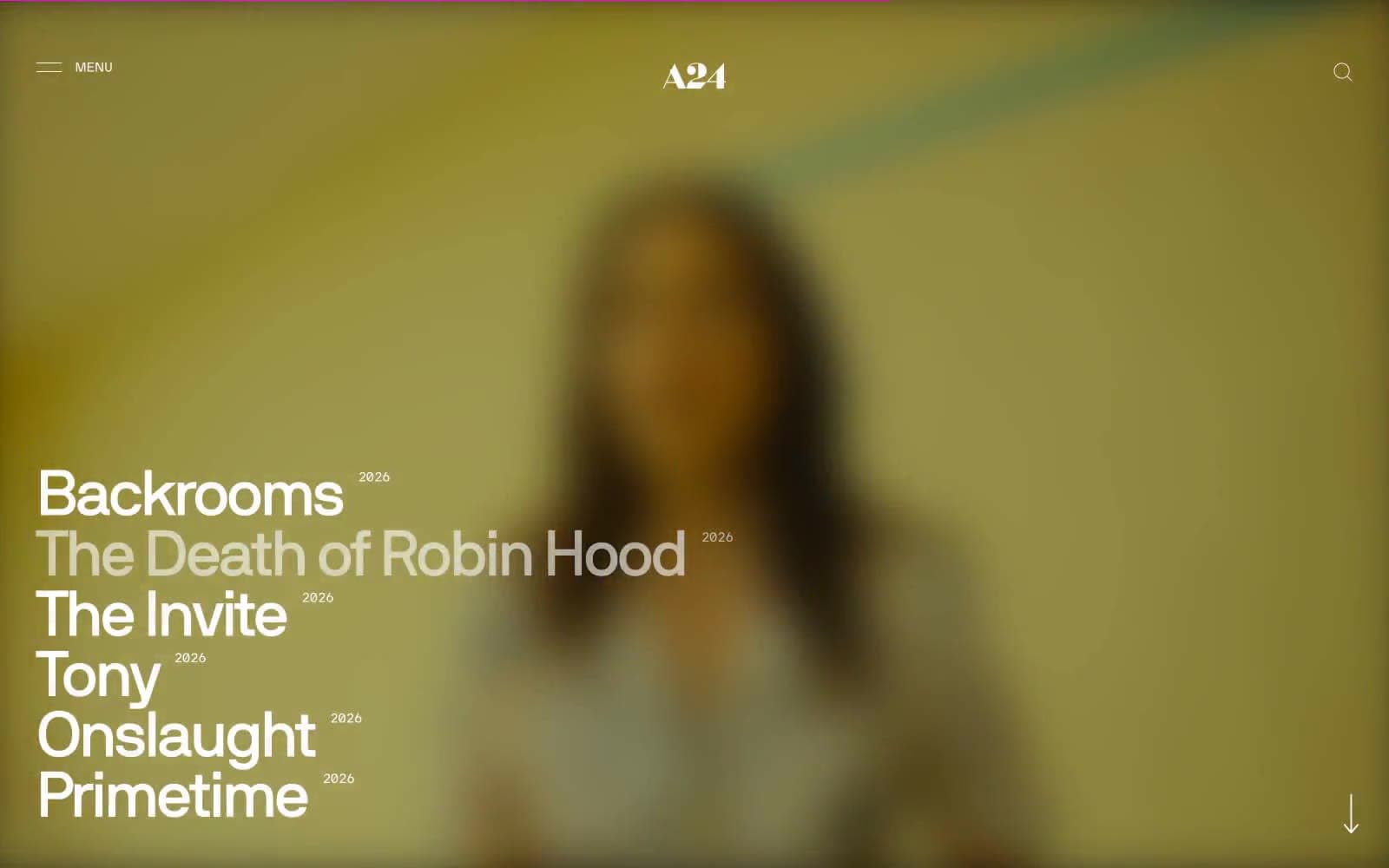
Deezer. Festival poster meets dark arena.
- Media
- Mixed theme
- 10 colors
- 2 typefaces
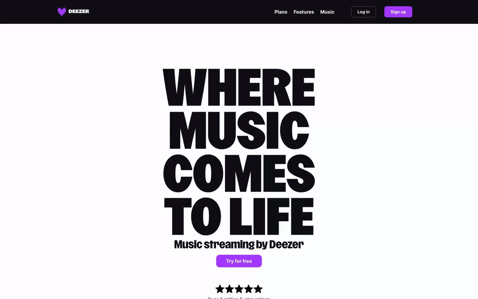
Deezer's visual system is a dramatic concert-poster language: a sunlit white hero dominated by a single ultra-condensed display headline, followed by dark arena sections where content floats on light card surfaces against near-black backgrounds. Typography carries the entire brand voice — a custom 700-800 weight display face with absurdly tight line-heights (0.71–0.90) that makes the hero feel like a music festival flyer, not a SaaS page. One vivid violet (#a238ff) is the only chromatic note across the system, used with discipline: filled CTAs, pill badges, and the top promotional banner. The palette is otherwise near-monochrome — stark black on white for the hero, near-black with white text for the lower arena, and a single soft lilac for subtle washes. Components are light, flat, and confident: pill-shaped buttons, thin dividers, no decorative shadows, no gradients. The rhythm alternates light/dark bands vertically to create contrast between marketing drama and product clarity.
Deezer design system

Brand2
Violet supporting accent for decorative details and low-frequency emphasis. Do not promote it to the primary CTA color
Soft violet tint for decorative washes, the banner background fill, and subtle highlight surfaces adjacent to Signal Violet elements
Neutrals8
Display headline text on light surfaces, icon fills, maximum-contrast text
Dark section backgrounds, navigation bar, inverse canvas, pricing and FAQ arena
Button text on light pill surfaces, subtle text on cards
Secondary text, subdued meta labels, footer body copy
Subdued headings, section sub-labels, de-emphasized display elements
Muted body text, helper text, low-emphasis labels on light surfaces
Hairline borders, thin dividers, subtle separators on cards
Page and hero backgrounds, card surfaces floating on dark sections, light theme canvas
Try a pairing
Pick any two colors from the palette to check whether text stays readable on top.
Aa
Pure Black on Signal Violet
4.55 : 1 contrast
- Body textPasses AA 4.5
- Large textPasses AA 3
- StrictFails AAA 7